Baltimore Orioles Caps History
The St. Louis Browns became the Baltimore Orioles in 1954.
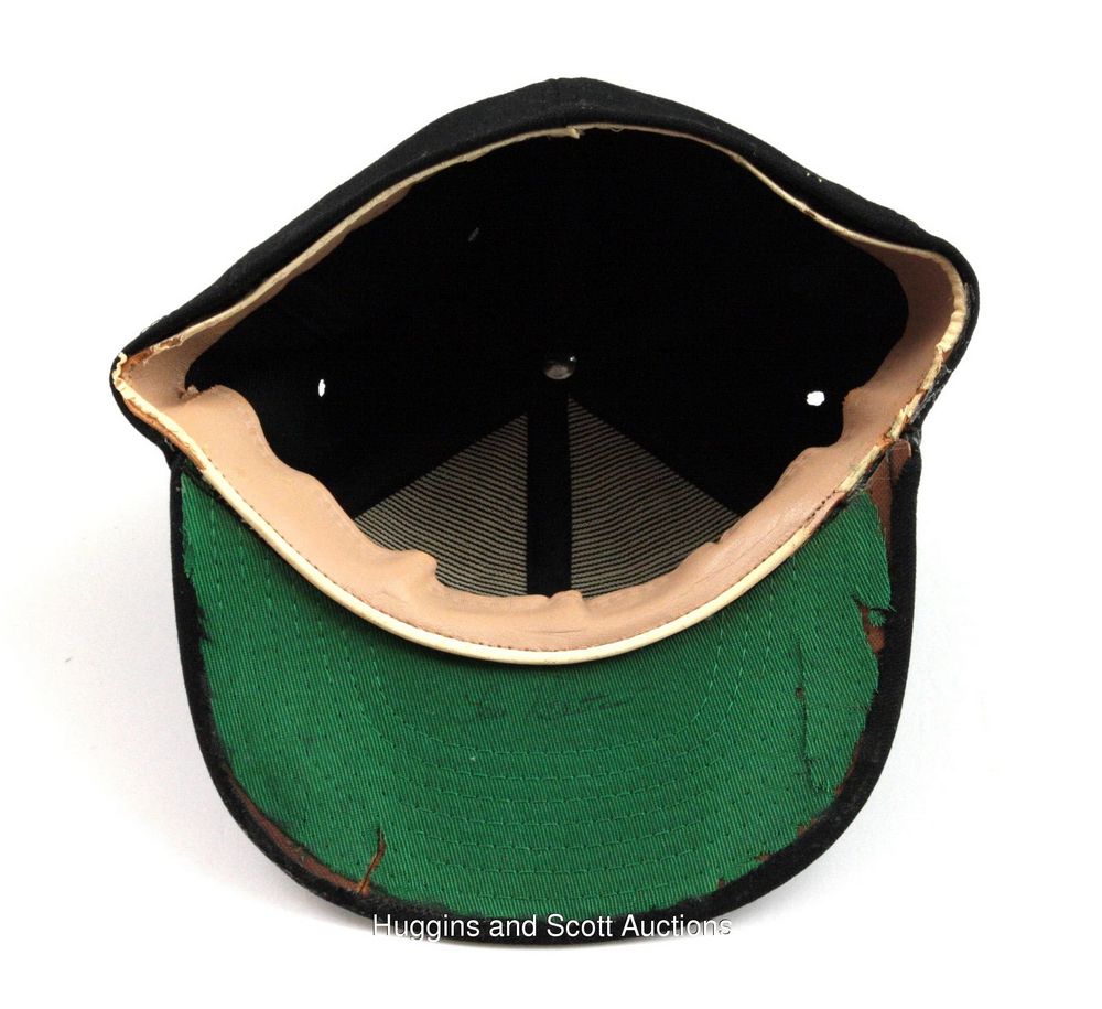
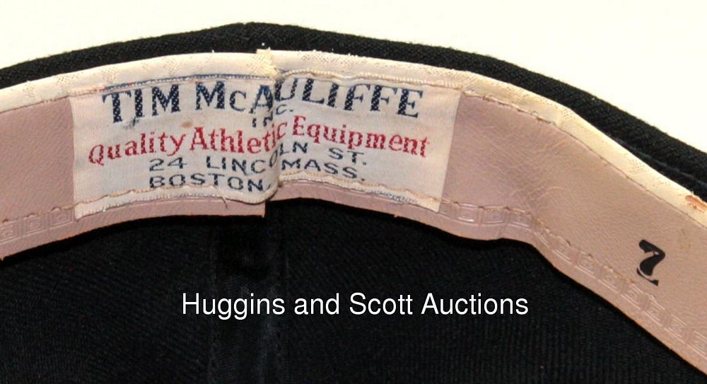
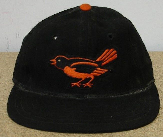
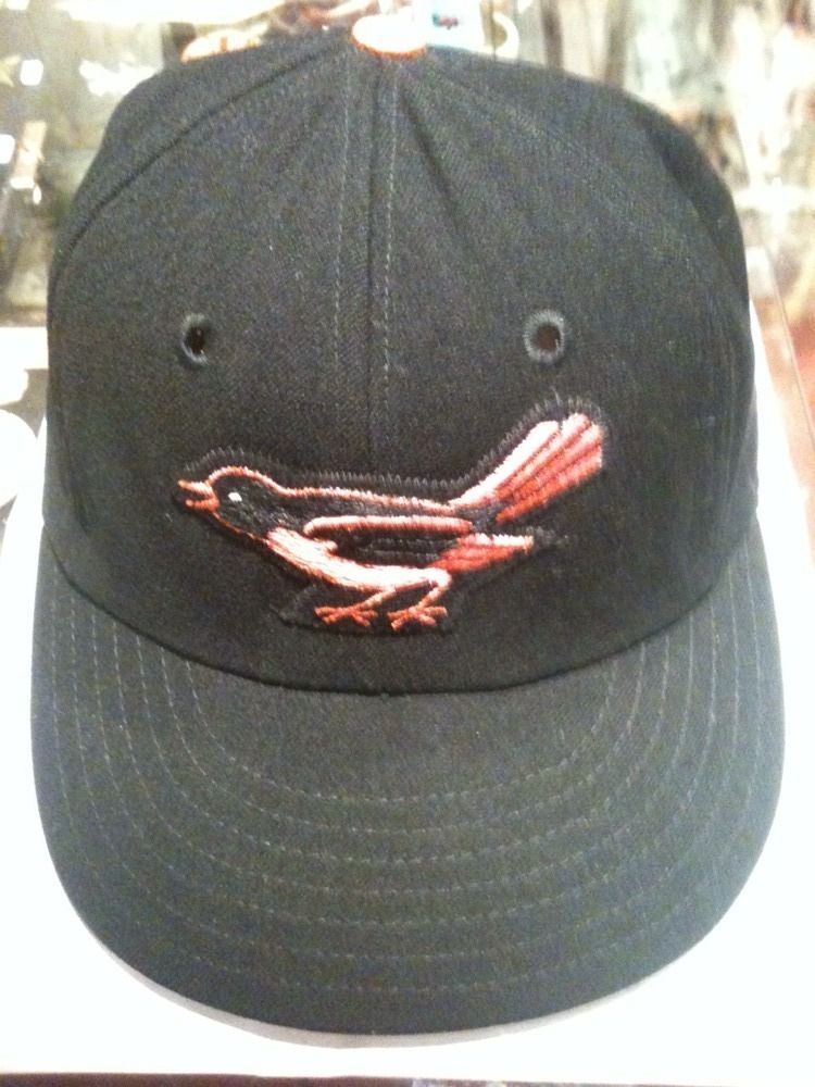
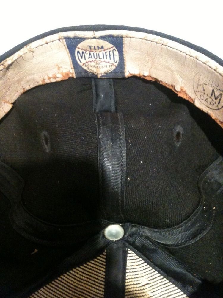
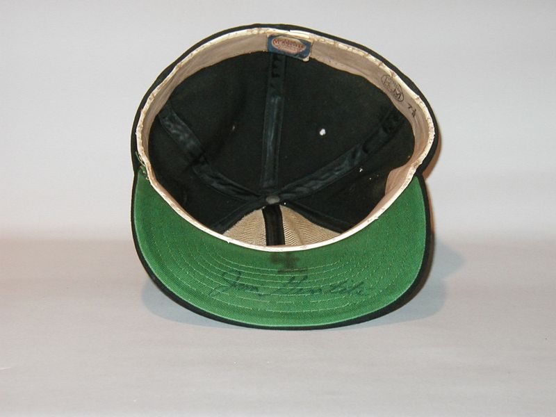
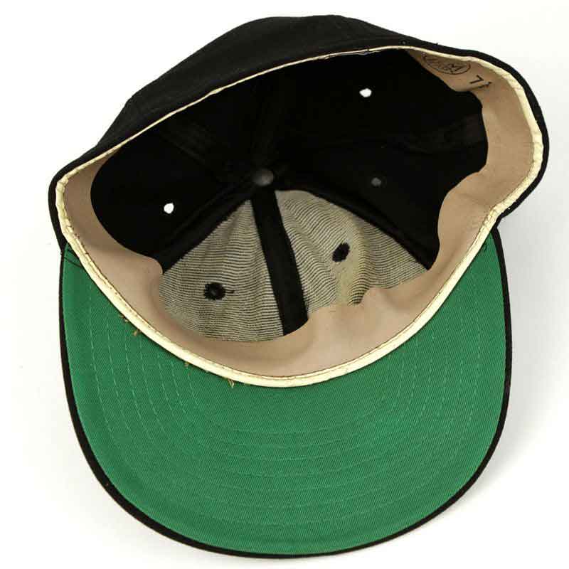
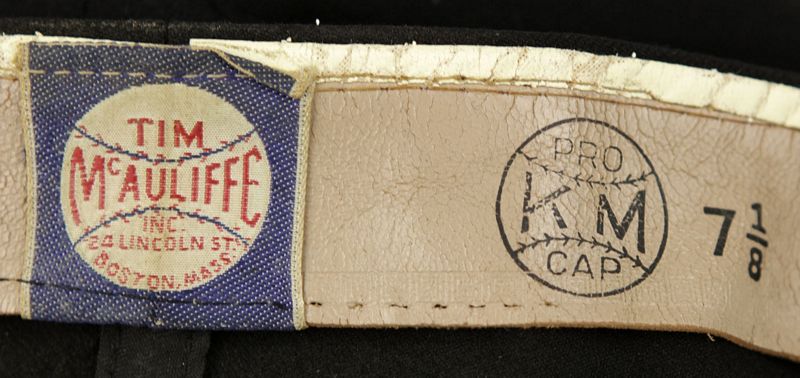
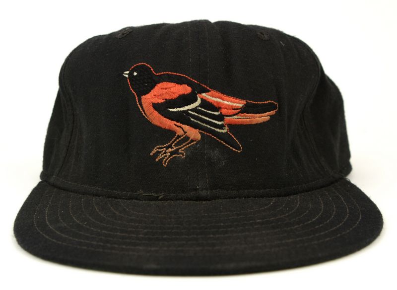
1954-57
The Orioles become the only MLB team to not use a letter or letters on their cap. I've also seen 1954 caps made by Lippman but not convinced those were worn on-field, anyone know?.
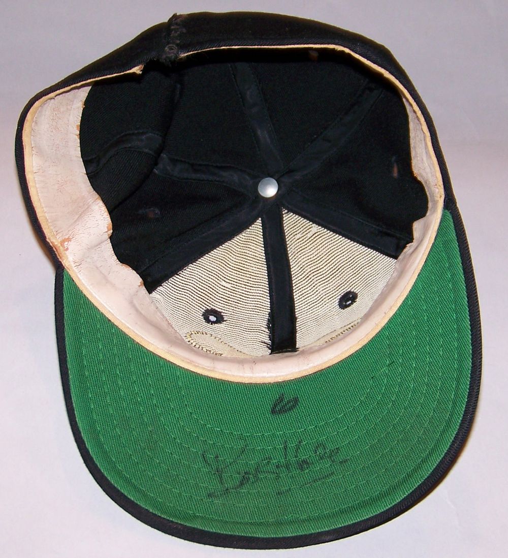
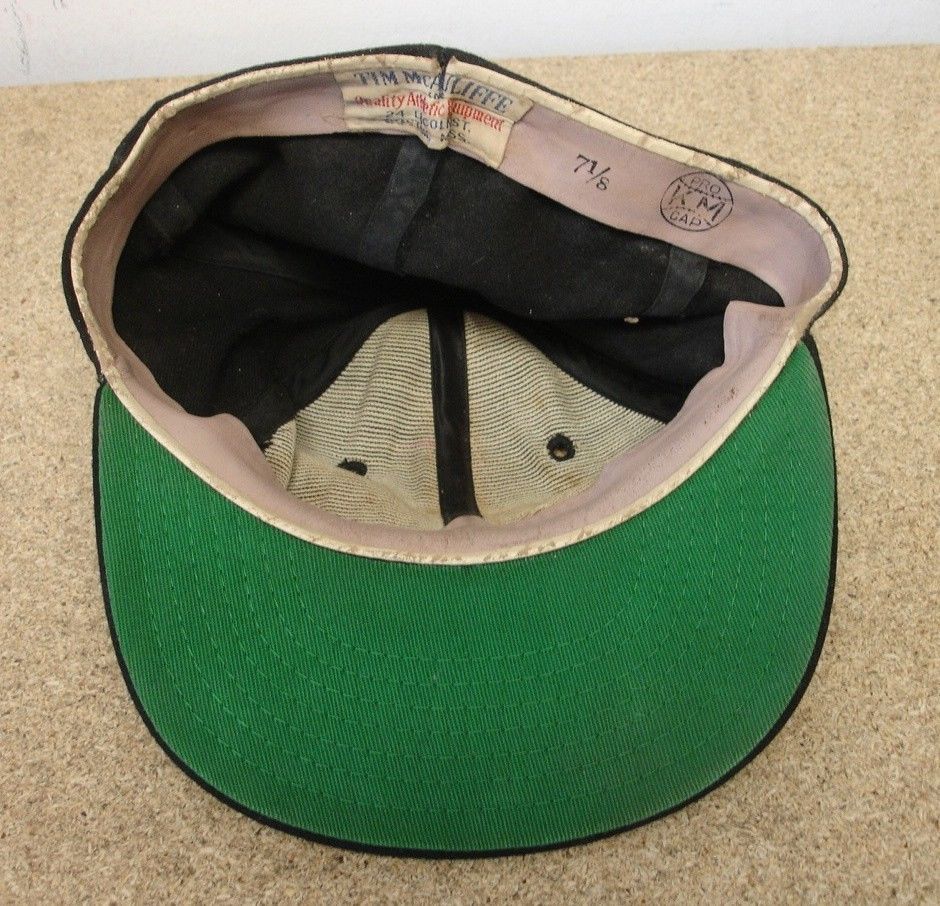
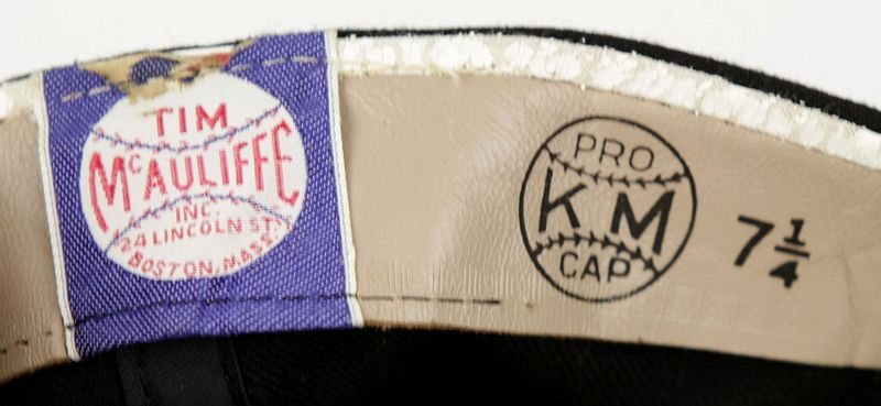
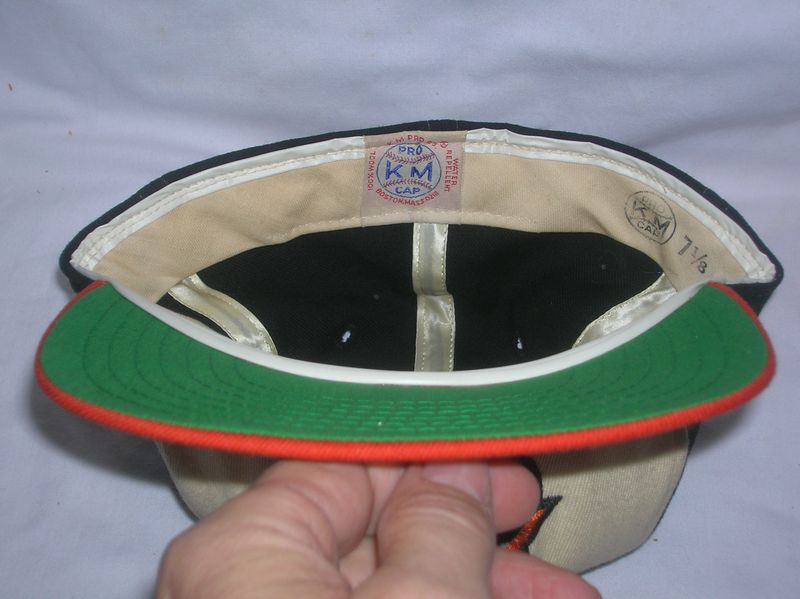
Tim McAuliffe/KM Pro

In 1955 batting helmets had an old English style "B". I see American Needle makes a "1955 throwback" cap in that style but I've never seen a photo of a player wearing such a cap.

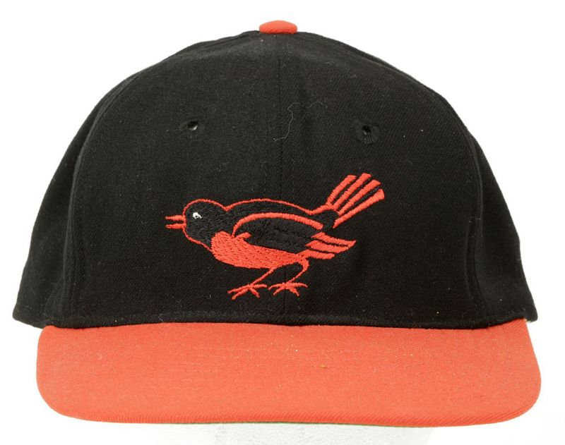
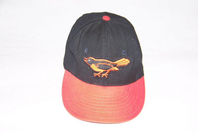
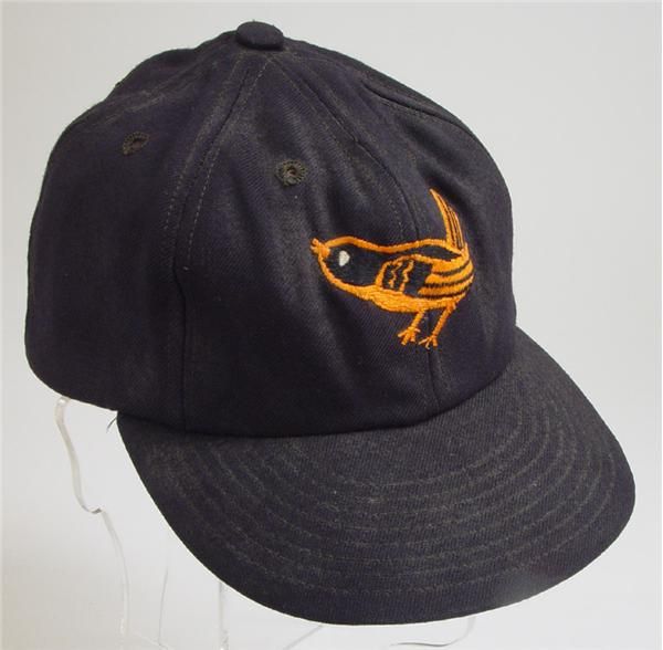
1958-62
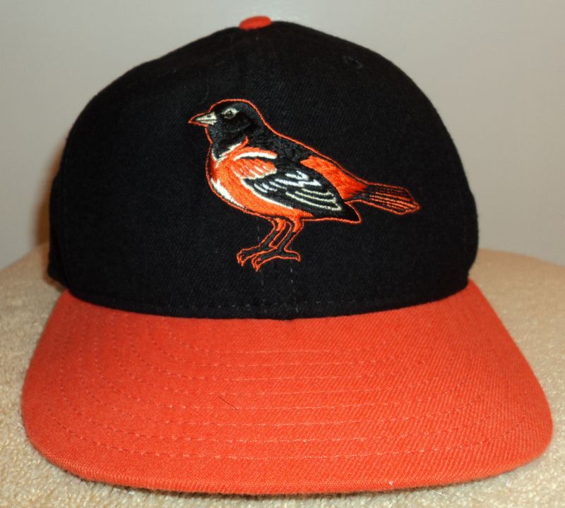
Orange visors are added to caps. Tim McAuliffe switches from sewn-on patch to a logo directly embroidered to the cap. In the process, the bird gets a slightly different look.
Tim McAuliffe/KM Pro
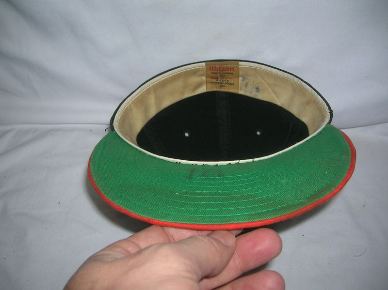
Meanwhile New Era and Wilson caps keep the sewn-on patch and original logo.
New Era

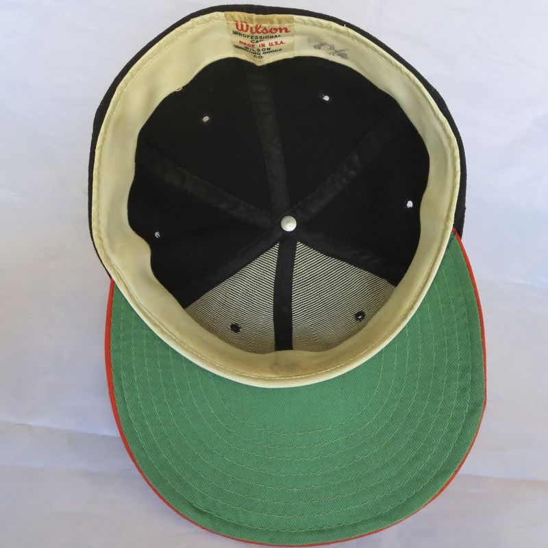
Wilson
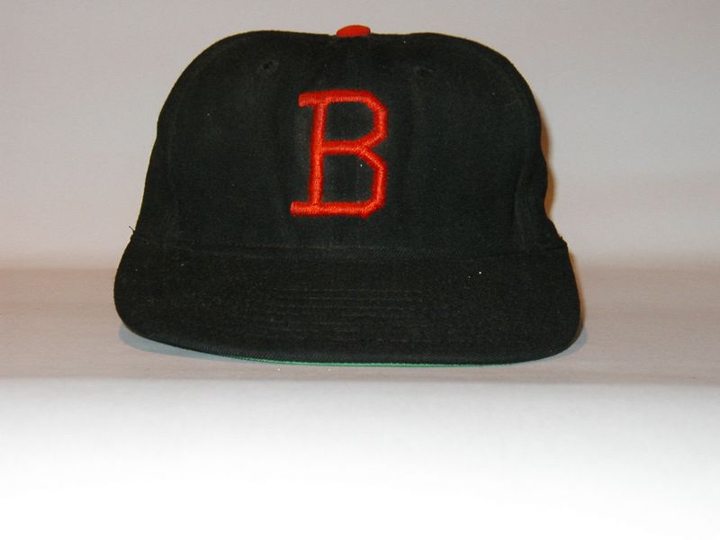
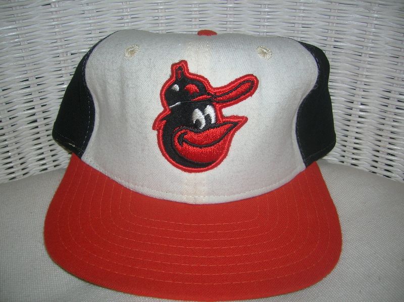
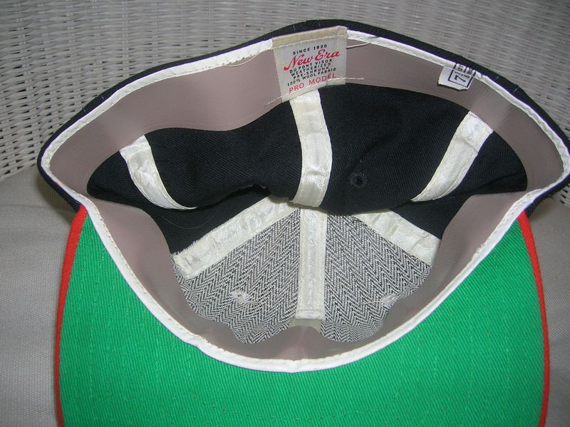
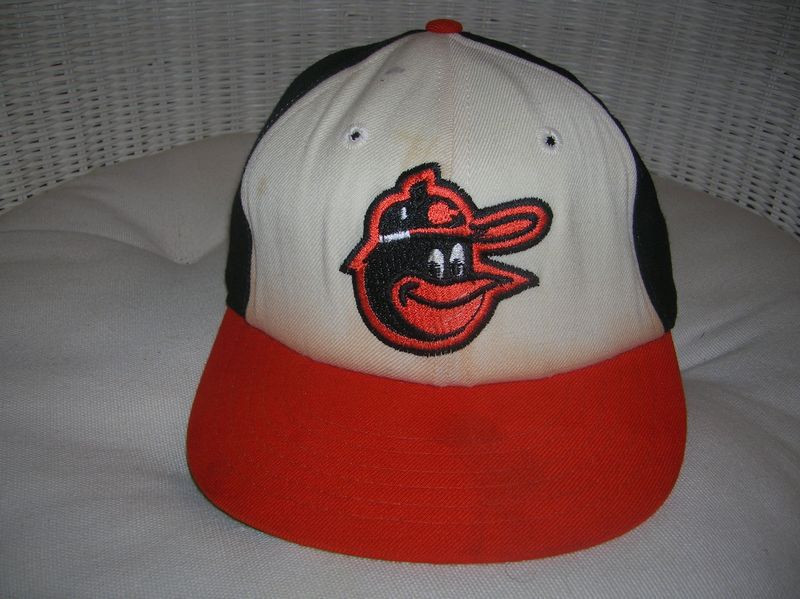
1963
The home cap gets a block letter B for 1963 only. Back to a black visor and another tweak to the bird for the road cap.
Tim McAuliffe/KM Pro

1964-65
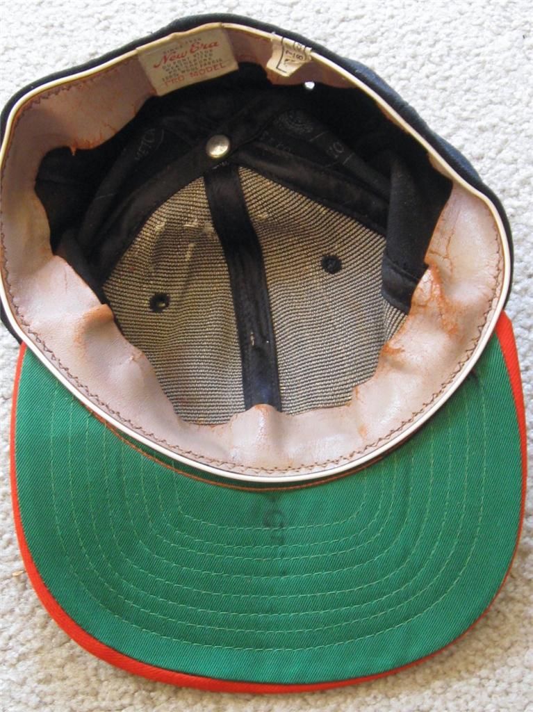
"B" cap dropped. Black visor cap worn home and road. McAuliffe caps were probably still used but Wilson caps started appearing.
Wilson

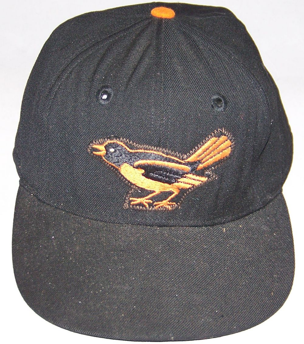
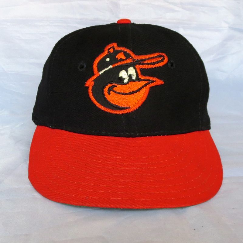
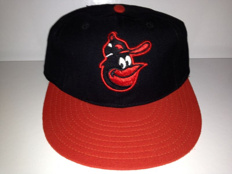
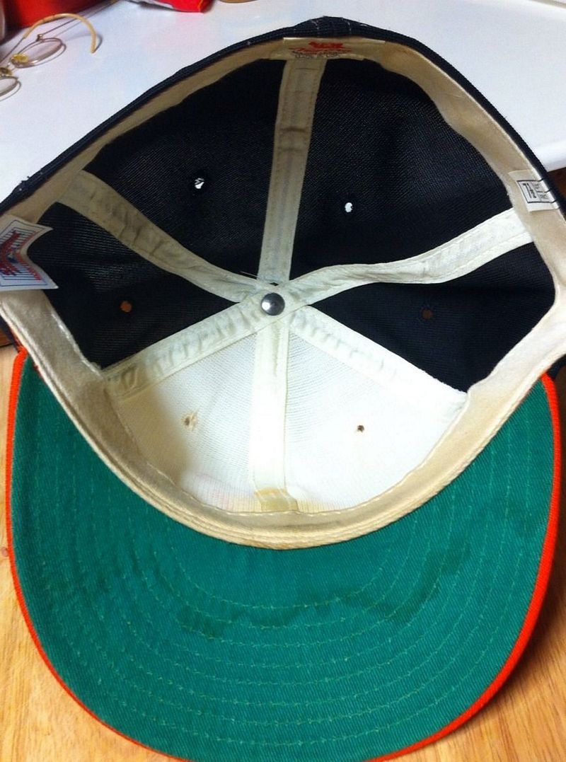
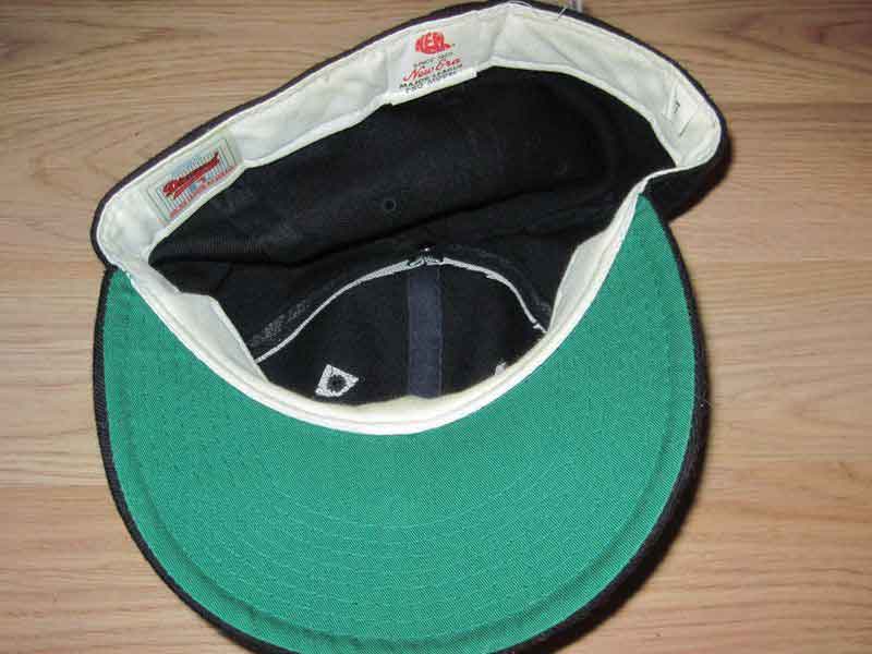
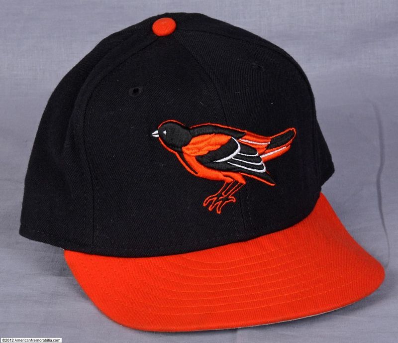
1966-74
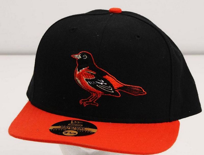
The Orioles introduce what might be the most loved cap logo ever, the Cartoon Bird (aka Happy Bird). The Orioles cap story around this time is fascinating as it is a microcosm of the battle being waged by capmakers not just for the MLB market, but for the soon-to-explode retail cap market, a battle ultimately won by New Era.
There are basically two Cartoon Bird designs. The first, which I call the "Roman" design, was created by Roman Art & Embroidery, the company that put logos on the caps of most MLB teams since the 1940's. Now, Roman didn't make caps themselves until 1977; so their designs went on caps sold by everyone except New Era. In order to put a Roman logo on a cap, a blank cap had to be sent to Roman Art, or else Roman Art supplied a logo patch that was sewn onto the blank cap. The second, which I call the "New Era" design, was created by New Era and was sewn onto New Era-made caps at the New Era factory. The basic difference in appearance: the Roman design is wide, the New Era design is narrow. The Roman design underwent multiple tweaks over the years, while the New Era design did not.
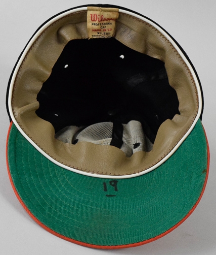
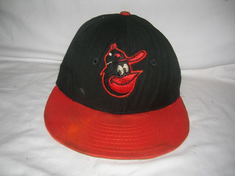
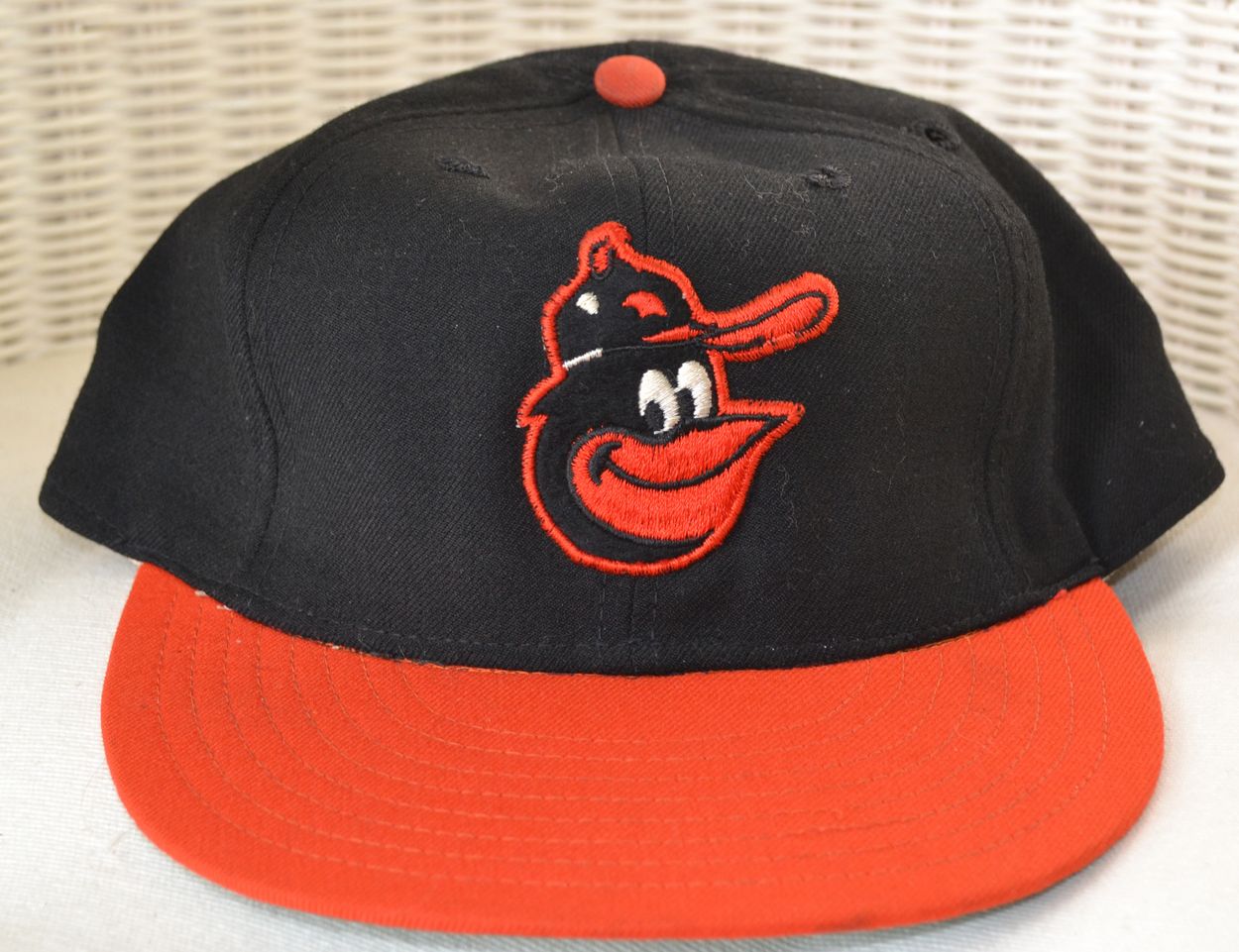
Wilson - Roman logo
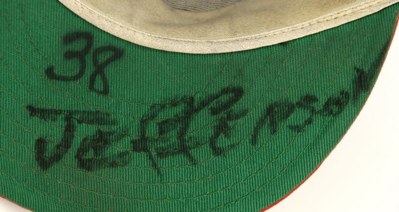
From 1966-74 the Orioles predominantly use Wilson caps sporting a Roman logo. Wilson caps were actually manufactured by New Era under private label without a logo; Roman Art made the logo patch which was sewn onto the cap. Game used caps and photos of players wearing this logo are common.
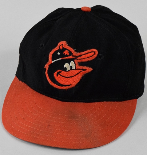
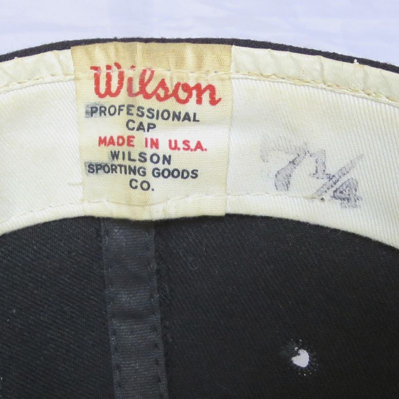
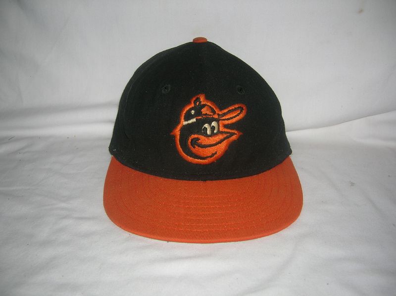
In 1974 things change as New Era stops making caps for the Wilson label in favor of selling under their own name. We see a change to the "Roman" logo on Wilson caps - perhaps because both cap and logo were manufactured by American Needle for Wilson.
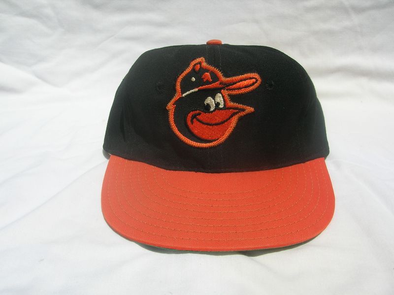
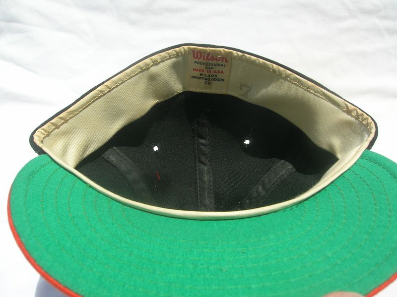
Wilson - Roman logo
The Roman Cartoon Bird gets tweaked. This is the predominant cap worn during the season and possibly the last blank caps made by New Era for Wilson.


Unused and Rarely Used Versions
Wilson - New Era logo
Wilson caps were made for them by New Era, and New Era had their own version of the Cartoon Bird logo, embroidered directly onto the cap, which started to appear around 1969. Game used caps are scarce, player photos nonexistent. Clearly the team tried these caps but preferred the Roman design.
Pro McAuliffe - New Era logo
Tim McAuliffe's company folded after his passing in 1969. McAuliffe's jerseys had been manufactured by Stall & Dean (who carried on making jerseys under their own new label "McAuliffe Uniform") - and Stall & Dean also decided to try their hand at caps under a "Pro McAuliffe" label. (The Leslie Company, maker of "Tim McAuliffe/KM Pro" caps for 20 years also carried on making caps, now under the "KM Pro" label through 1976). Since Stall & Dean hired New Era to manufacture their caps, here's the New Era bird logo. It doesn't look like the team used Pro McAuliffe caps though.
New Era - New Era logo
New Era starts making Orioles caps under their own label. Probably not used during the season.
New Era nylon - New Era logo
And New Era introduces an all-nylon cap which is probably a prototype, possibly used in spring training.
-1.jpg)
-2.jpg)
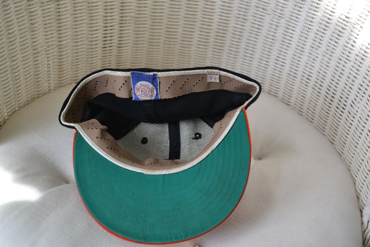
KM Pro - Roman logo
And here's a KM Pro version made by the Leslie Company with thick wool and a Cartoon Bird similar to, but slightly different from, the Roman logo. I've seen game used caps but no player photos, so again, maybe only used in spring training or by only a few players.

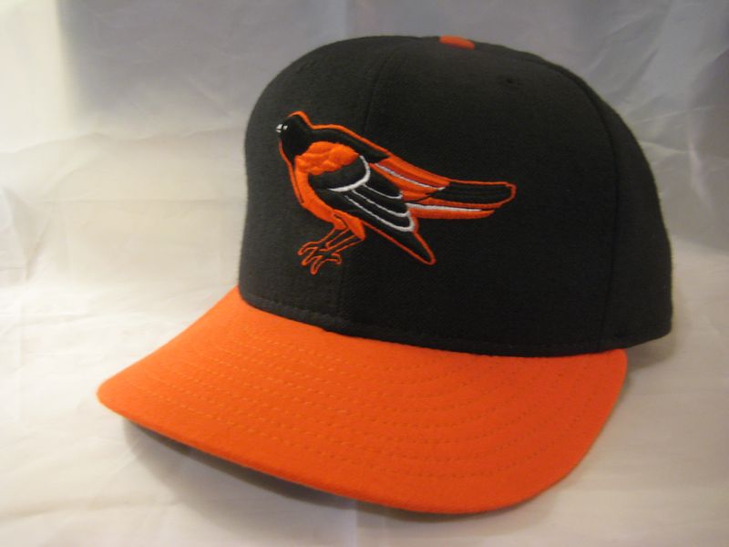
1975-76
Another entrant arrives as the Orioles turn to local capmaker AJD for their classic soft double-knit polyester white-front and orange-front (Sunday) caps. No other MLB team that I know of ever wore double knit caps. Wilson is out of the picture, and although we see player-used New Era and KM Pro caps those were almost certainly not used during the season.
AJD - Roman logo
The AJD Cartoon Bird is the same Roman design from 1974, but it's tilted way up. The logo is a sewn-on patch and the earliest caps have no outline giving it somewhat of a rough-looking appearance.
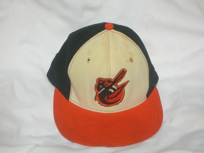
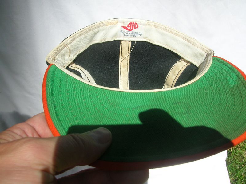


Soon afterward AJD added an orange outline around the logo to give it a more finished appearance.
-1.jpg)
-2.jpg)

New Era - New Era logo - likely not used in season
New Era also made an orange panel nylon cap that the team tried out, but probably only in Spring Training.

KM Pro - Roman logo - likely not used in season
KM Pro made white panel caps in 1976 with a new variation of the Roman Cartoon Bird (notice the bird's cap button is now black). Almost certainly not used by the team. I've never seen a player-used KM Pro cap like this.
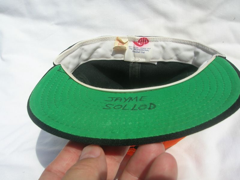
1977-79
The orange panel cap is dropped. New Era becomes the predominant cap, but some players wear AJD during the 1977 season, and some wear Roman Pro during the 1977-79 seasons. A bit of a mish-mash look for the team in this period.
New Era - New Era logo
AJD - Roman logo
Leftovers from 1976, AJD caps are last worn on-field during 1977.
-1.jpg)
-2.jpg)
Roman Pro - Roman logo
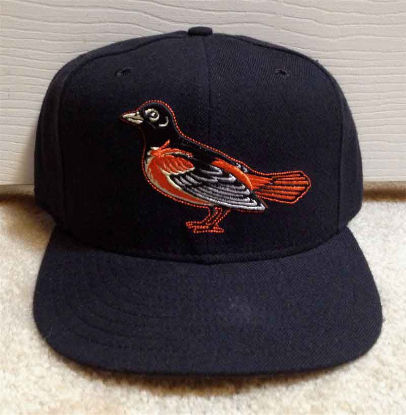
After KM Pro closed, Roman bought some of their equipment and inventory and started Roman Pro cap in 1977. The Roman Bird gets another tweak once again (though it looks like the one on the KM Pro cap, it's slightly different). Some players wear Roman Pro caps on-field in 1977-79. (note- those Roman Cooperstown "1966-74" black crown caps made in the 1980's have this 1977 logo on them).

1980-81
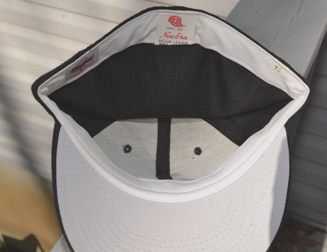
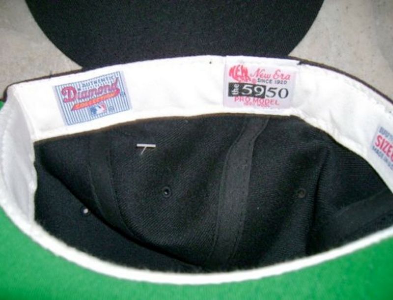
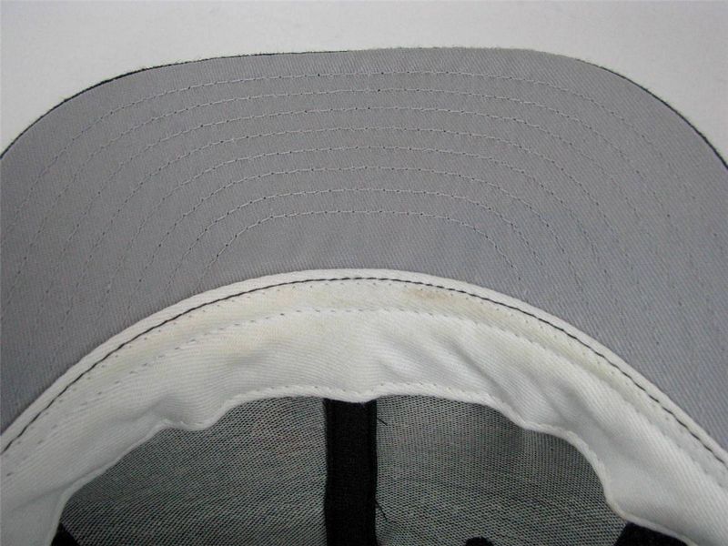
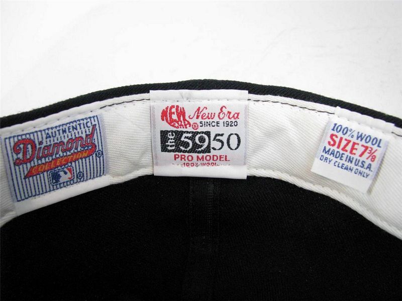
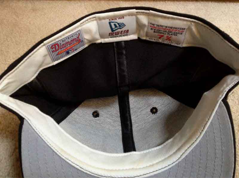
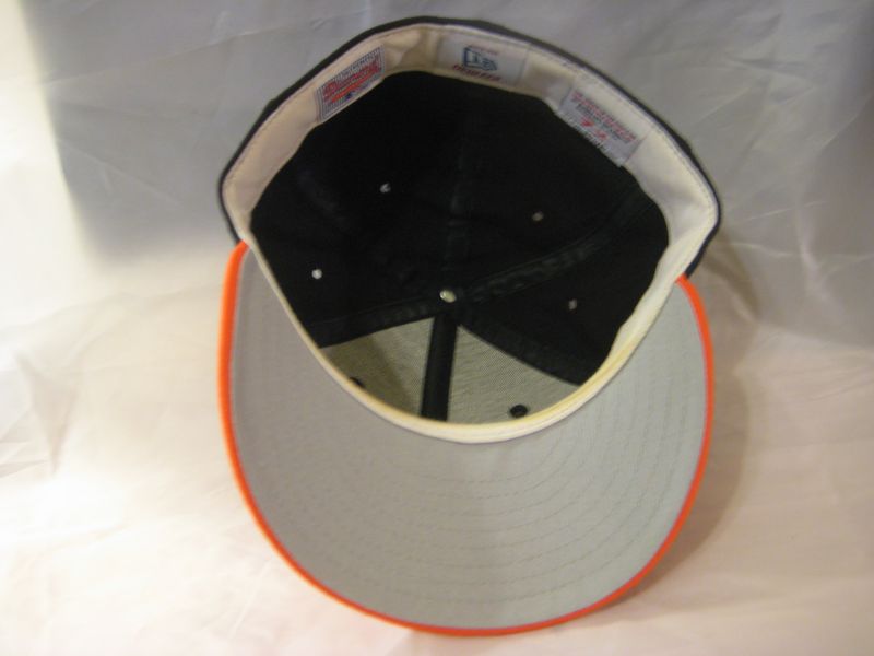
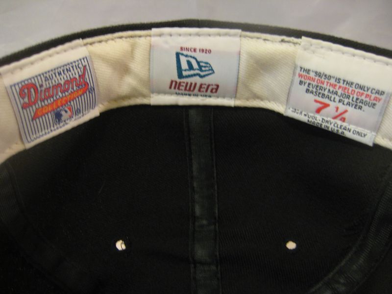
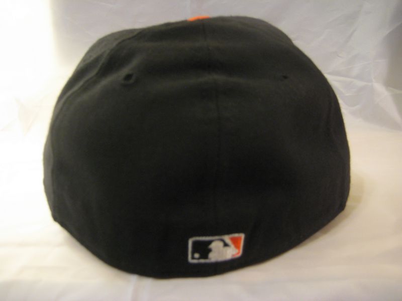
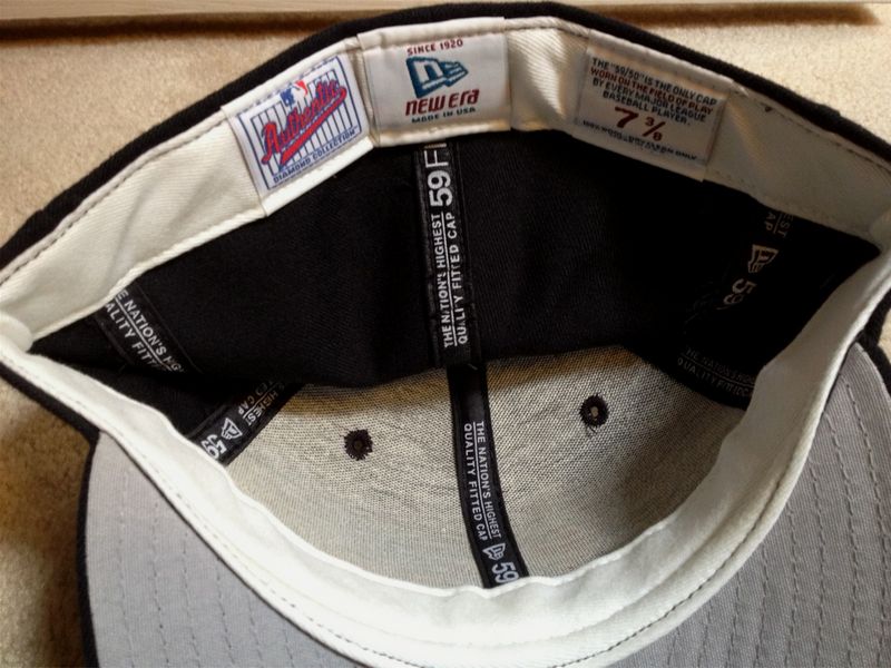
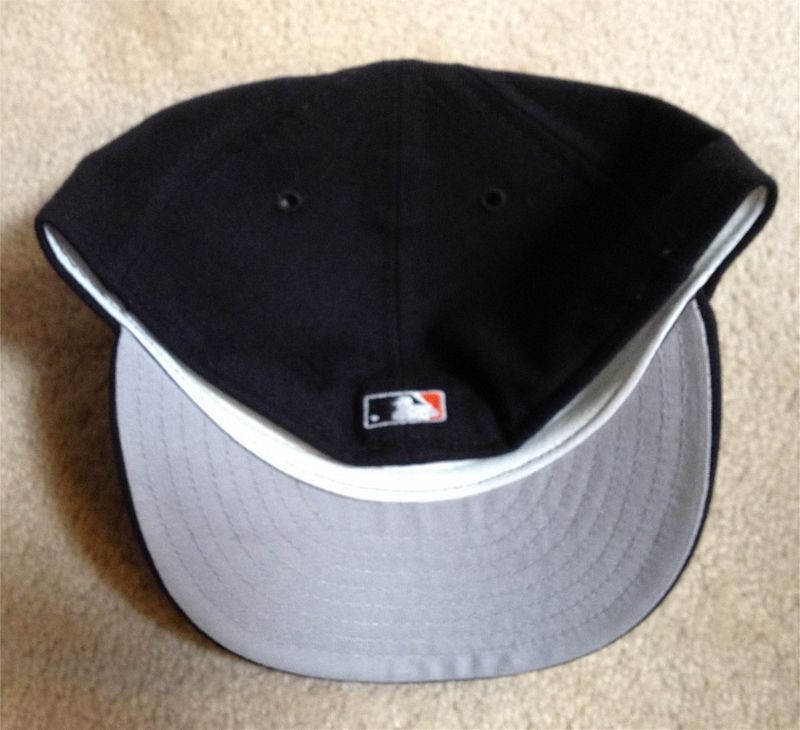
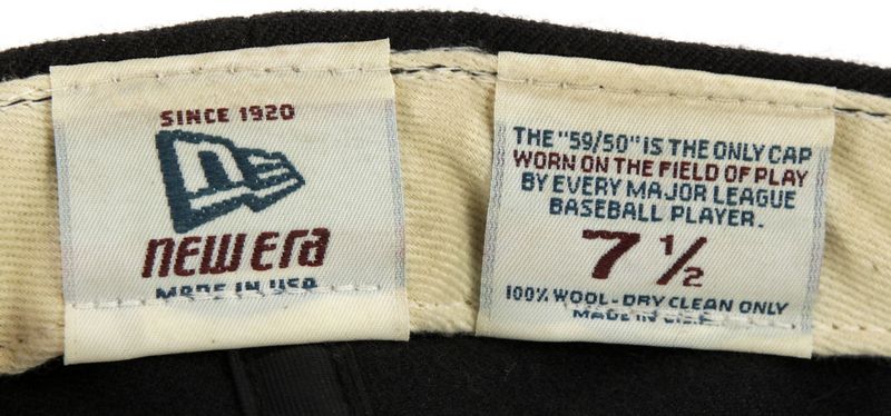
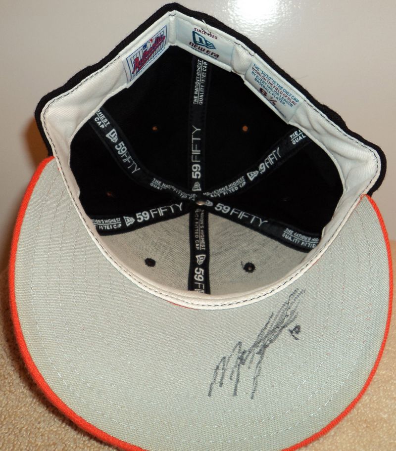
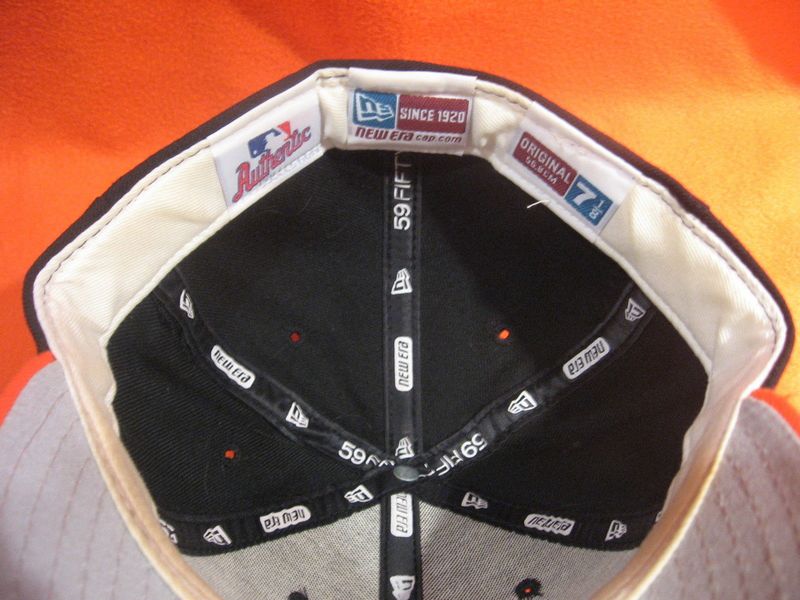
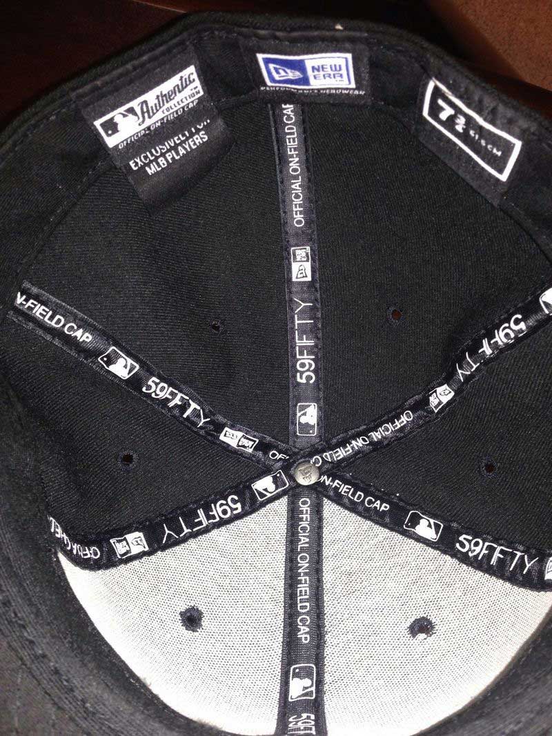
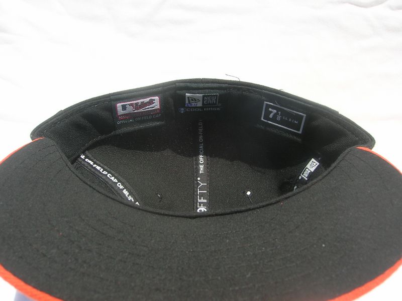
By 1980, New Era has (almost) won the battle. MLB tags appear inside caps in 1981.
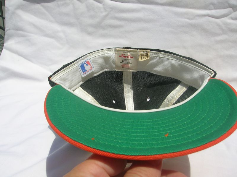
New Era
1982-88
Nylon caps debut.
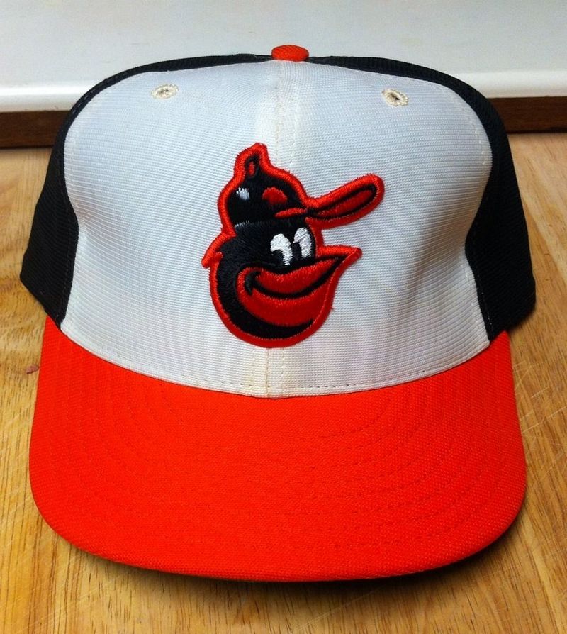
New Era
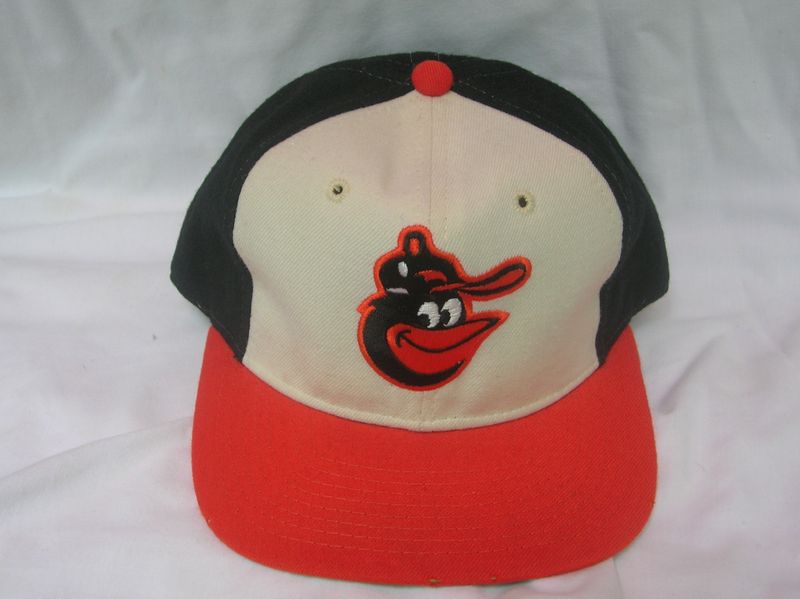
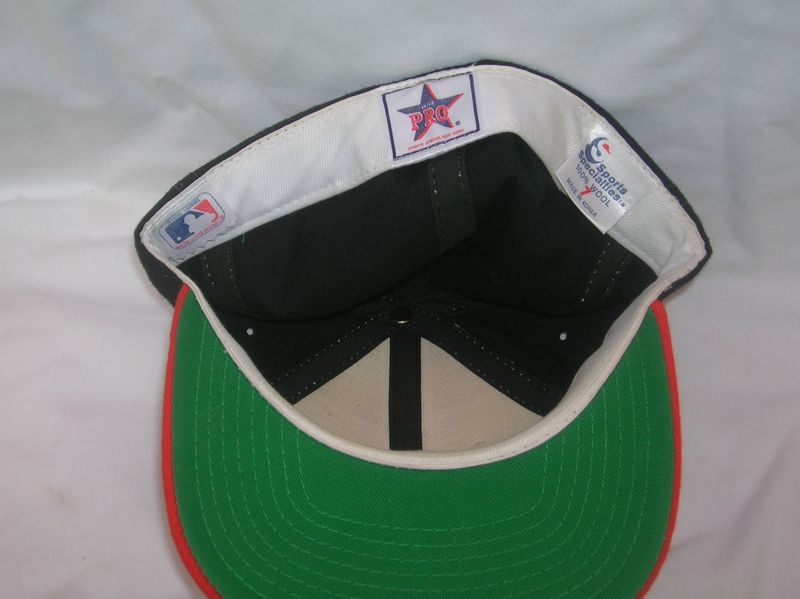
Sports Specialties
Some players use these wool caps around 1985-86. Yet another slight variation for the poor Cartoon Bird.
New Era
Clear sailing for New Era's nylon cap.

For more great stuff on the Cartoon Bird visit the Cartoon Bird blog.
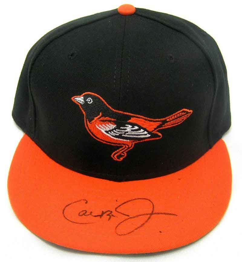
1989-94
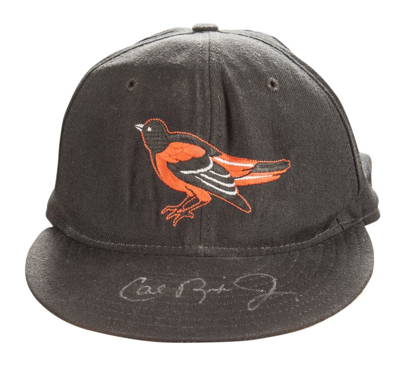
In a debatable move, the Cartoon Bird flies away in favor of an Ornithologically Correct Bird> I cannot pronounce "ornithologically". Caps return to wool. Grey undervisors begin to appear.
New Era

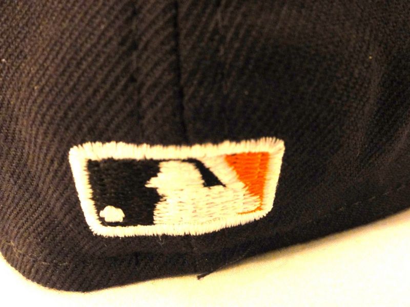
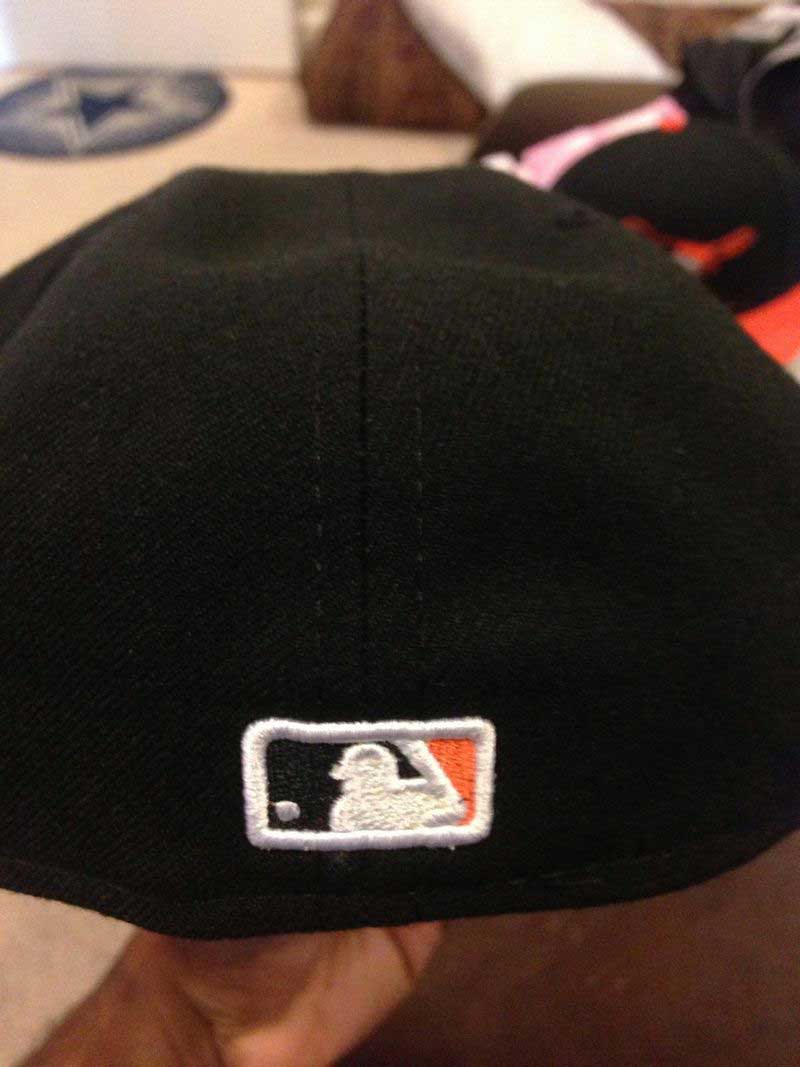
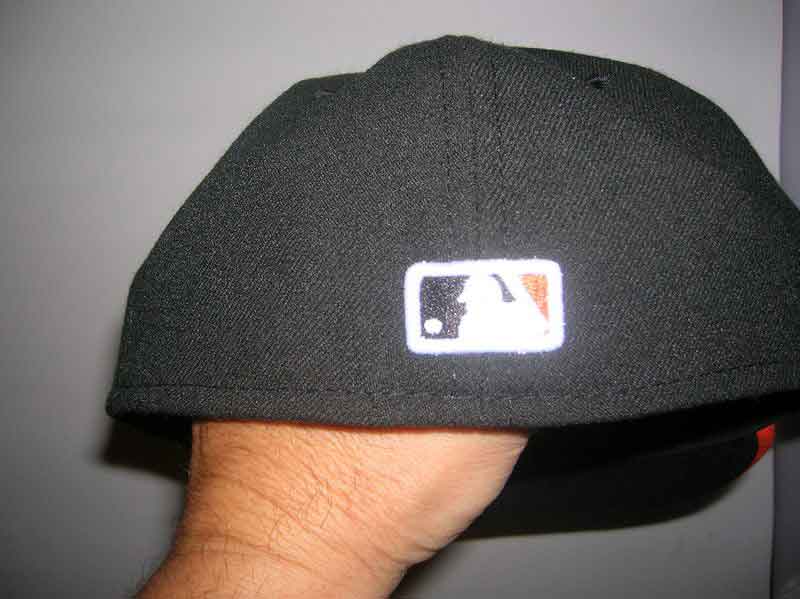
MLB Batterman logo initially appears as a glued on patch in 1992, is embroidered in a single color, then in team colors.
1995
Road cap changes to grey, so disliked by players it was dropped after 3 games. An orange visor alternate cap is introduced.
New Era

1996-97
Grey cap dropped. Raised embroidery appears in 1996.
New Era
1998
The bird gets a lot meaner looking.
New Era


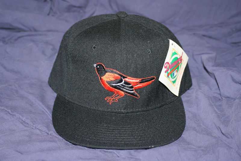
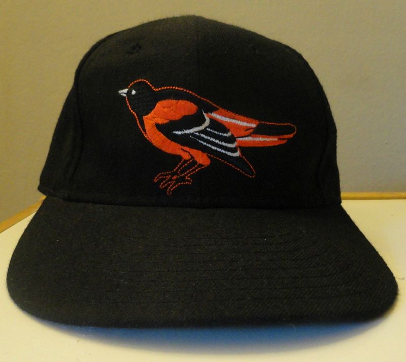
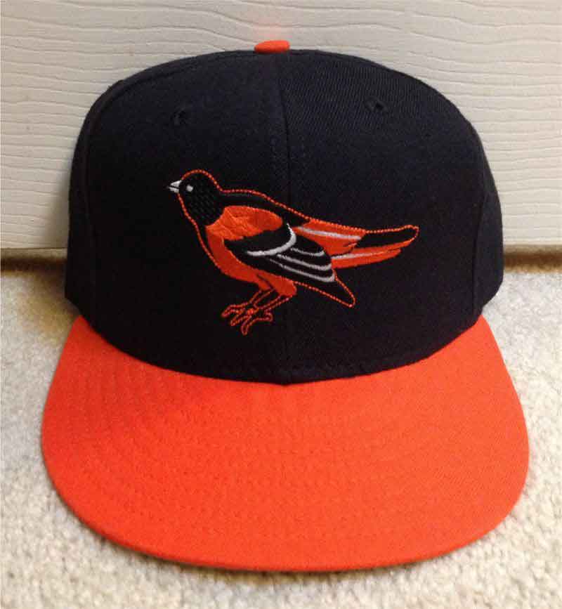
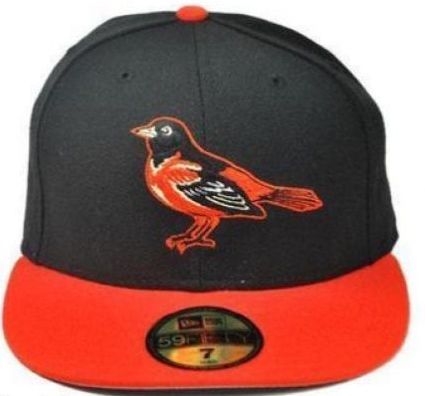
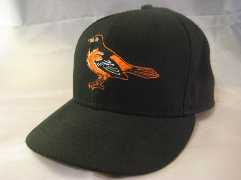
1999-2001
Why not just redesign the bird again, maybe it wasn't "Ornithologically Correct" enough. Black caps worn home and road, orange visor cap with the alternate.
New Era


2002-04
The home cap visor becomes orange again.
New Era


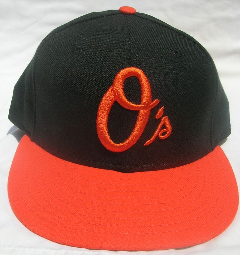
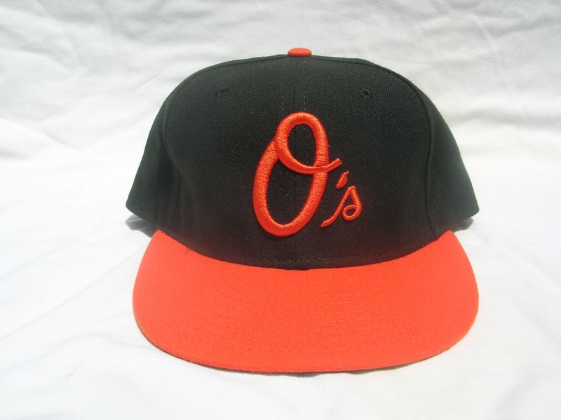
2005-06
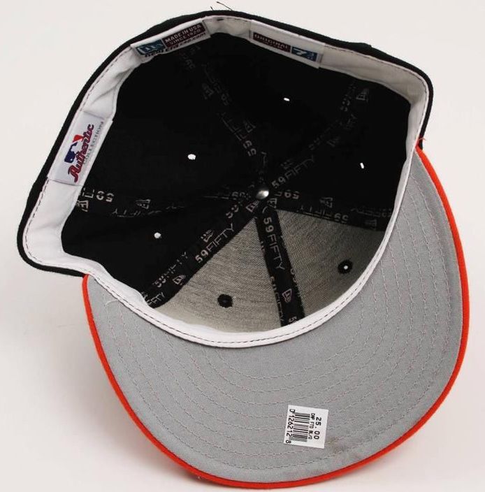
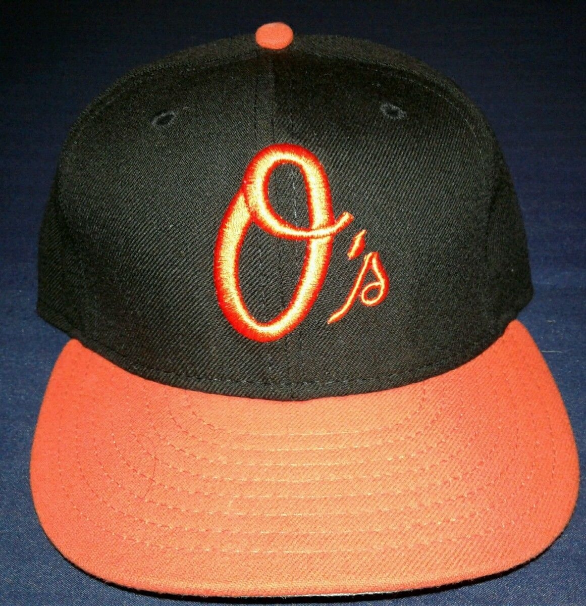
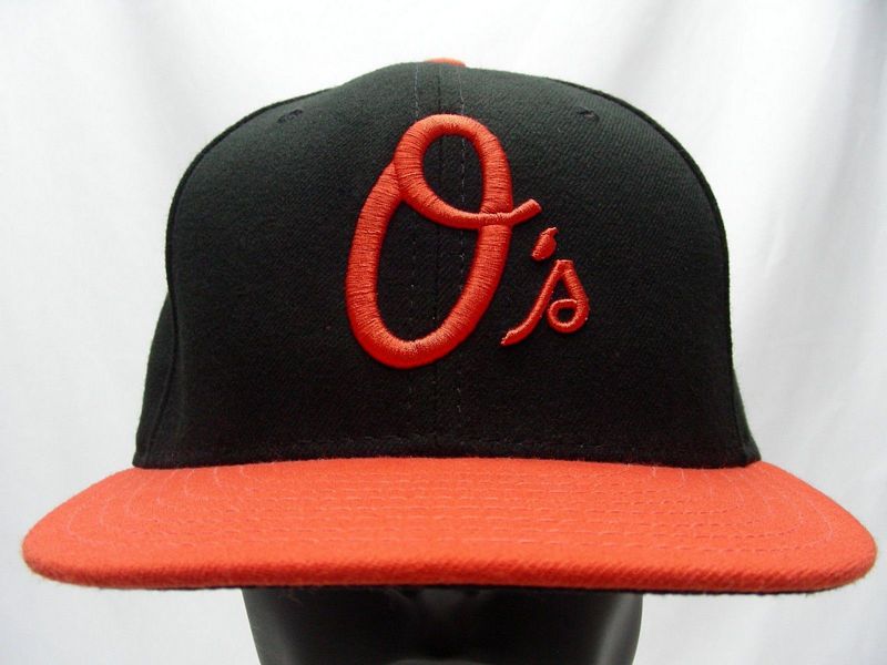
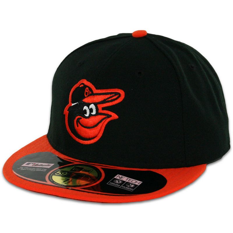
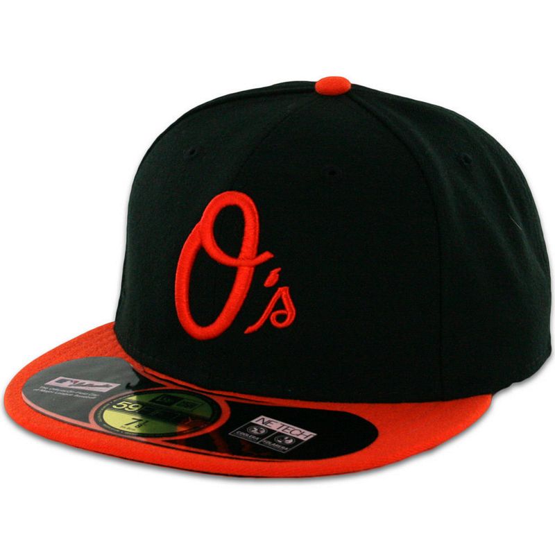
Alternate "O's" logo introduced.
New Era
Cap's with the small "s" rather than a scripted "s" are a mistake by New Era but were sold at retail anyway. The Orioles never wore this cap.


2007-08
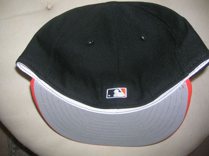
In 2007 caps change to polyester with black undervisors.
New Era
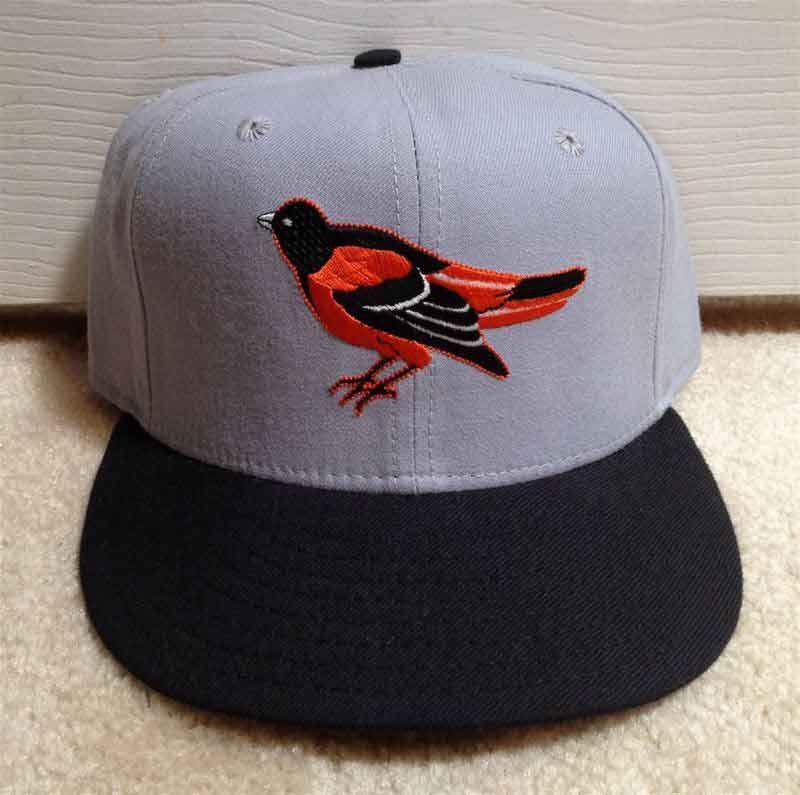
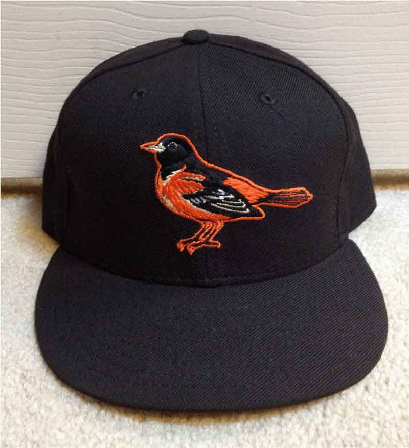
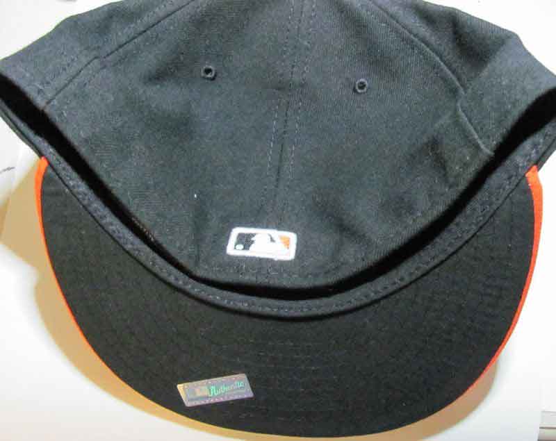
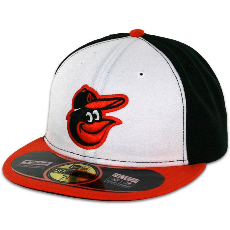
2009-2011
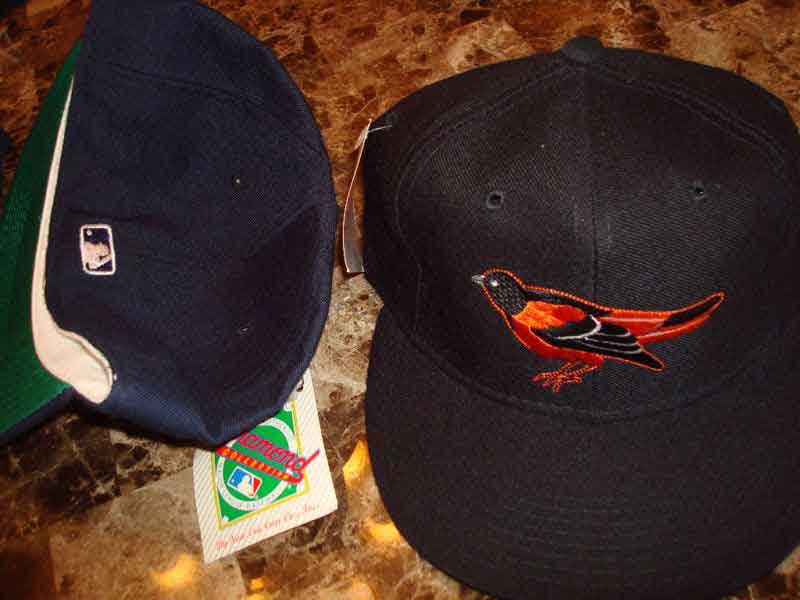
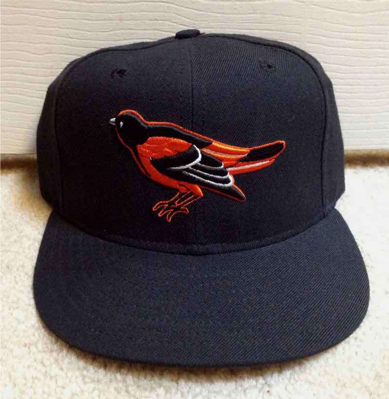
Yet another redesign of the ever-changing bird, which now stands perched on thin air suffering the same identity crisis the Cartoon Bird went through. Orange visors are worn home and away. The "O's alternate cap remains.
New Era

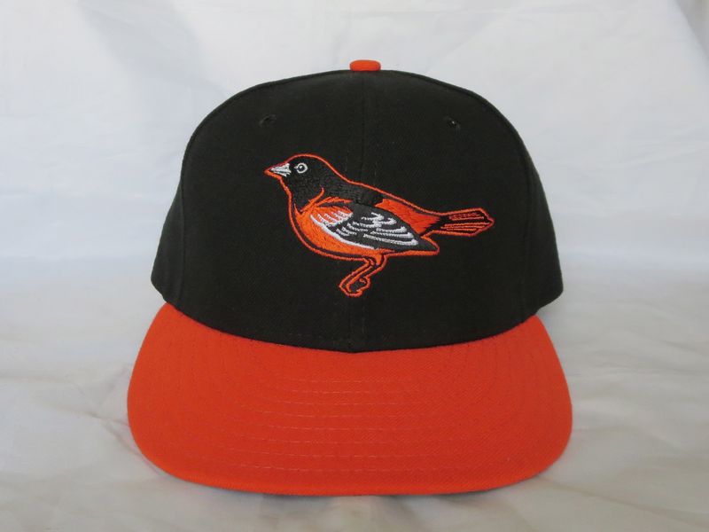


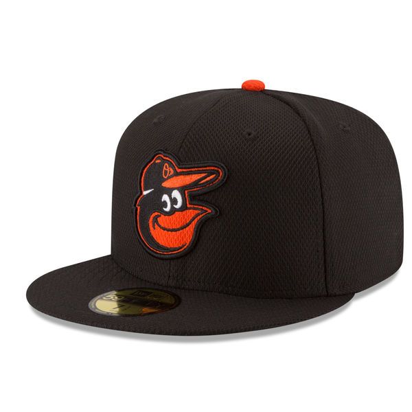
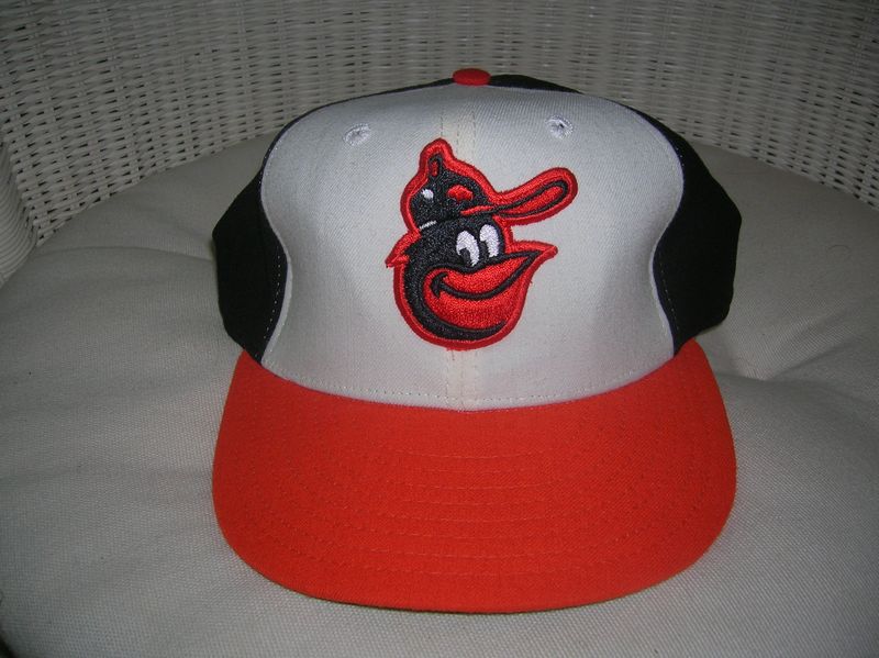
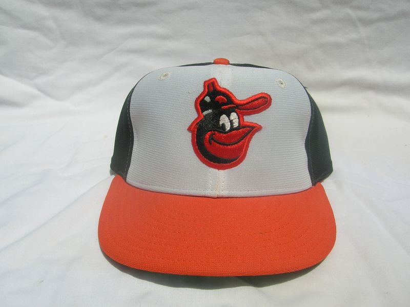
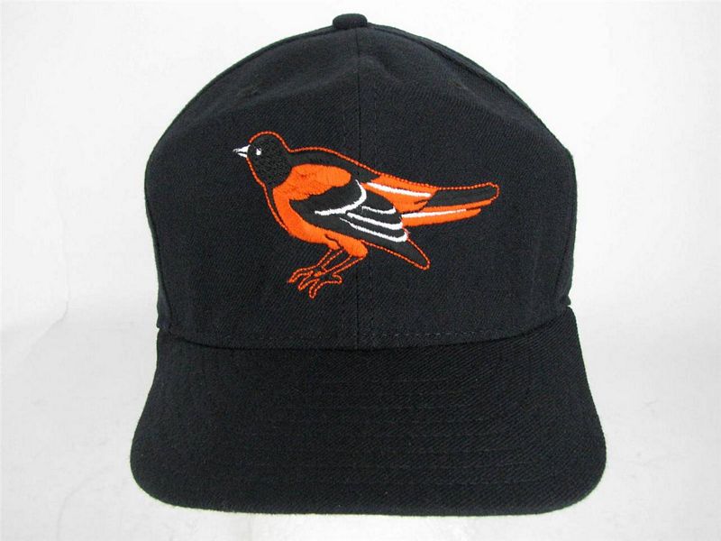
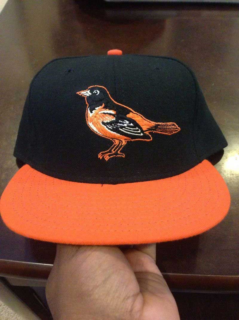
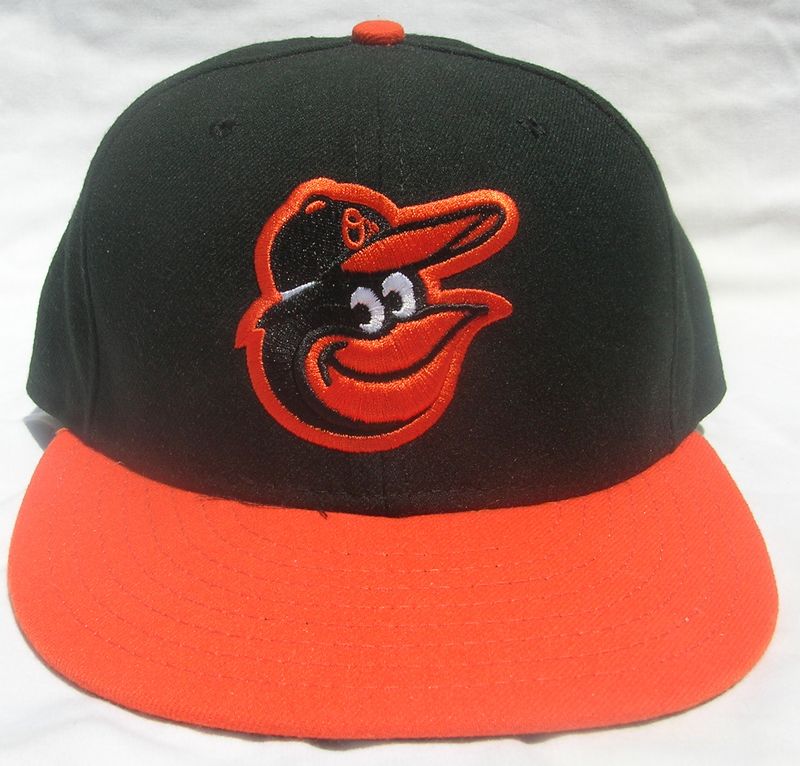
2012-2015
To heck with Ornithological Correctness, the (slightly reworked) Cartoon Bird makes a popular comeback and the Orioles return to powerhouse status for the first time since he left. The "O's" alternate cap remains.
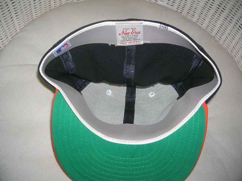
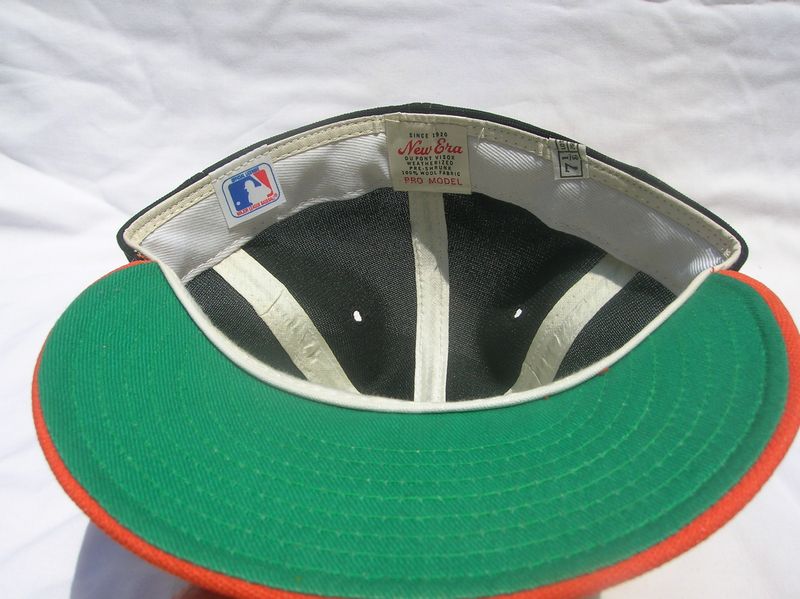
New Era


2016-present
The Diamond Era BP cap is used a couple times.
New Era