Pittsburgh Pirates Caps History
1900
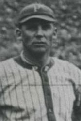
White cap, blue visor, blue "P" at home, road cap the same but in grey.
1901-05
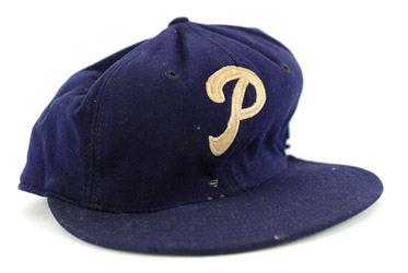
Navy with white P.
1901-06
Navy with white P.
1907-08
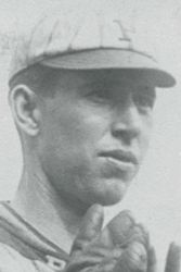
Navy with white P and white with blue P and from photos it seems they were used interchangeably home and road.
1913-14
Navy with white P.
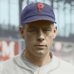
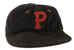
1915-19
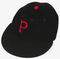
Navy with red P.
1920
White crown, blue visor, blue pinstripes, red P.
1921
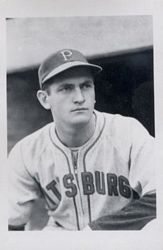
Returns to blue cap with red P.
1922
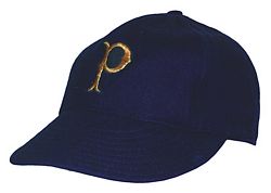
Blue cap with old English style P.
1923-30
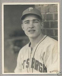
It looks like the cap construction changes from the newsboy style cap to today's type. Cap again returns to blue with red P, which appears to be thickly embroidered.
1931-35
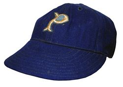
The "P" changes to sewn on felt.
Spalding
1936-37
The "P" returns to embroidered and becomes a bit slimmer. Probably the old felt logo caps are still used along with the newer embroidered logo caps.
1938-39
The "P" returns to embroidered and becomes a bit slimmer and the button changes to red.
Spalding
1940
Caps get a horizontal stripe.
1941
Caps get red visors. Road cap has a white stripe.

1942-46
GoldSmith
MacGregor GoldSmith
1947
Cap logo changes to script for a year.
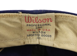
Wilson
1948-50
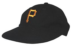
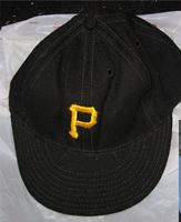
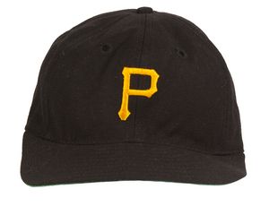
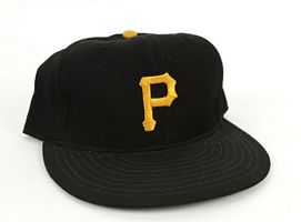
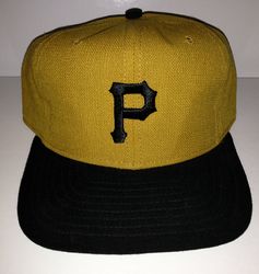
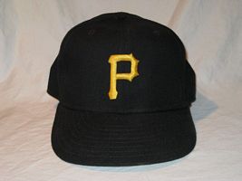
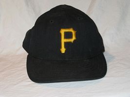
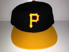
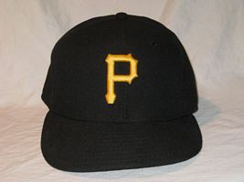
The Pirates switch to black and gold. Caps have gold buttons 1948-50.
1951-64
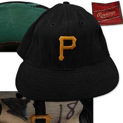
Caps have black buttons 1951-64.
Rawlings
MacGregor GoldSmith
Rawlings
1965-70
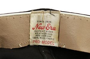
Cap buttons change to gold. New Era's "P" is a bit thicker.
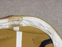
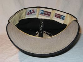
New Era
1970
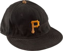
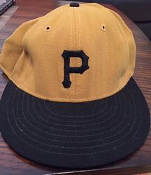
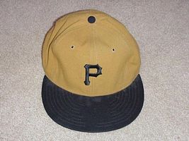
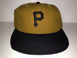
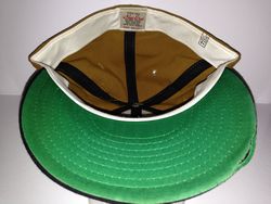
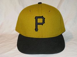
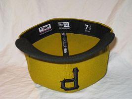
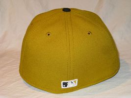
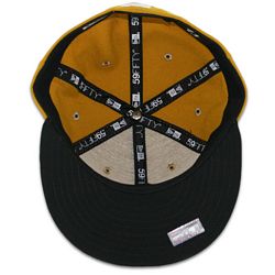
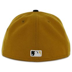
An "old" gold cap debuts in mid-season 1970 along with MLB's first double knits for the opening of Three Rivers Stadium. I read a story about the 1970 Pirates jerseys/caps awhile ago, how hard the team tried to find material for caps to match the “old gold” color in the new double knit jerseys. The coarse wool was what they came up with in 1970. But apparently it wasn’t popular, probably too hot, etc., so the switch to lighter wool (which had a lighter color) was made for 1971.
New Era
The first gold caps are of a coarse wool material.
1971-75
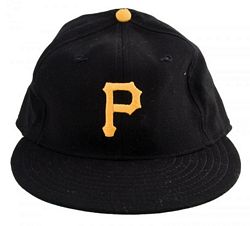
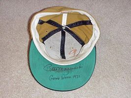
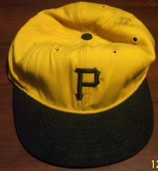
As discussed directly above, the switch to soft wool which has a lighter color gold.
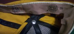
New Era, KM Pro
1976
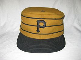
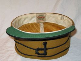
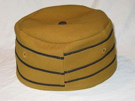
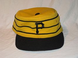
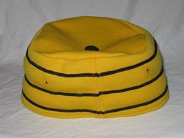
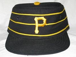
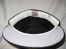
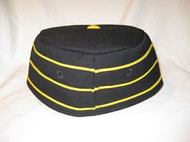
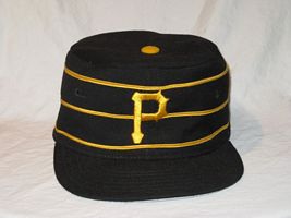
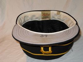
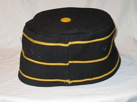
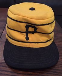
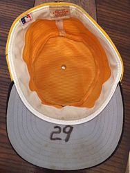
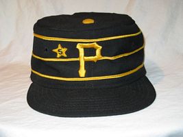
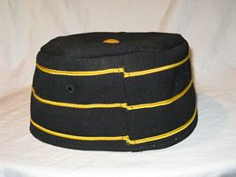
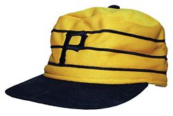
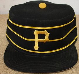
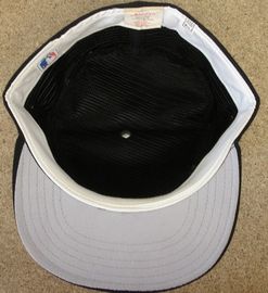
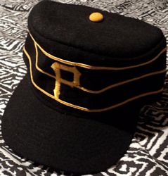
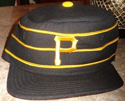
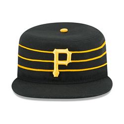
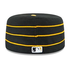
Pillbox caps are adopted by several clubs for the NL Centennial coinciding with the USA Bicentennial celebration (Cardinals, Giants, Mets, Phillies, Pirates, Reds, NL Umpires, NL All-stars). The Pirates keep this style for 10 years.
New Era
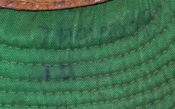
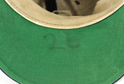
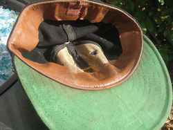
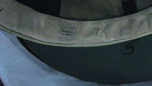
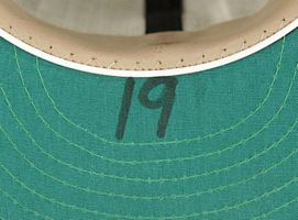
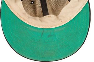
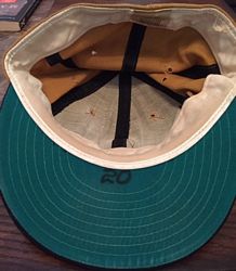
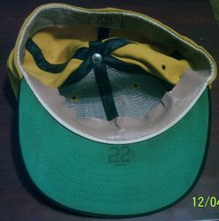
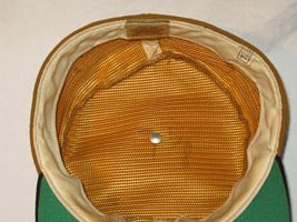
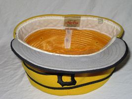
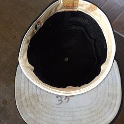
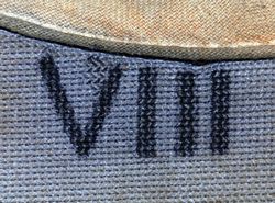
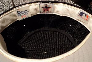
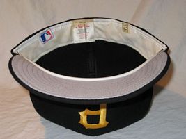
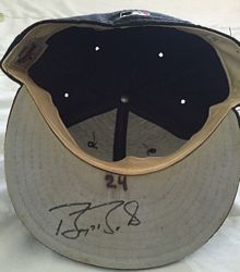
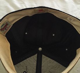
1976 - Only year of an "old" gold pillbox. Note that game worn Pirate pillbox caps will often have the size written on inside top mesh.
1977-79
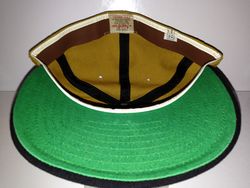
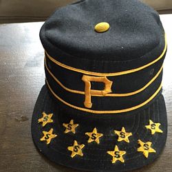
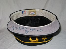
Pirates switch from old gold to bright gold, introduce a black version, and undervisors turn grey. The team enters their “Bumblebee” period (‘77-84) where a dizzying array of jersey, pant, and cap styles allows for seven possible uniform combinations which the club varies on a nightly basis. Stargell stars appear on caps in 1978.
New Era
1980-82
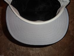
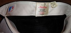
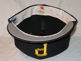
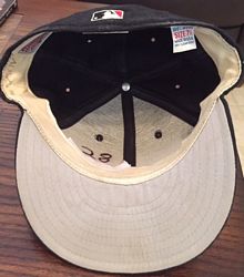
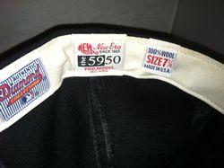
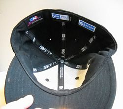
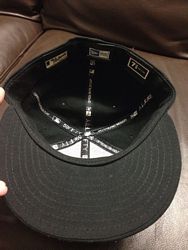
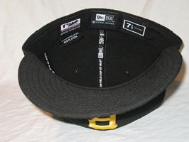
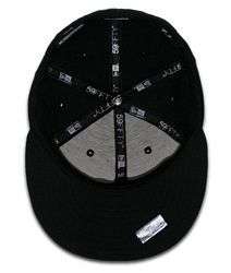
Crown gets higher and ‘P’ gets slightly larger. From 1980 onward Stargell stars have black ‘S’ stitched in middle. Team issued caps from the 80’s are distinguished by the same heavy mesh lining from previous years. Replicas are lined with thin white foam.
New Era
1983-84
‘P’ gets a slightly wider. Crown is maximum height. Gold caps switch to nylon.
New Era
1985-86
Gold cap retired following the 1984 season.
Some players wear Sports Specialties caps
Sports Specialties
New Era
1987-1996
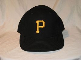
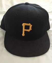
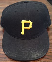
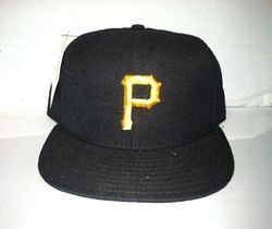
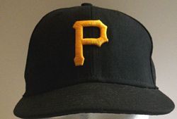
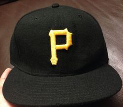
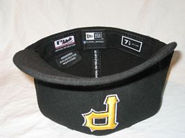
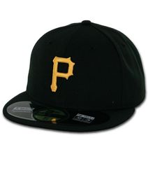
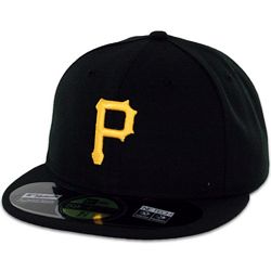
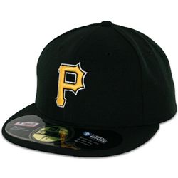
Pirates switch back to a standard round crown. Black with gold ‘P’ echoes style worn from 1948-70. ‘P’ returns to slightly rounder style of 1980-82.
New Era
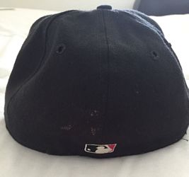
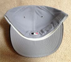
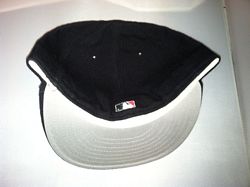
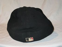
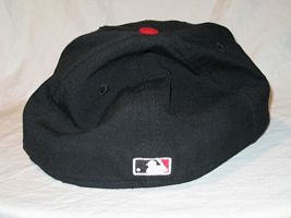
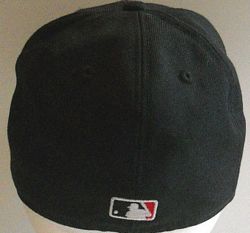
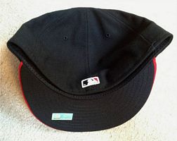
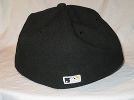
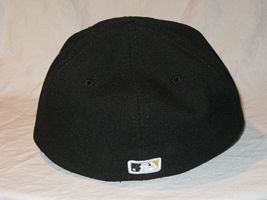
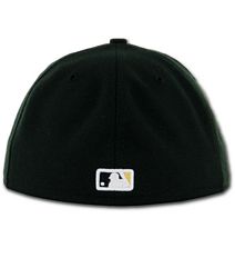
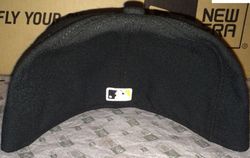
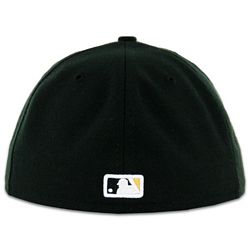
In 1992, MLB logo is glued the on back at first, embroidered on by year end.
Raised emboidered logos begin in 1996.
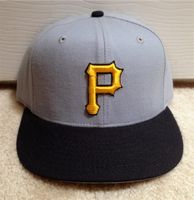
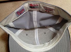
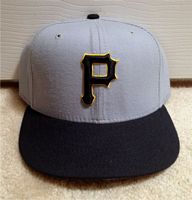
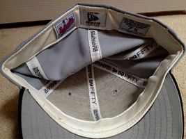
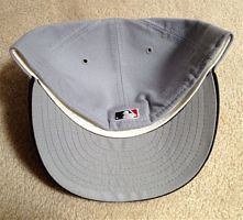
COLLECTOR ALERT! This grey cap with gold P was intended to be the 1997 alternate. But when the season rolled around the alternate cap had a black P. I've heard two stories about it: the Pirates decided to change the logo to black after the gold P caps were made; or, the gold P caps were a New Era mistake. Either way, the caps were dumped by retailers, never worn on-field, and depending on your point of view they are a collector's item or a mistake.
1997 Prototype NOT WORN ON FIELD
New Era
1997-2000
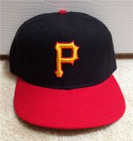
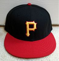
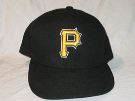
Jerseys are redesigned changing the font on the home, the road gets pinstripes, and an alternate black jersey with red trim returns red to the colorway for the first time since 1946. Two new caps debut: a road grey cap with an outlined ‘P’, and an alternate cap with a red bill.
New Era
The grey cap is rarely used after 1998 (black caps are worn home & away). The red bill alternate cap is gone after 2000.
2001-05
New Era
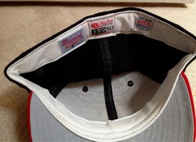
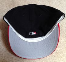
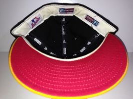
A new alternate cap is introduced, inspired by the style worn in the Turn Ahead The Clock game in 1999 (note - it's not the same as the TATC cap on which the red undervisor wrapped around the edge to the top of the visor). Worn with the black alternate jersey, it's the only MLB cap with a red undervisor.
Alternate yellow bill/red undervisor cap retired after 2005.
2006
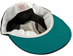
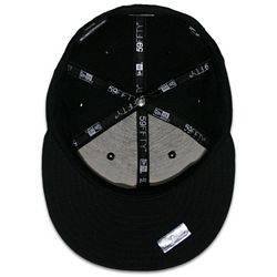
Black underbrims arrive in 2006.
New Era
2007-08
The red bill cap is brought back in 2007 and used with a new red alternate jersey. Caps go polyester.
New Era
2009-12
Red bill cap retired after 2008.
New Era
Double outlined ‘P’ former batting practice cap becomes the alternate in 2009.
2012-14
Home Sunday Alternate added, it actually debuts in 2012 with the black alternate jersey. Old gold cap is virtually identical to the 1970 color.
New Era
2015
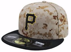
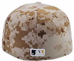
Camo cap joins the set.
New Era
2016
Throwback changes to the late 70's pillbox style (not quite as tall though) and the gold cap is dropped.

