Minnesota Twins Caps History
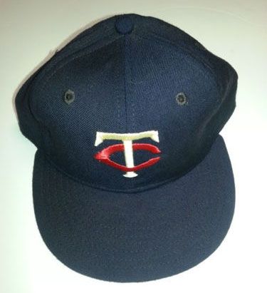
In 1960 MLB granted the city of Minneapolis an expansion team. Washington Senators owner Calvin Griffith requested that he be allowed to move his team to Minneapolis and instead give Washington the expansion team. Upon league approval, the team moved to Minnesota for the 1961 season. Not wishing to alienate fans in St. Paul he named the team the Twin Cities Twins, however MLB objected. Griffith therefore named the team the Minnesota Twins. Again in deference to St. Paul, the team did not use an "M" on the caps, but was allowed to keep its original "TC" (for Twin Cities) insignia. The team finally did install an M on the caps in 1987, but during the 2000's gradually restored the famous TC.
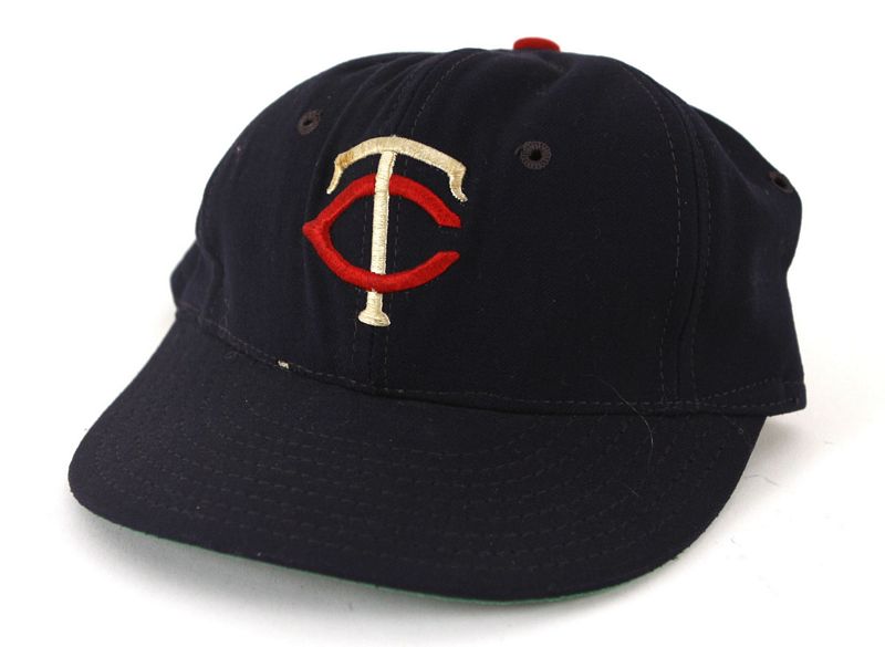
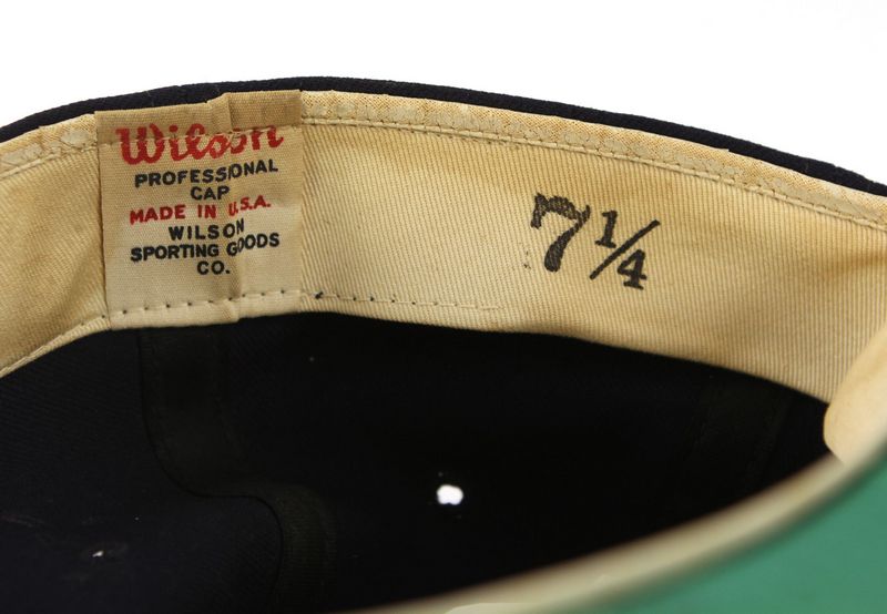
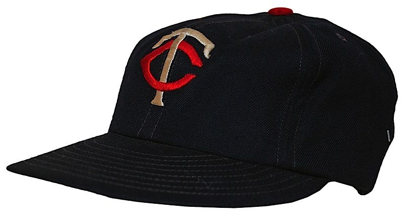
1961-62
Twins caps were navy with a red button through at least 1962. BTW - I'm in the market for this cap.
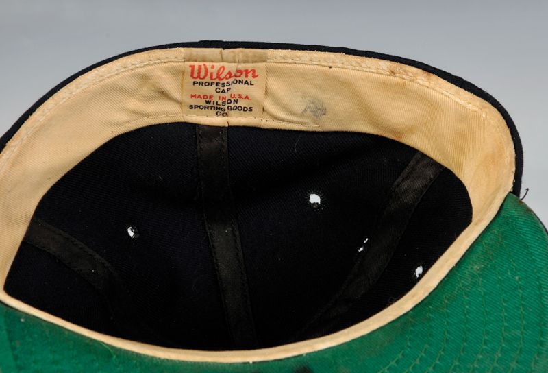
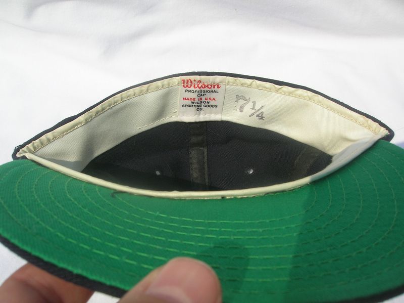
Wilson
1963-72
The button changed to navy, either 1963 or 64. If anyone knows for certain let me know.
Wilson

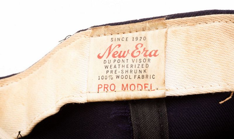
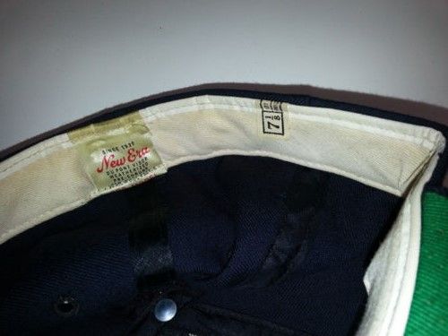
New Era
New Era caps appear by 1970, as New Era was starting to end making caps for Wilson and edge them out.
Wilson
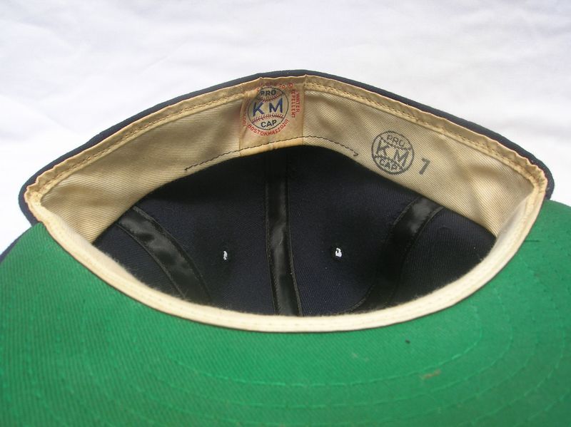
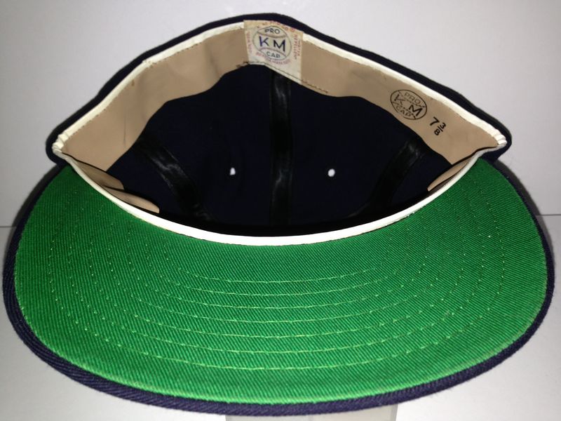
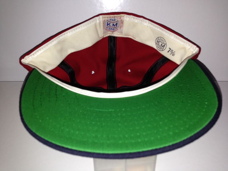
I believe the Twins try KM Pro briefly in 1972.
KM Pro
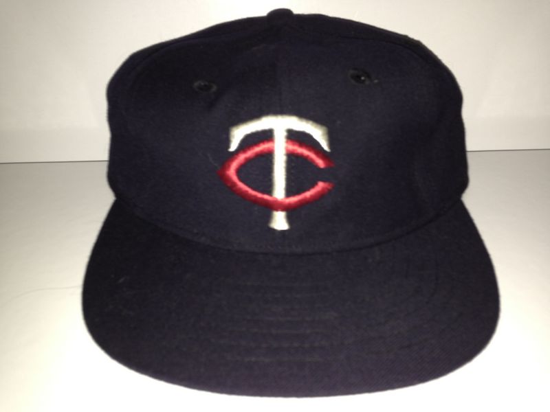
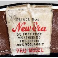
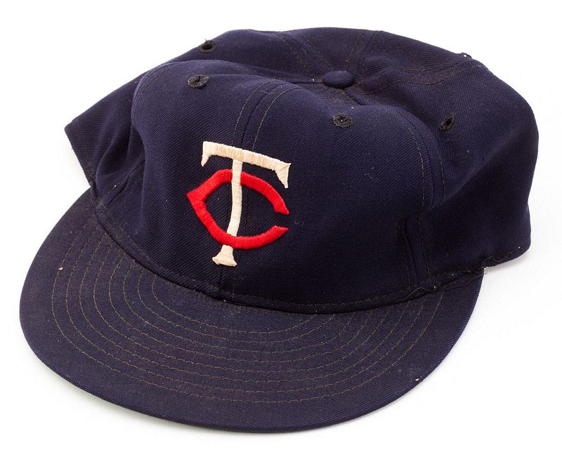
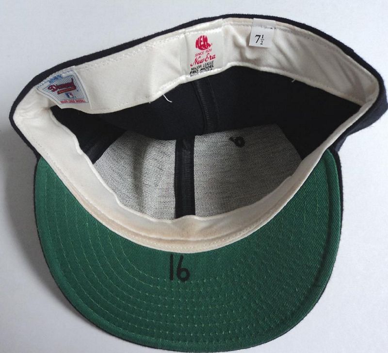
1973-75
The Twins use New Era only. The the top of the "T" becomes straight and not curved, and the point on the "C" becomes more pronounced.
New Era

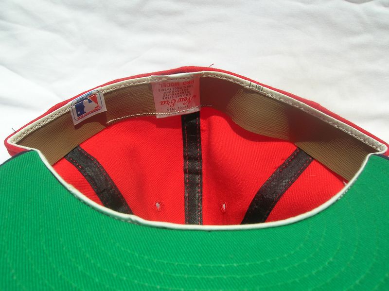
1976-84
The Twins begin to use a red cap at home, keeping navy caps for the road.
COLLECTOR ALERT! Here's a boo-boo that I'm quite certain never made it onto the field. This KM Pro cap has a tall thin logo and the letters don't interlock at all. The Twins were all-New Era by 1976 when the red cap was introduced, and as KM Pro folded in 1976 these caps were likely dumped at retail. I've seen several wrongly sold on eBay as authentic, so - it's rare but not an on-field cap!
KM Pro not used

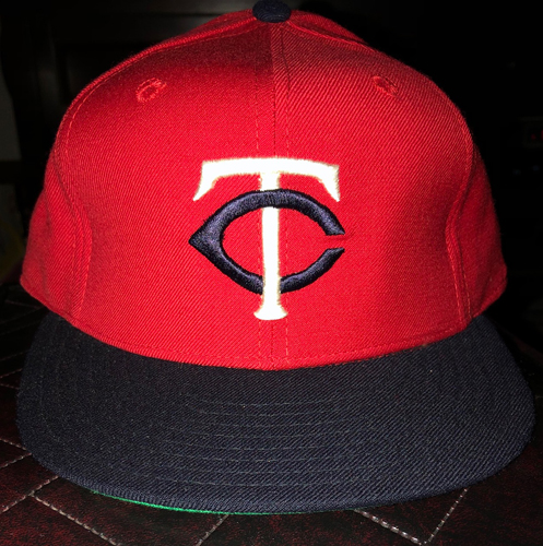
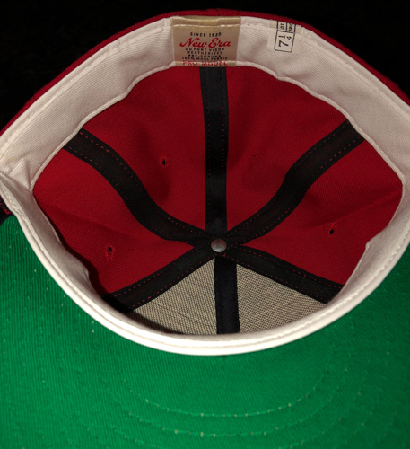
COLLECTOR ALERT! The Twins wore these in 1977 - Sports Illustrated pics abound and here's a game worn cap. See how New Era messed up the logo - the "C" interlocks the "T" the opposite way. I'm not sure how long these were used before corrected caps arrived. A true collector's rarity.
New Era
New Era


1985-86
The logo gets much thinner.

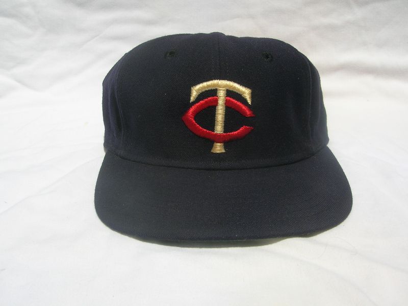
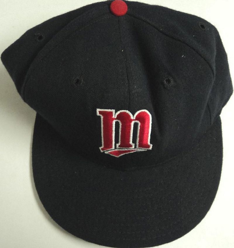
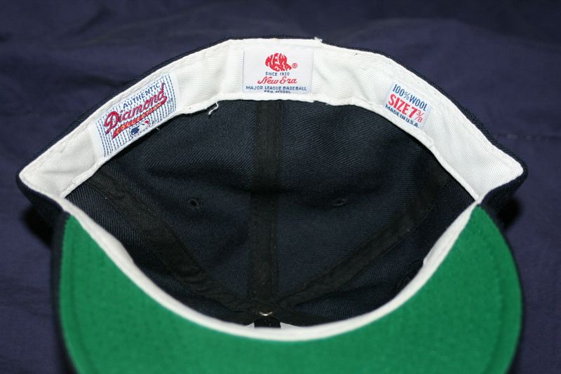
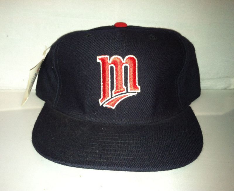
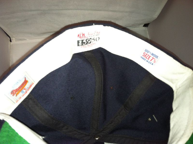
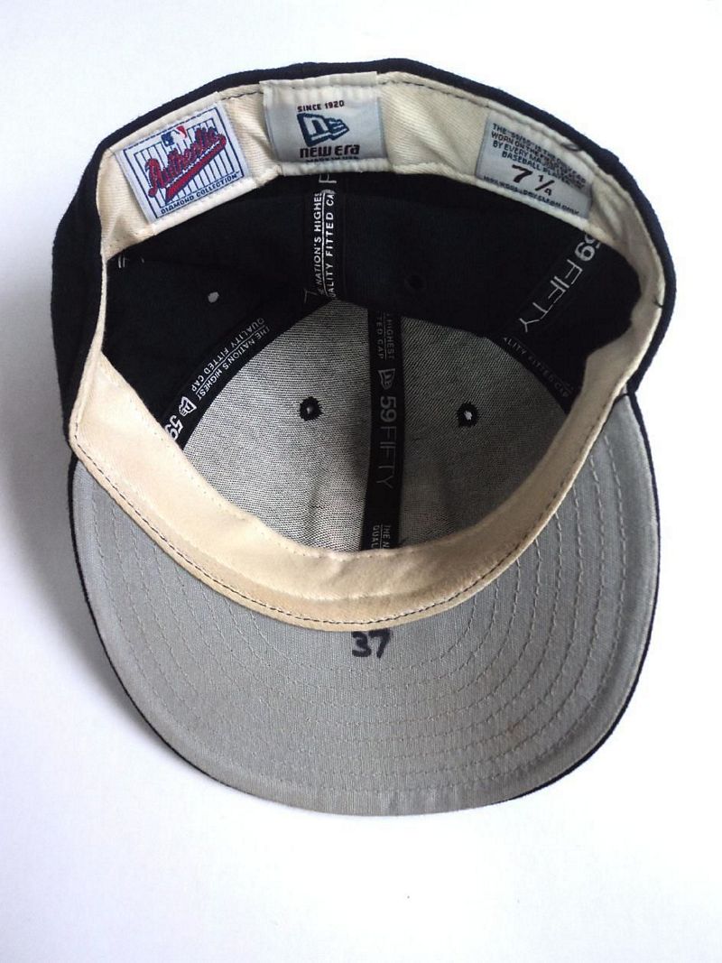
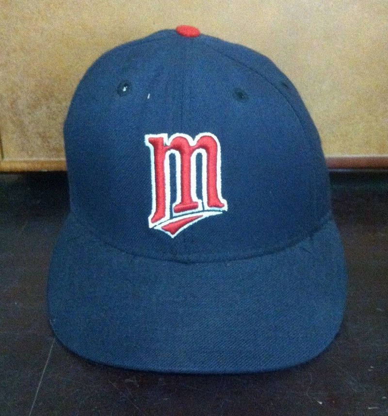
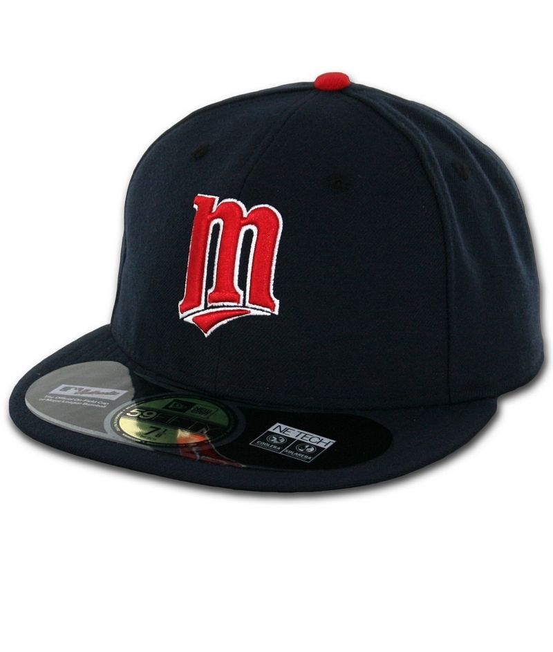
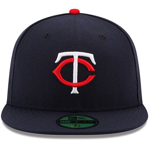
1987-1993
Caps get a new logo.
New Era

Both New Era and Sports Specialties caps are used in the late 1980's-early 1990's.
Sports Specialties


New Era
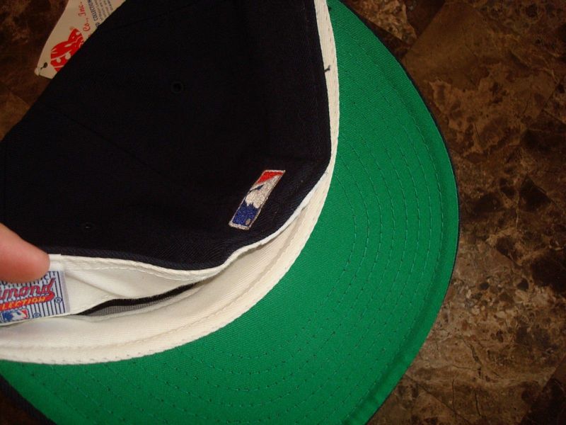
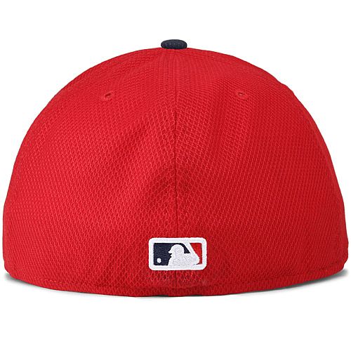
MLB Batterman logo initially appears as a glued on patch in 1992 then is embroidered on later in the year.
New Era

Sports Specialties

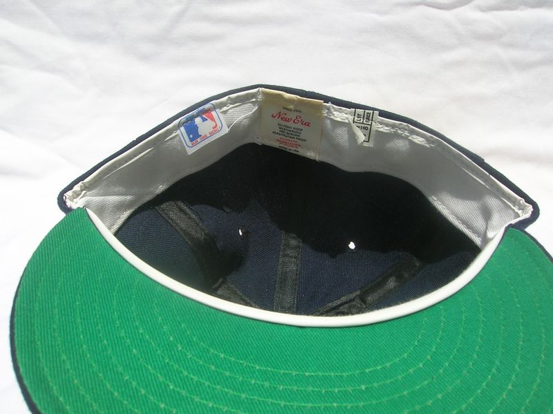
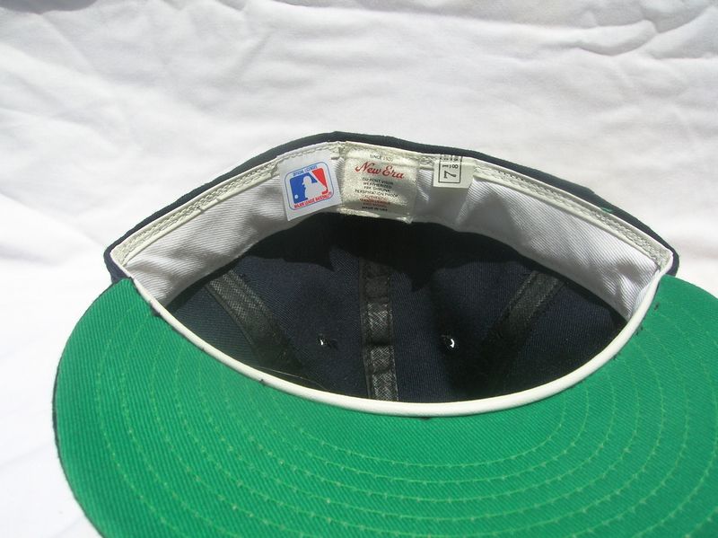
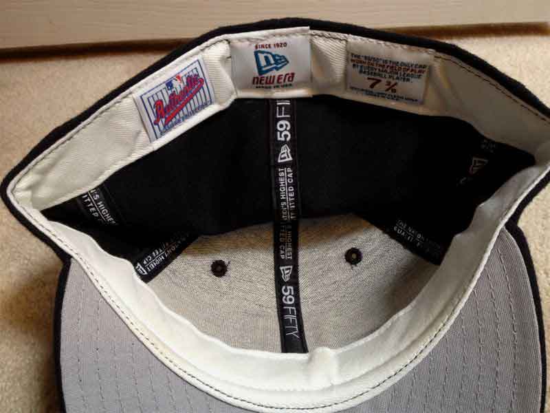
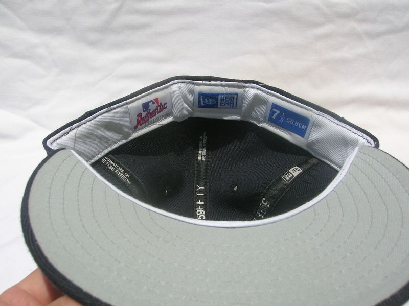
1994-2000
The Twins switch to grey undervisors in 1994.
New Era

Raised embroidery debuts in 1996.
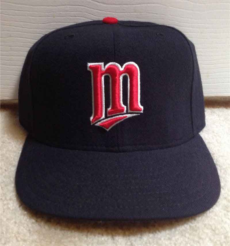
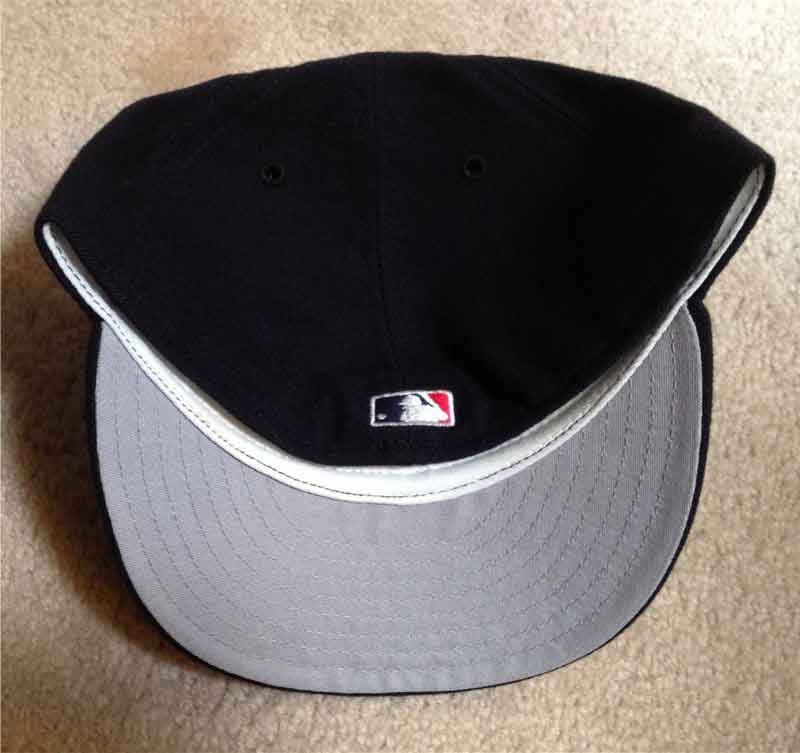
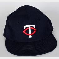
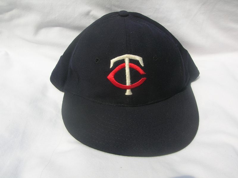
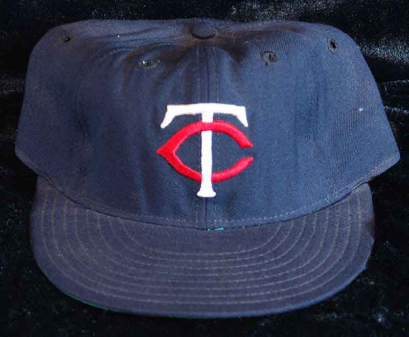
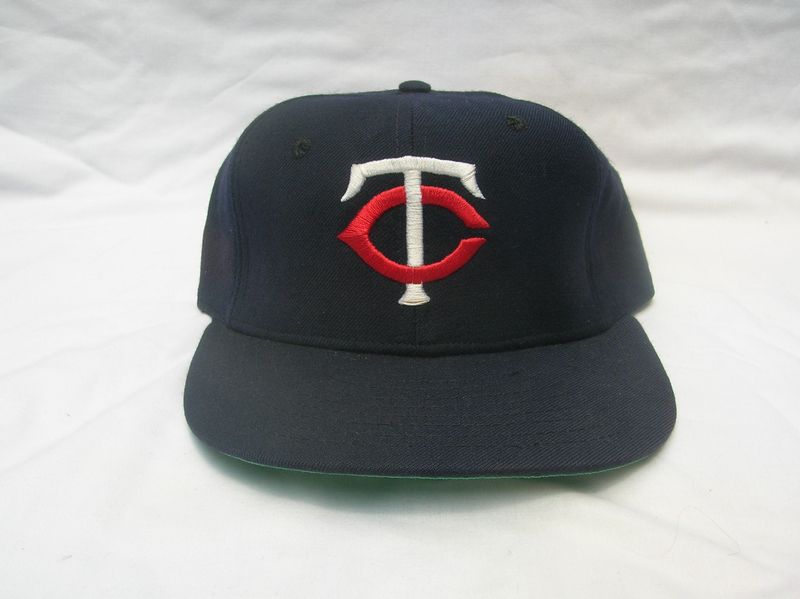
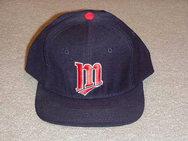
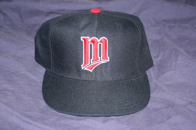
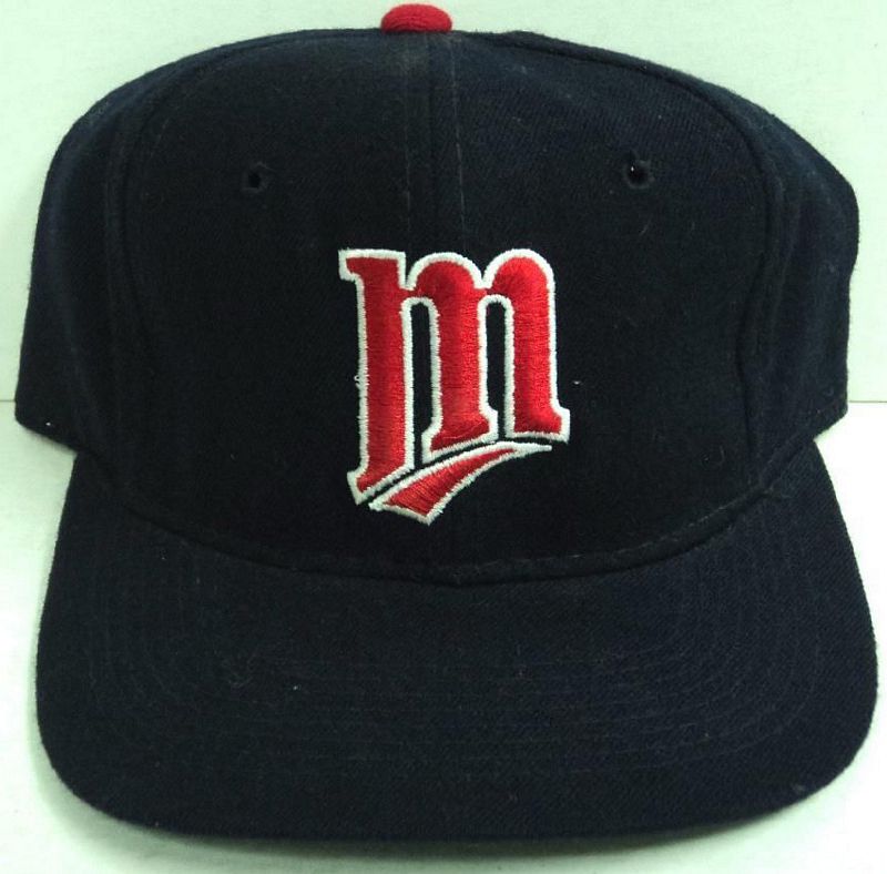
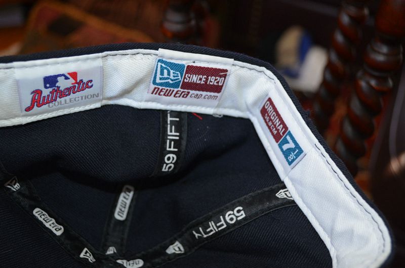
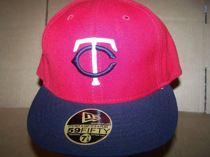
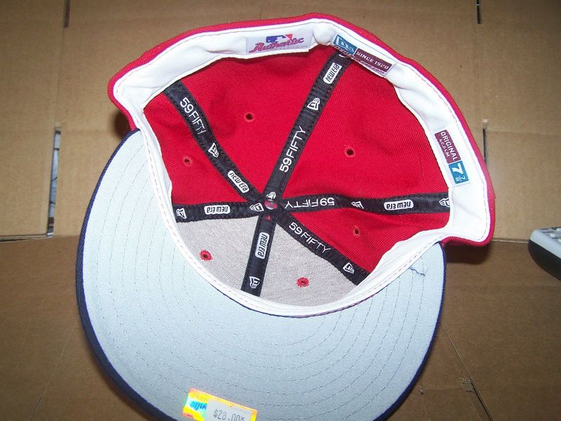
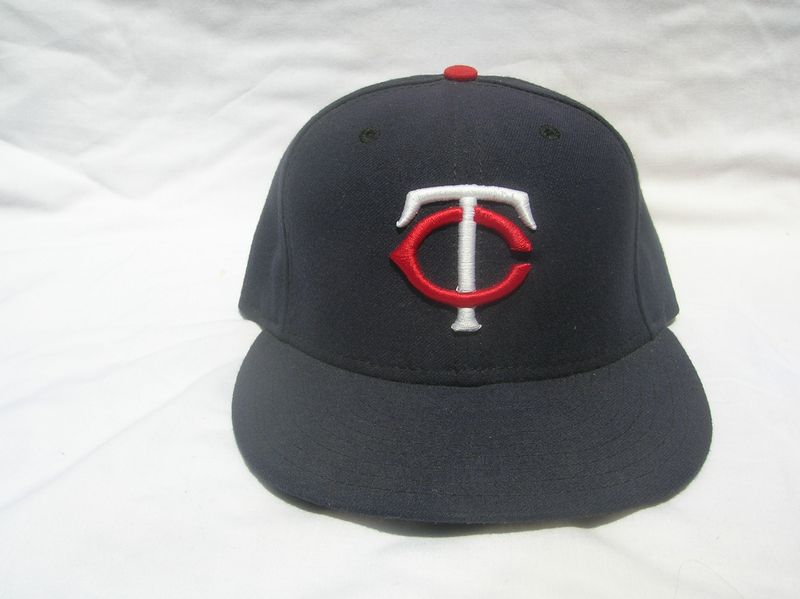
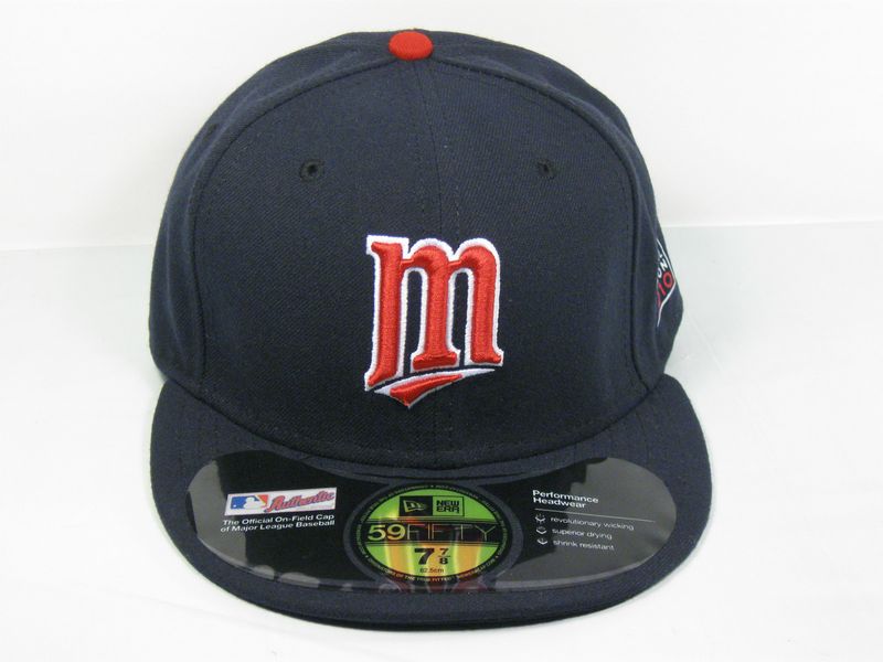
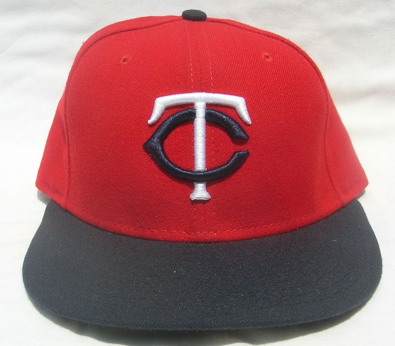
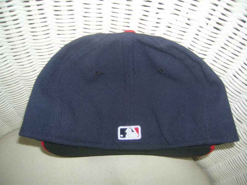
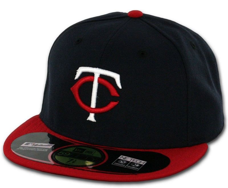
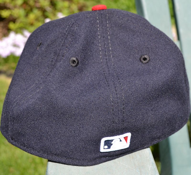
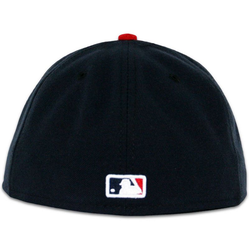
2001-03
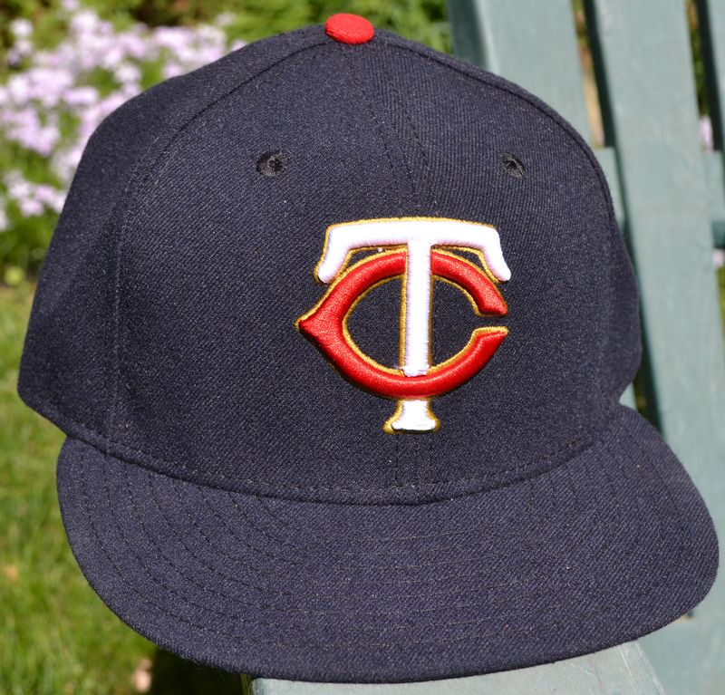
The TC logo returns on the home cap, the M cap remains as the road cap. Like the original 1961 cap, the button is red.
New Era


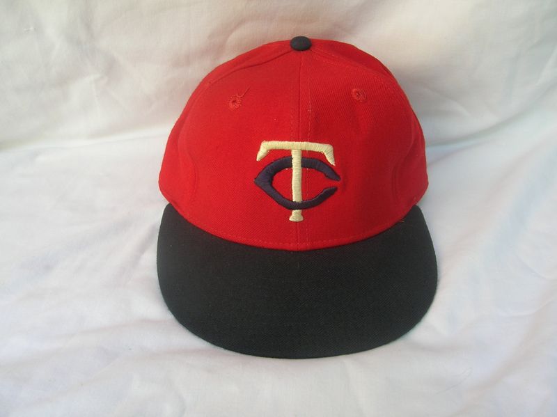
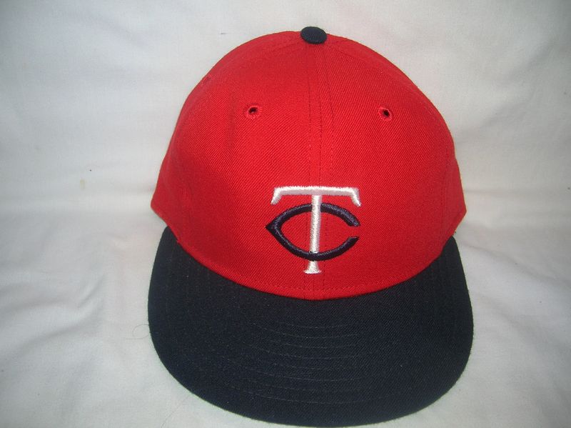
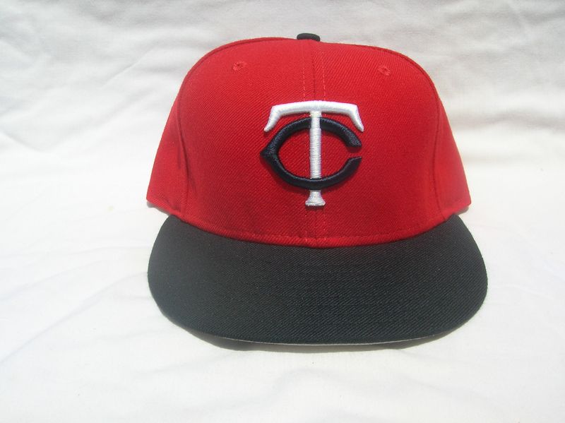
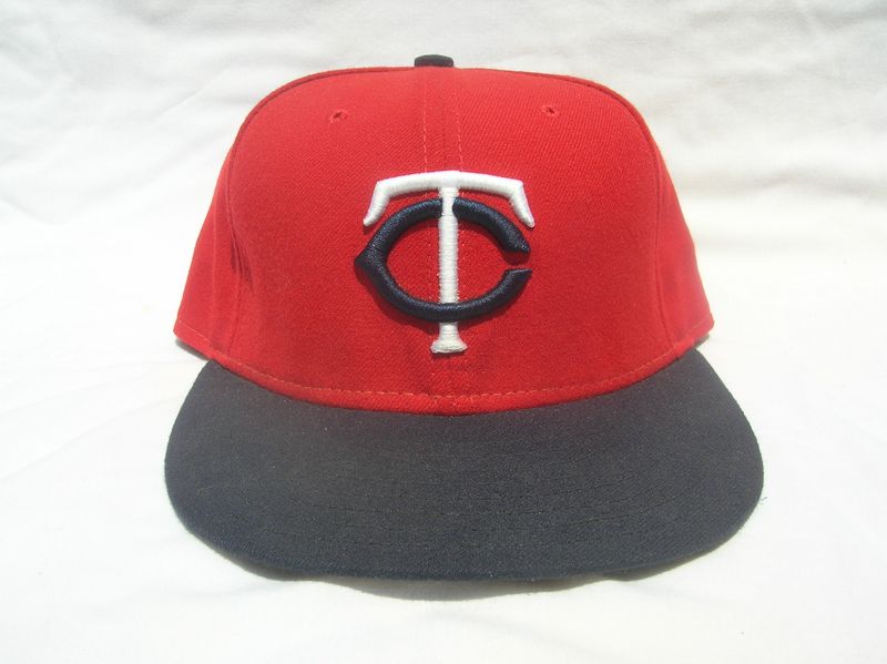
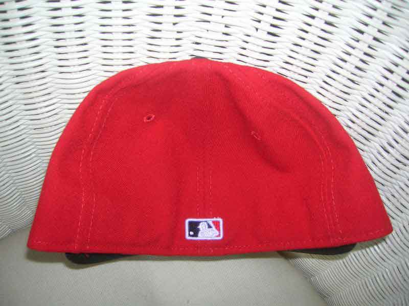
2004-06
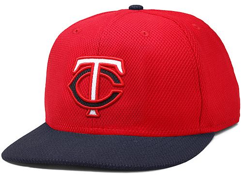
The red TC cap is reintroduced as an alternate for 2004.
New Era

2007-09
The Twins adopt polyester caps with black undervisors.
New Era


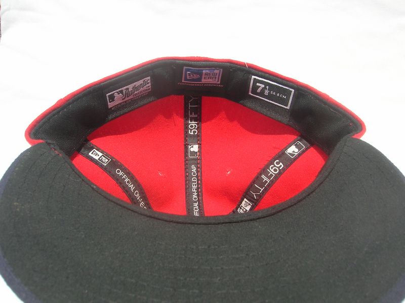
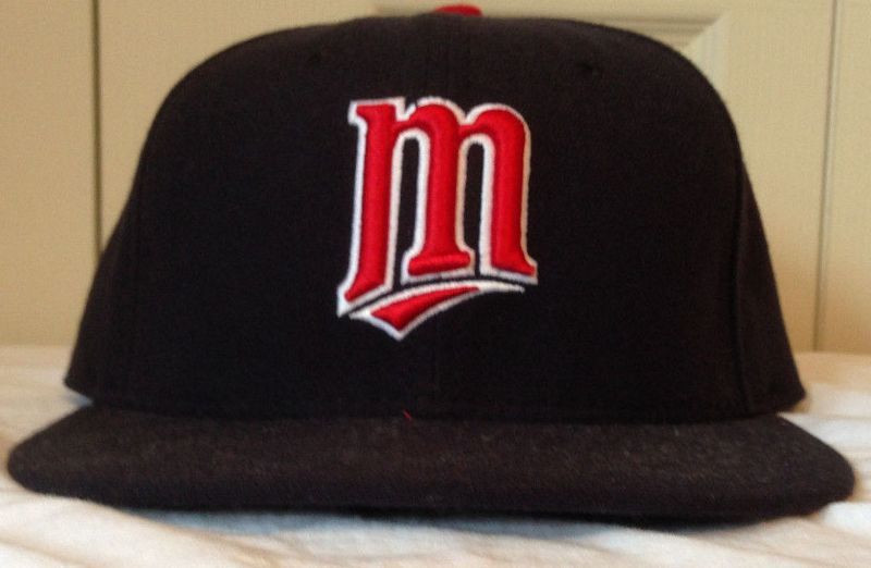
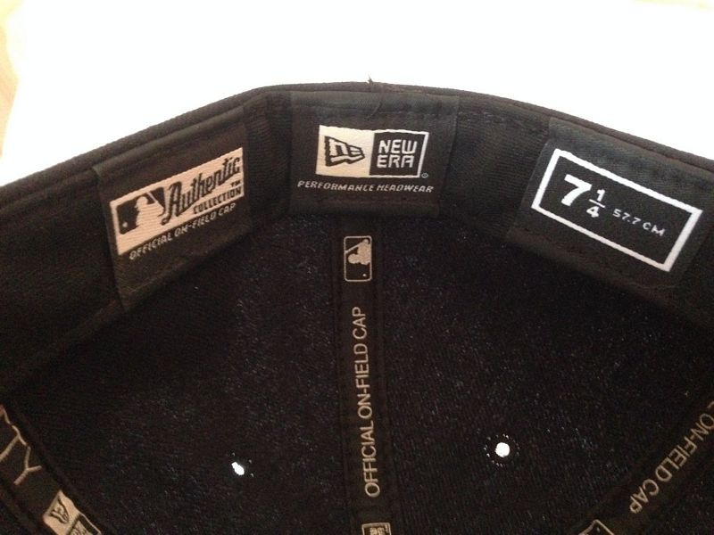
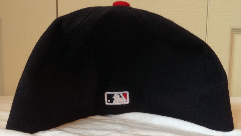

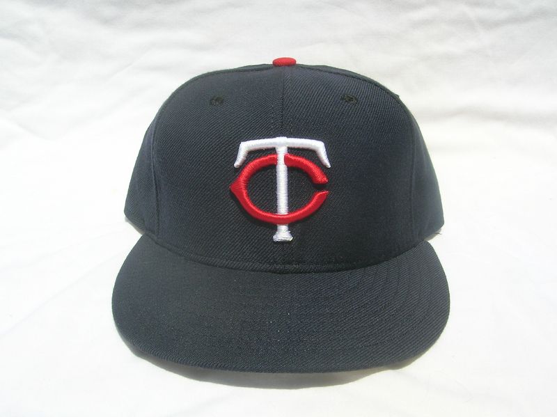
2010-12
Upon moving to Target Field the Twins redesign their jerseys. The home cap remains as is. The red cap is retired. The M logo becomes the alternate. A new navy cap with a red visor is the new the road cap.
New Era


2013
The Twins drop the M logo cap. BP caps worn a couple times.
New Era


2014
BP caps not used.
New Era
2015
New home cap with gold trim added.
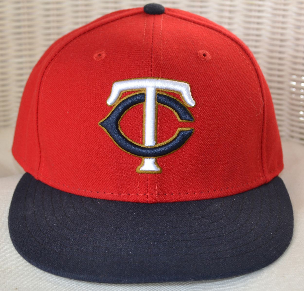
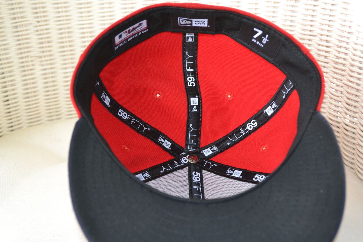
New Era


2016
New home alternate cap with gold trim added to wear with the new red Friday home jerseys.
New Era