Cleveland Indians / Naps Caps History
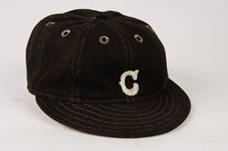
Cleveland's nickname was Blues in 1901, Broncos in 1902, and Naps 1903-14 before settling on Indians in 1915 in tribute to Louis Sockalexis, a popular player in the 1890's who was the first Native American to play Major League baseball.
Cleveland Naps
1910-14
Cleveland Indians
1915-16
Home is white with pinstripes, road navy with pinstripes
1917
Home cap loses the pinstripes
1918-21
Solid navy worn home and road.
Spalding
1922-32
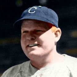
Style of the "c" changes slightly, the middle of the letter is slimmed down.
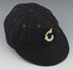
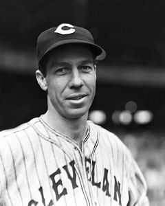
1933-36
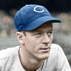
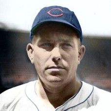
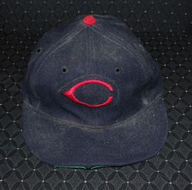
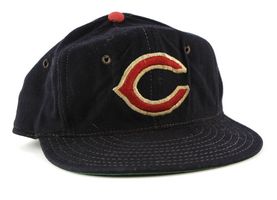
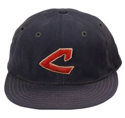
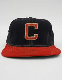
The home cap gets a red wishbone "C". The small white rounded "c" stays on road caps and is modified a bit - note the upper serifs on the "c".
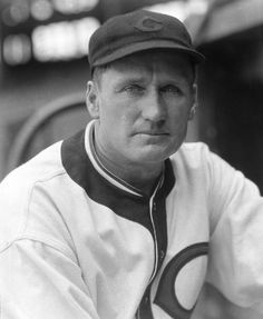
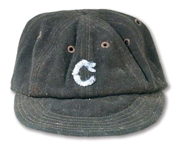
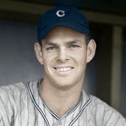
1937-41
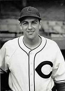
Road cap "C" changes to wishbone white.
1941
During 1941, a new logo appears, red on home caps, white on road caps.
1942-44
Red wishbone "C" on both home and road caps.
1945-47
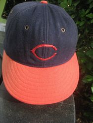
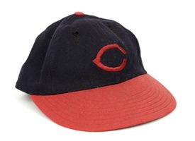
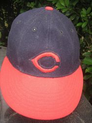
Red visors are added to caps in 1945.
Wilson
1948-50
The logo gets thicker on Wilson caps. Some are sewn on a patch.
Wilson
McAuliffe caps are also used starting in 1948 (anyone have one?). The logo is not as wide.
1951-53
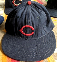
The visor turns navy.
Tim McAuliffe by Leslie
McAuliffe logos are not as wide as Wilson.
Wilson
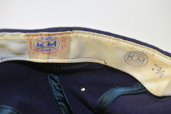
Tim McAuliffe/KM Pro
Some McAuliffe logos are sewn on a patch. The 1953 cap here was also used in spring 1954.
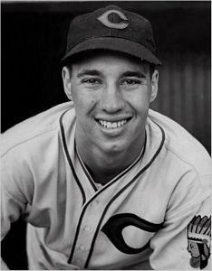
1954-57
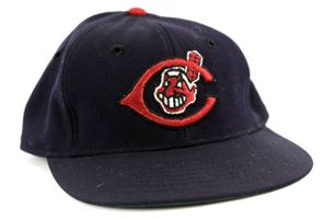
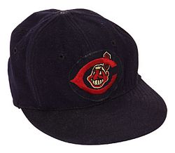
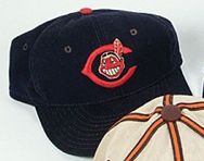
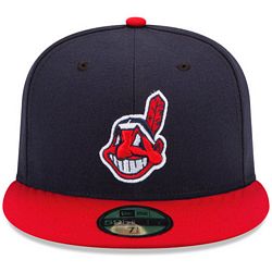
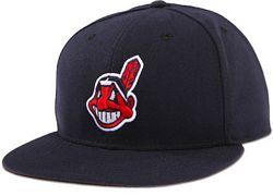
Chief Wahoo is added to the logo.
Tim McAuliffe/KM Pro
McAuliffe caps are used in 1954.
Wilson
Wilson caps wore 1955-57 have the logo on a patch, and a thicker "C".
1958-61
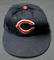
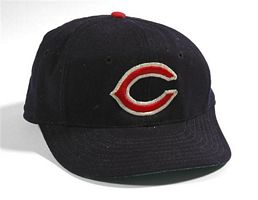
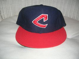
Chief Wahoo is dropped from the cap logo which gets white trim around the C. These look nearly the same as the 1955 but Indians C is a bit bigger with wider white trim.
Wilson
1962
Wilson
Chief Wahoo pops back in for one season on Wilson caps. Now, the Chief's feather overlies the "C", the opposite of the 1954-57 version.
1963-64
Chief Wahoo is gone again as caps return to the 1961 style.
Wilson
1965-69
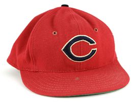
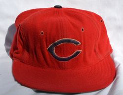
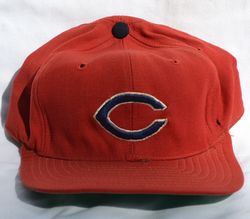
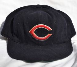
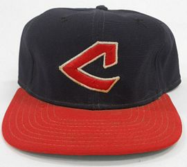
The colorway is flipped.
Wilson
Wilson date code here is actually HXC, 1965. Wilson caps have very thick wool.
New Era
New Era caps start to appear.
1970-71
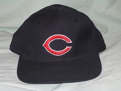
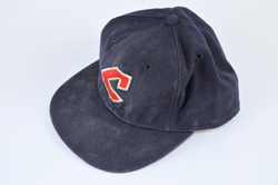
The navy cap returns, this time with a navy button instead of red.
Wilson
New Era
Note New Era's satin undervisor.
Wilson
1972
The cap goes back to red.
Wilson
1973
New design
KM Pro
1974
Caps change to nylon and a red visor cap debuts for use with a new red alternate jersey. The logo is enlarged.
New Era
1975-77
Navy cap is retired, the red visor cap is worn with all jersey sets.
New Era
1978-85
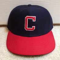
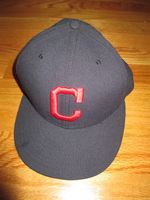
Logo returns to a traditional C. On some caps it's thick, others thin, even from the same year.
1986-93
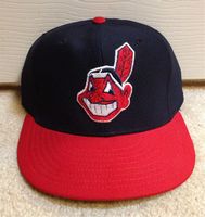
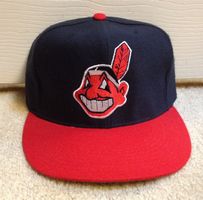
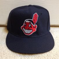
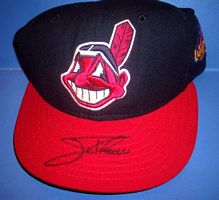
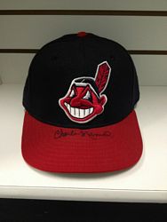
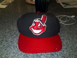
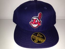
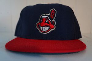
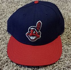
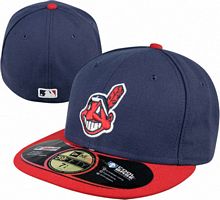
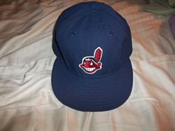
Chief Wahoo becomes the cap logo. Undervisors turn to grey.
New Era
Caps return to wool from nylon.
MLB Batterman logo initially appears as a glued on patch in 1992 then is embroidered on later in the year.
1994-2001
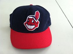
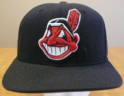
All-navy road cap debuts.
New Era
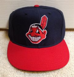
Raised embroidery appears in 1996.
2002
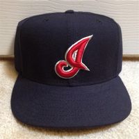
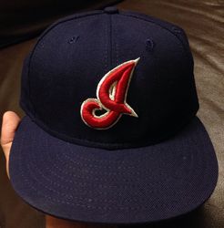
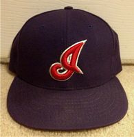
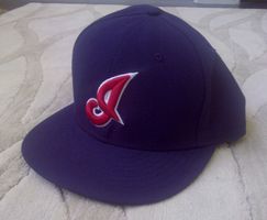
An alternate cap with an "I" logo and silver trim appears and is worn with a new alternate sleeveless jersey.
New Era
2003-06
A silver outline replaces white around Chief Wahoo who gets smaller.
New Era
2007
In 2007 polyester caps with black undervisors debut
New Era
2008-10
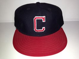
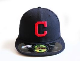
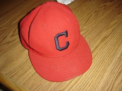
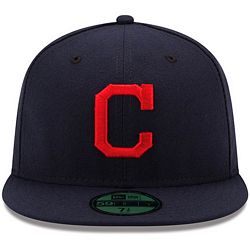
Silver outlines change back to white. An alternate navy cap with a "C" logo debuts. The "I" logo cap is rarely (ever?) worn. Caps turn to polyester with black undervisors.
New Era
2011-14
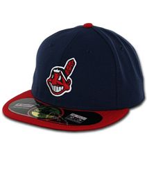
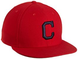
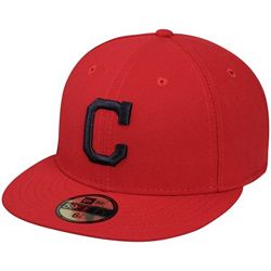
The navy "C" cap becomes the road cap. The navy Chief Wahoo cap is now a road alternate. A red "C" logo cap is introduced for use with the home alternate jersey. The "I" logo cap is dropped.
New Era
2015-present
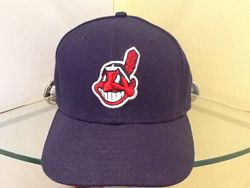
The color of the two Chief Wahoo caps is darkened to match the road cap.
