Oakland Athletics / A's Caps History
Oakland landed a young competitive team when Charles Finley moved the Kansas City Athletics in 1968. The jerseys were colorful and the team went on to win 3 straight World Series titles in 1972-74.
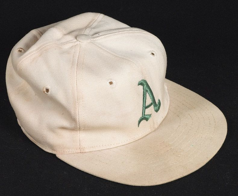
1968
The Athletics reinstate the "A" insignia on the caps in place of the "KC". For one season caps return to the darker green worn in Kansas City from 1963-65.
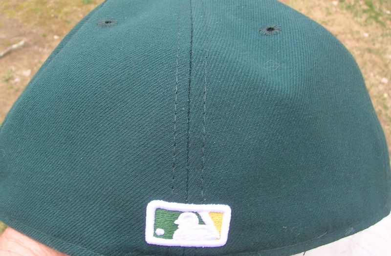
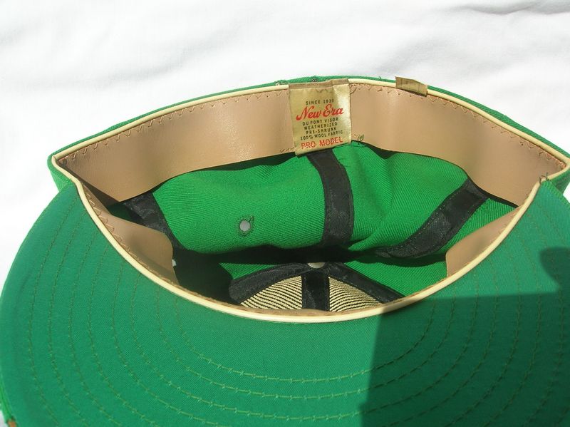
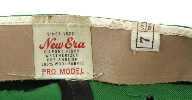
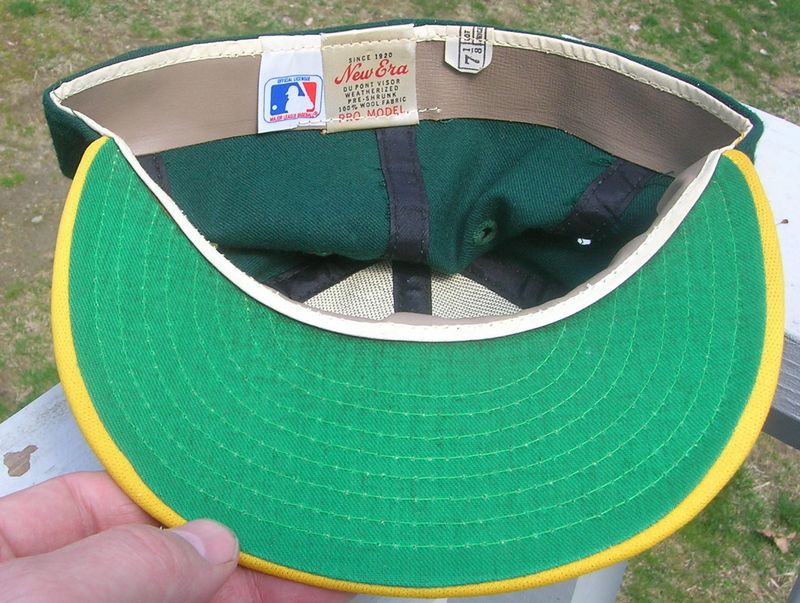
New Era
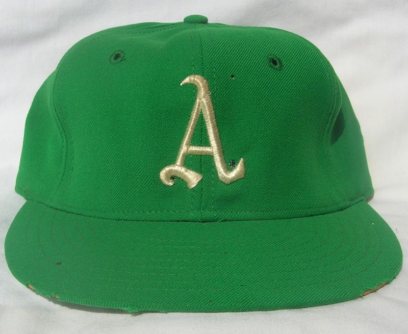
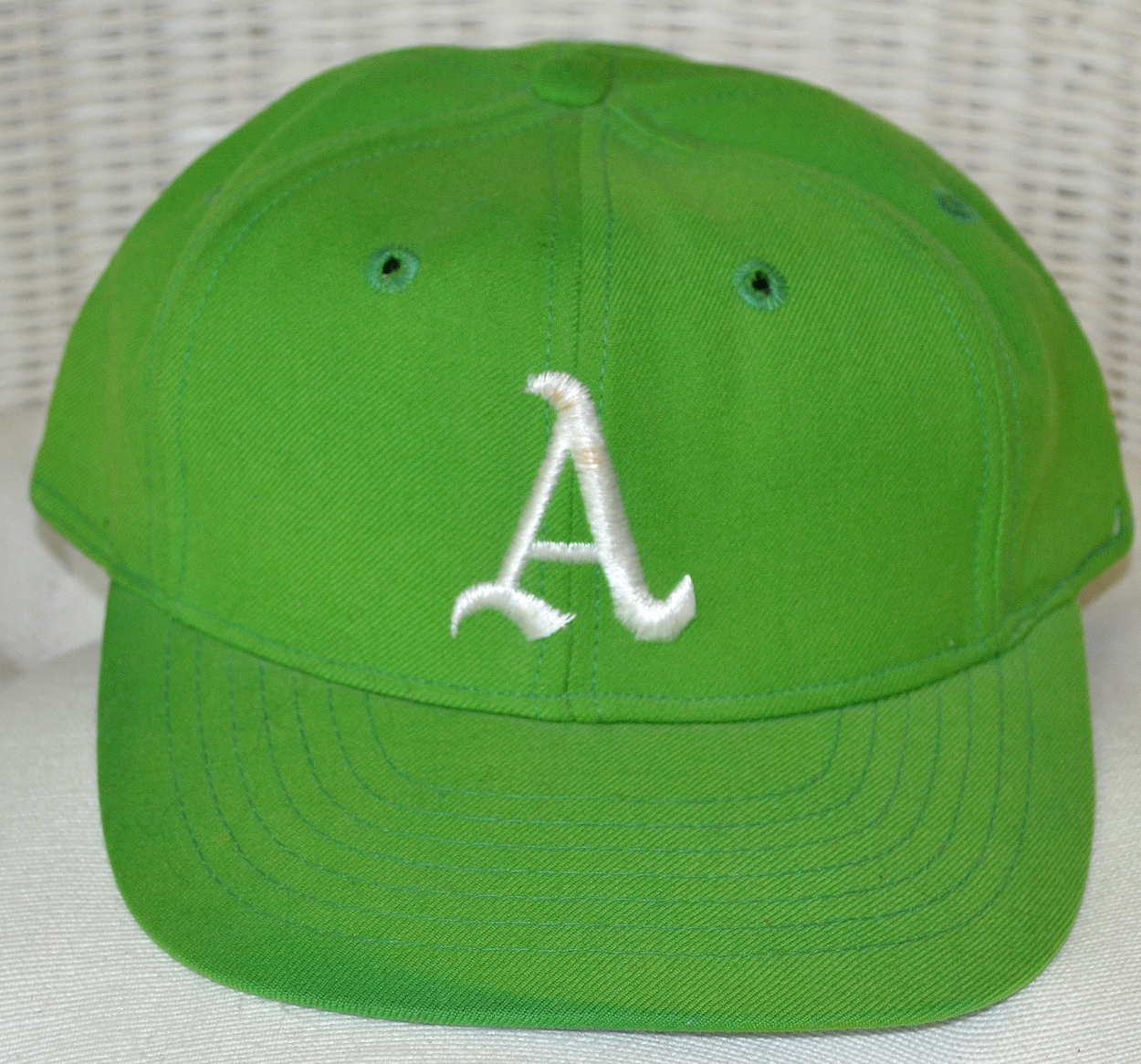
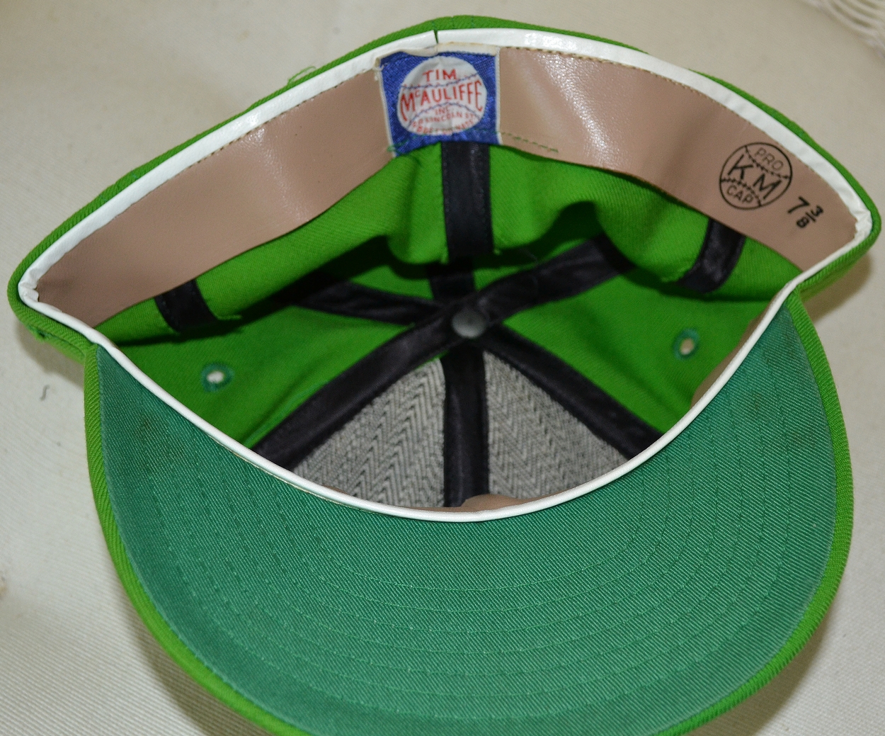
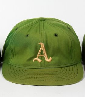
1969
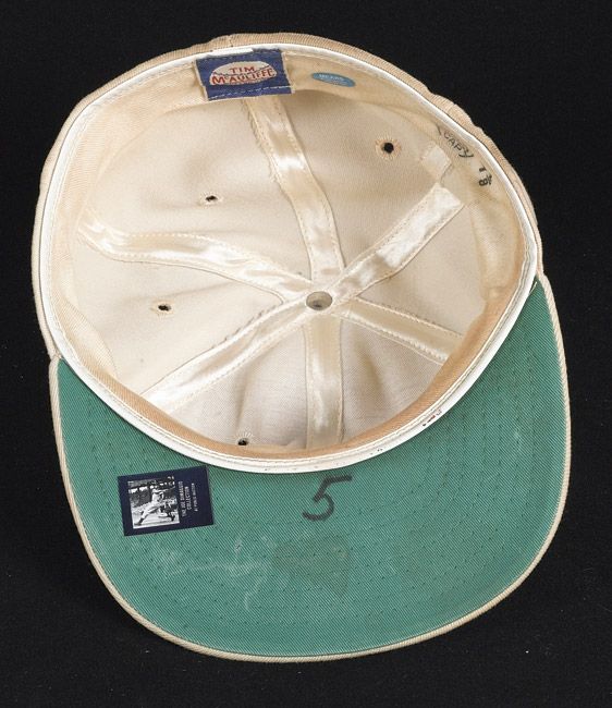
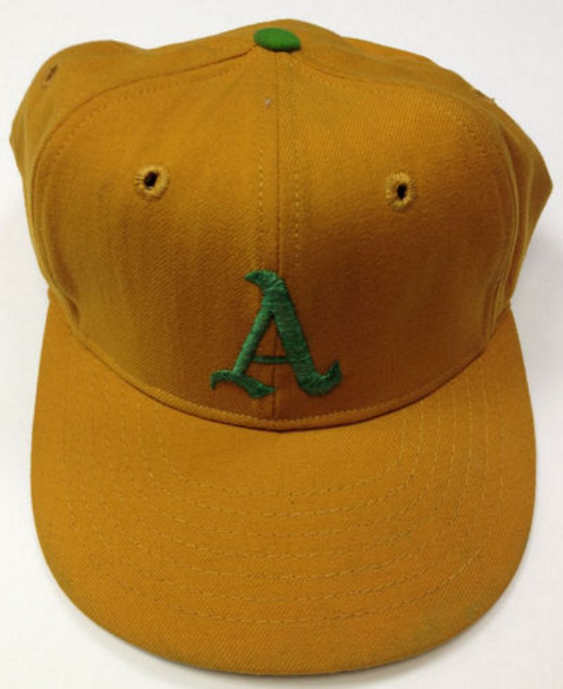
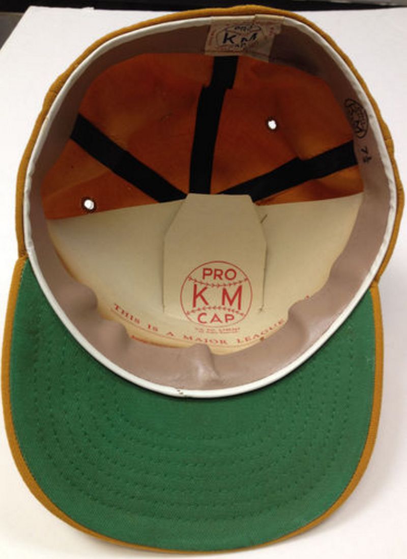
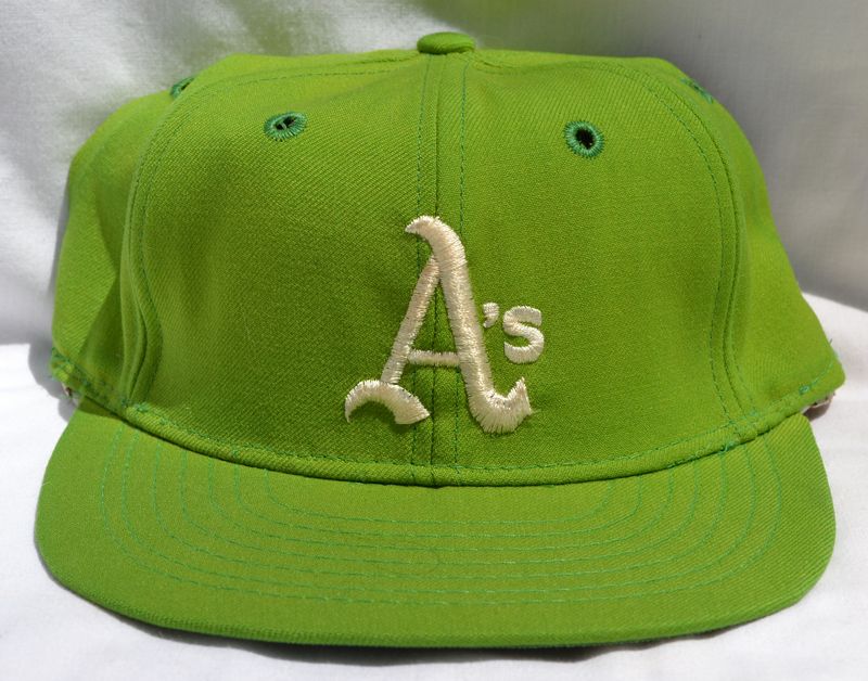
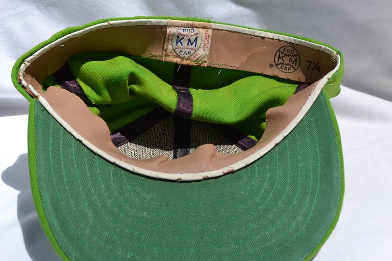
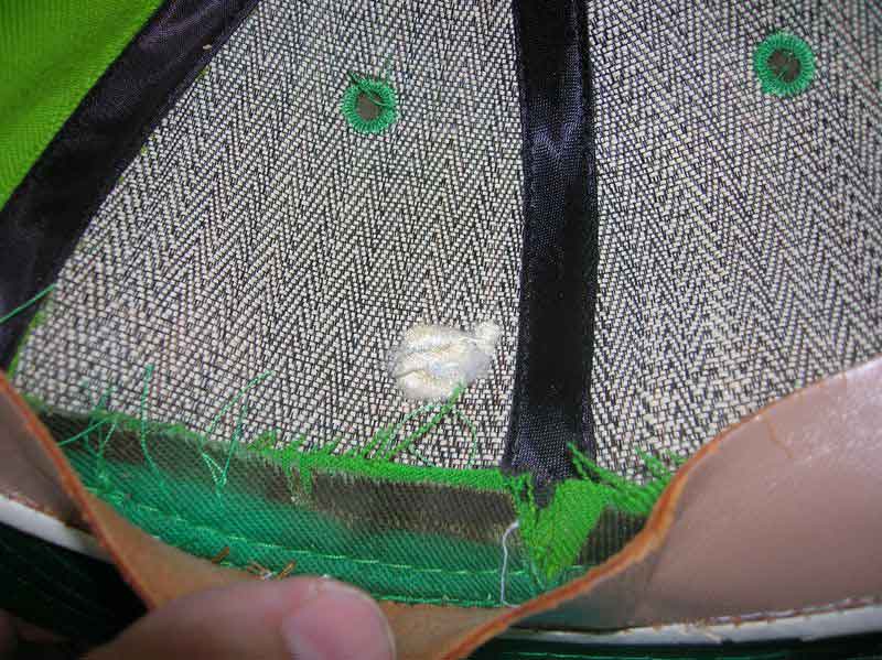
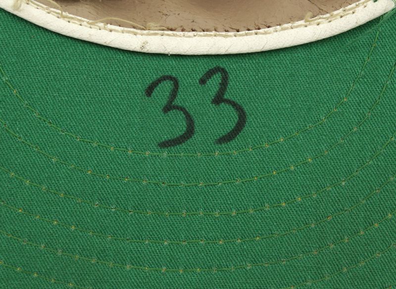
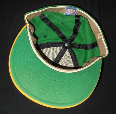
The Athletics wear McAuliffe/KM Pro and New Era (McAuliffe closed after the 1968 season but McAuliffe-labelled caps had been made for the '69 season). The color returns to the lime worn in KC 1966-67, and the logo gets a new shape. A gold alternate cap is used on occasion. As in Kansas City, white coaches caps were used.
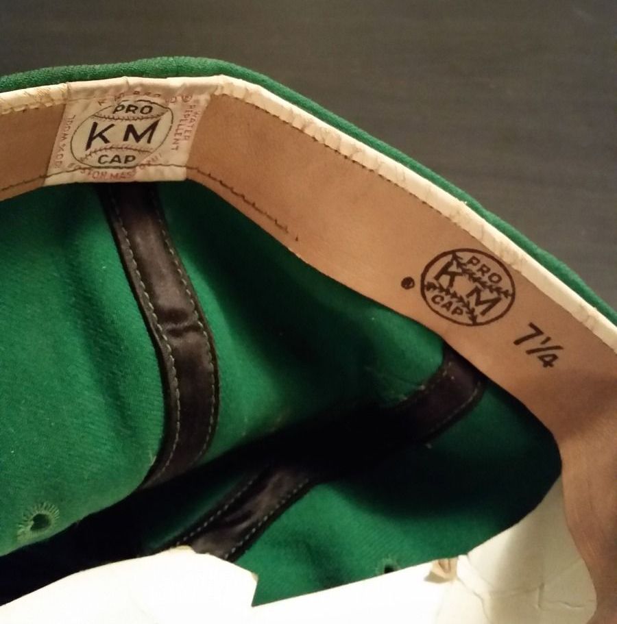
Tim McAuliffe/KM Pro
New Era
The tail on the A is slightly different on New Era caps.
-1 NE.jpg)
KM Pro
1970
Charles Finley officially changes the name to A's. An apostrophe "s" is added to existing jerseys and caps. Both New Era and KM Pro are worn.
KM Pro
New Era
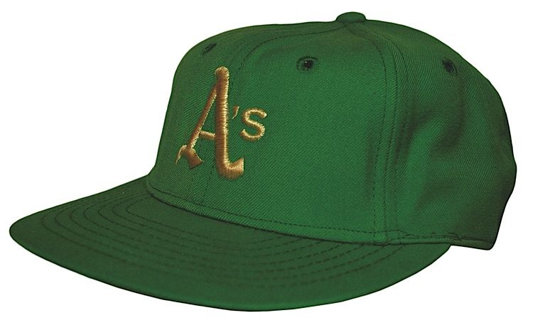
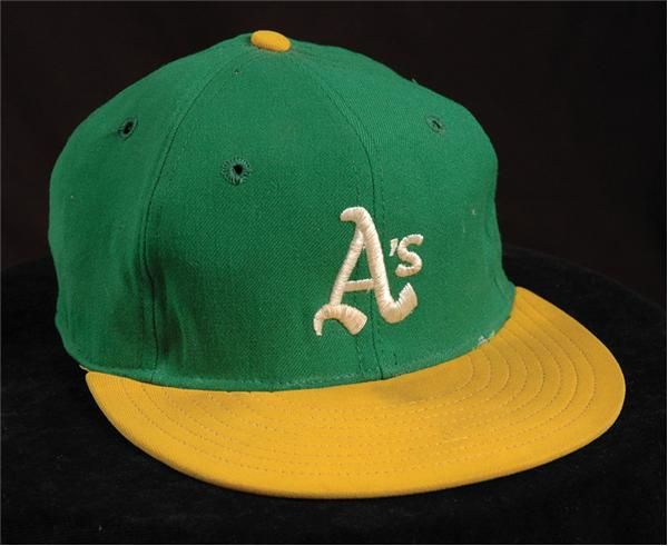
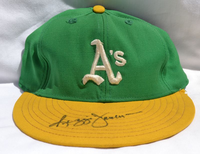
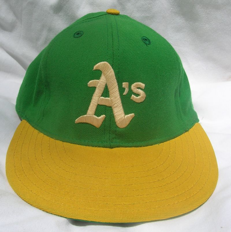
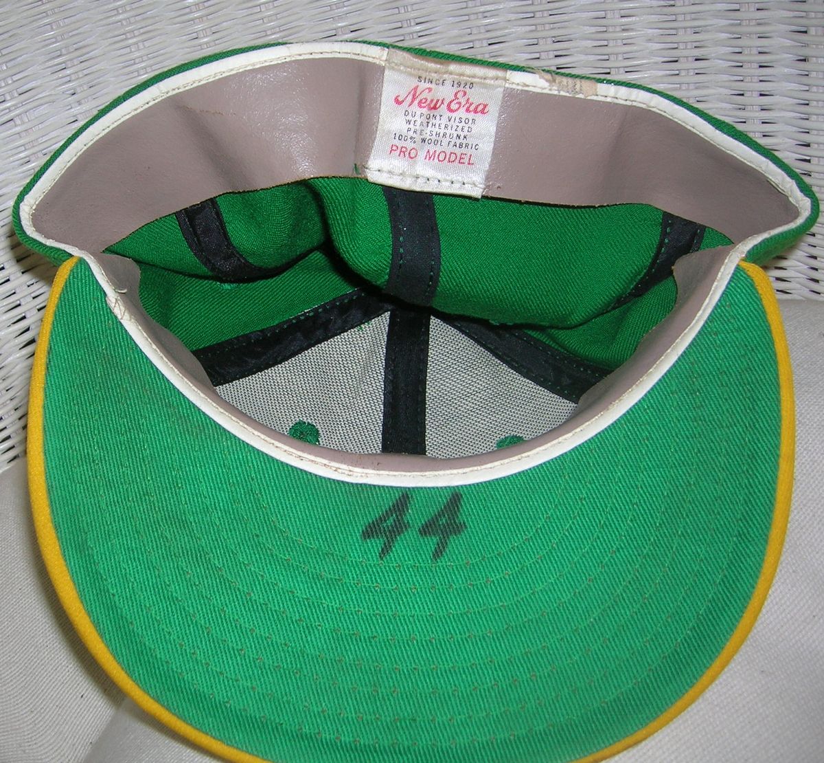
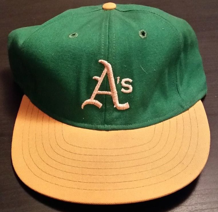
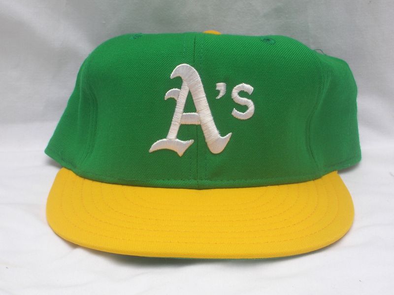
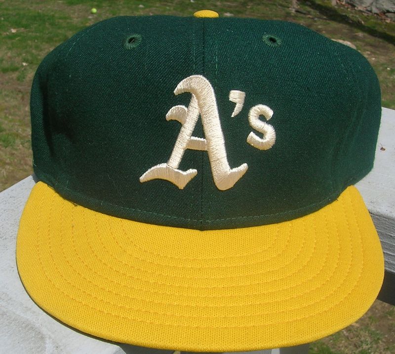
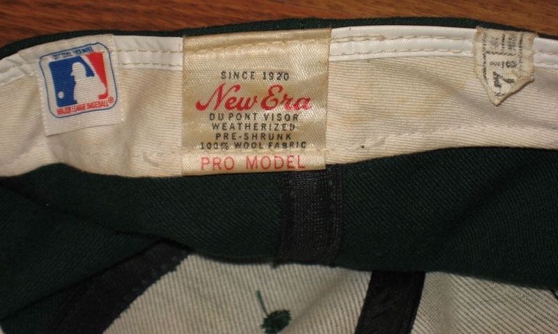
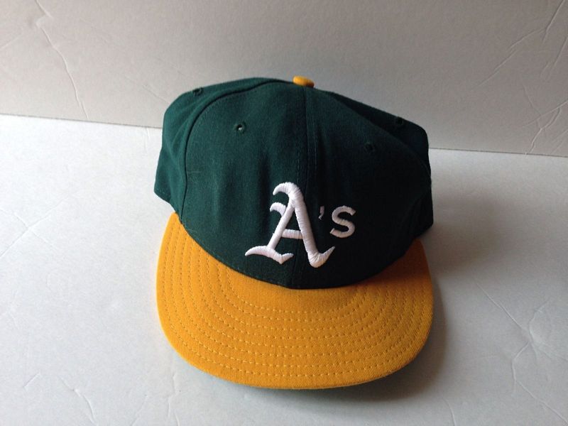
1971
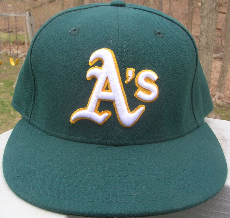
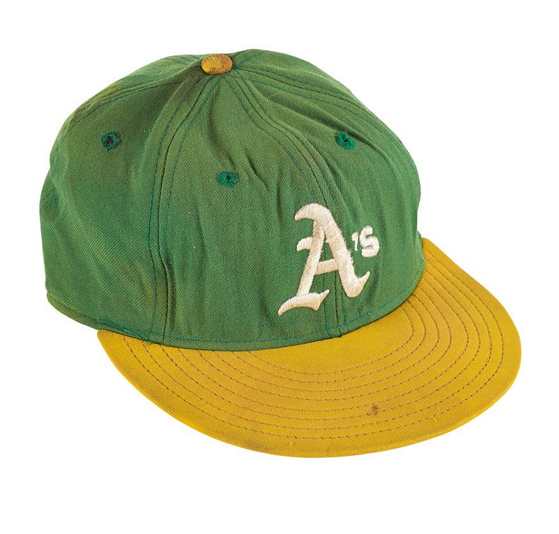
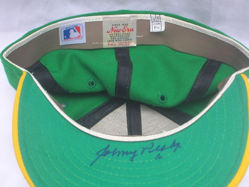
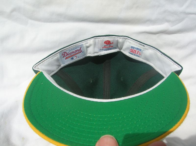
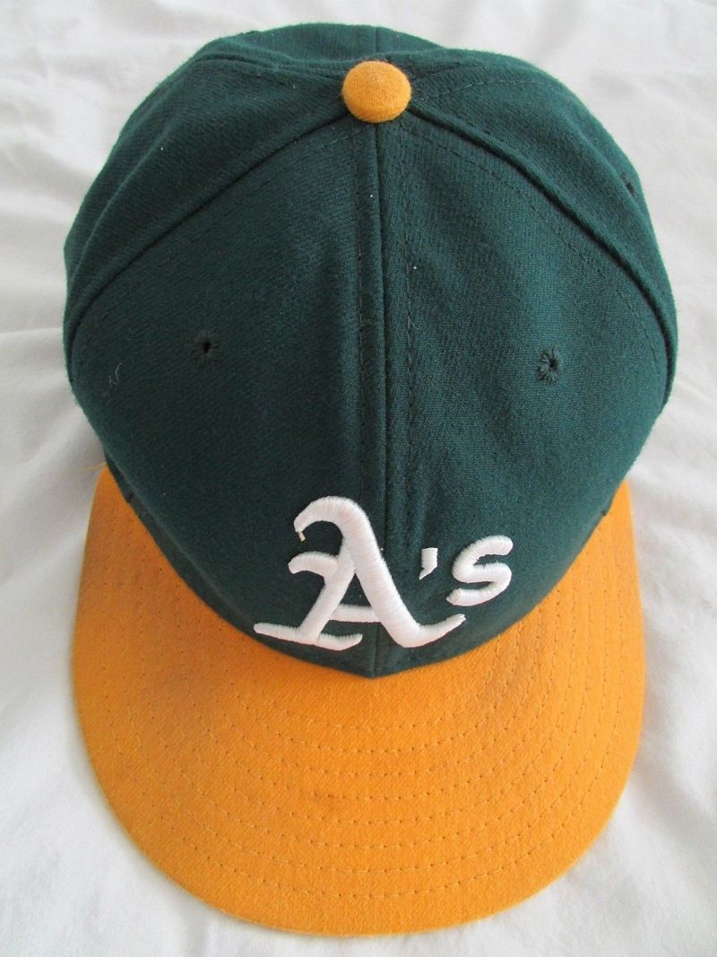
The A's change to their now-classic green with gold visor and button. Looks like KM Pro were used first, but New Era took over. The New Era gold is more yellow, the "A" is thicker and has a sharper tail.
KM Pro


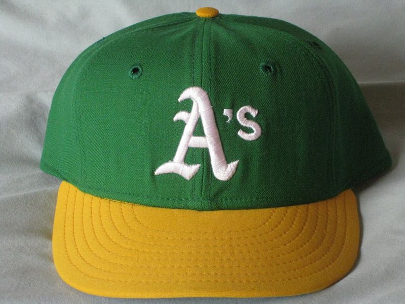
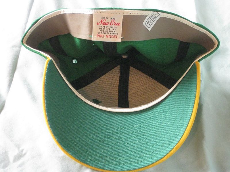
New Era
This is exactly the same as the KM Pro above but with a New Era tag. Looks like New Era bought these from Leslie Co. and tagged them as their own.

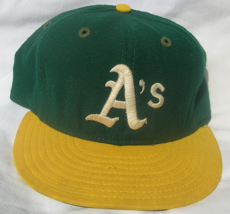
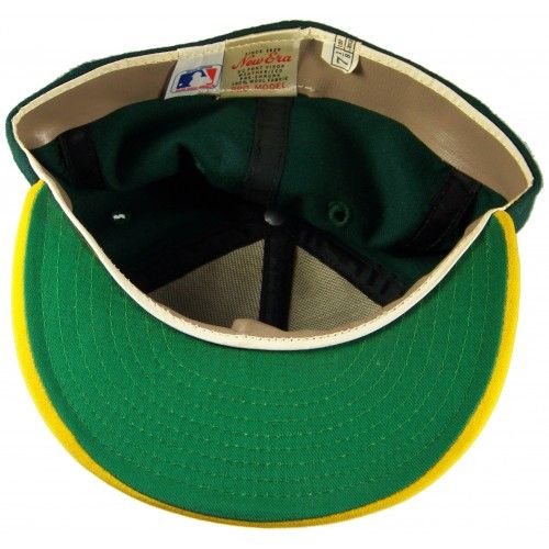
1971-72
By late season 1971, this model takes over. The logo is a bit different, and the gold color is closer to yellow.
In 1972, the team uses New Era only. 1971 caps are carried over and used by many players. In addition, New Era introduces a taller logo with a much closer resemblance to the jersey logo (see the Oct. 23 1972 SI cover). Still, players continue wearing older caps, even into following seasons after a second serif had been added to the logo. No MLB fashion police back then....
Here's the 1971 carryover...
New Era
1972
...and here's the one that looks like the jersey logo.
New Era


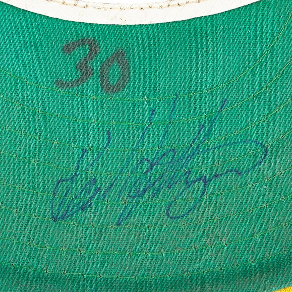
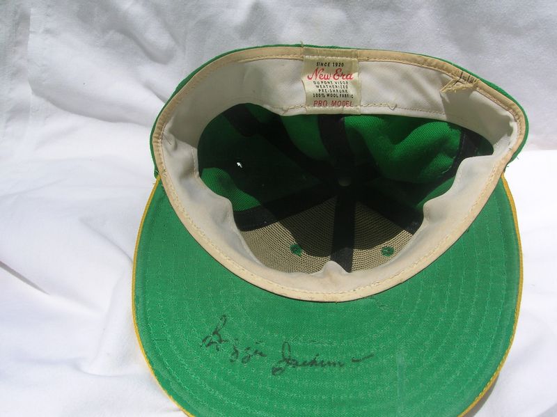
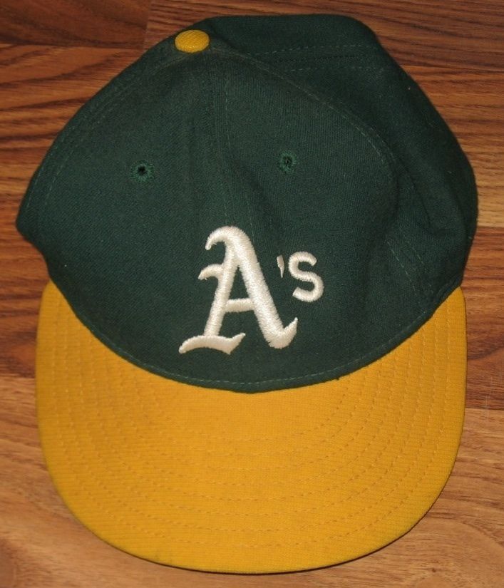
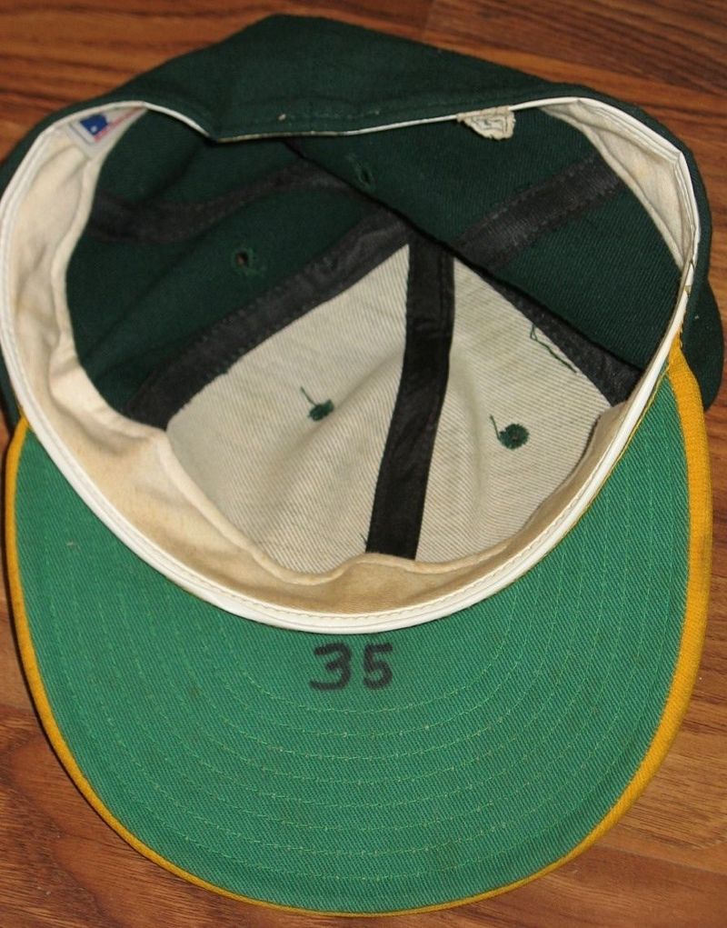
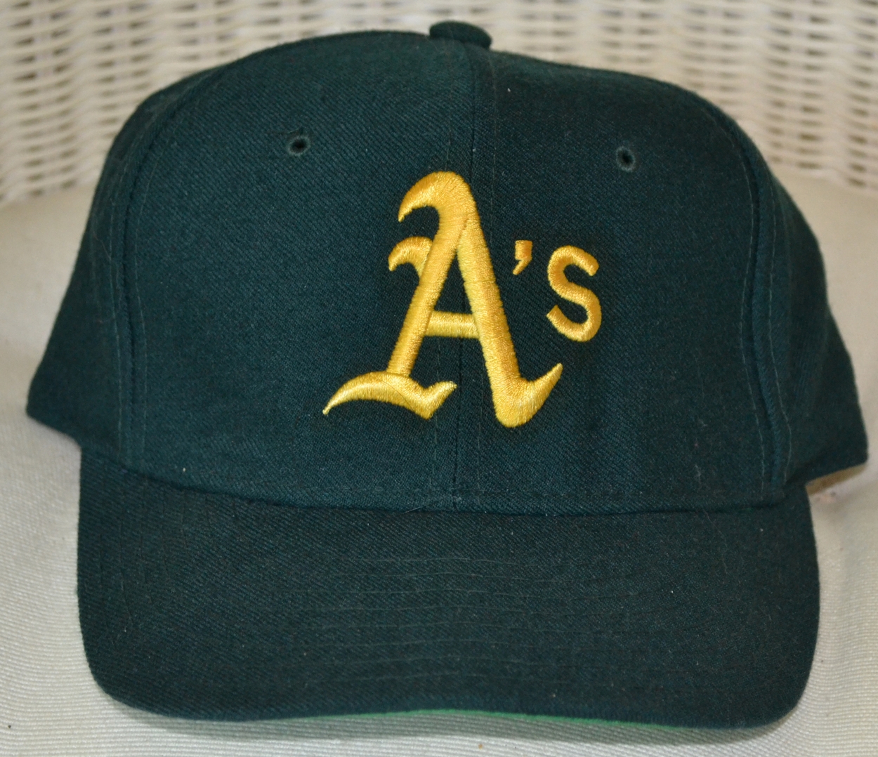
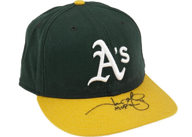
1973-74
In 1973 the logo gets thicker and a second serif is added reminiscent of the Philadelphia Athletics of the 1950's.
New Era
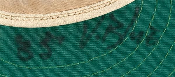
BTW MEARS sold this cap as a "1986 Canseco cap". Sigh, where to start on that goof.... the team changed colors in 1982; Canseco wore size 7 1/2 or 7 5/8 not size 7.... in reality this is aDave Hamilton cap from the 1973-74 World Series years which is worth more than a 1986 Canseco would be. Do your research & don't trust auction houses.

Pro McAuliffe
A rare Pro McAuliffe, appears to be New-Era made early 70's style, but I'm not sure if the A's ever wore these on-field

1975
Apostrophe gets thicker.
New Era
1976-79
New Era
Exaggerated apostrophe and the "s" gets larger.

COLLECTOR ALERT!
I've seen caps like this one sell for a fair bit whenever they pop up in auctions, so I'm compelled to advise, Oakland NEVER used this style KM Pro with this awful logo. 1971 was the last time they wore KM Pro.
1980
The serif points get sharper, the apostrophe smaller.
New Era
1981
Apostrophe changed again.
New Era
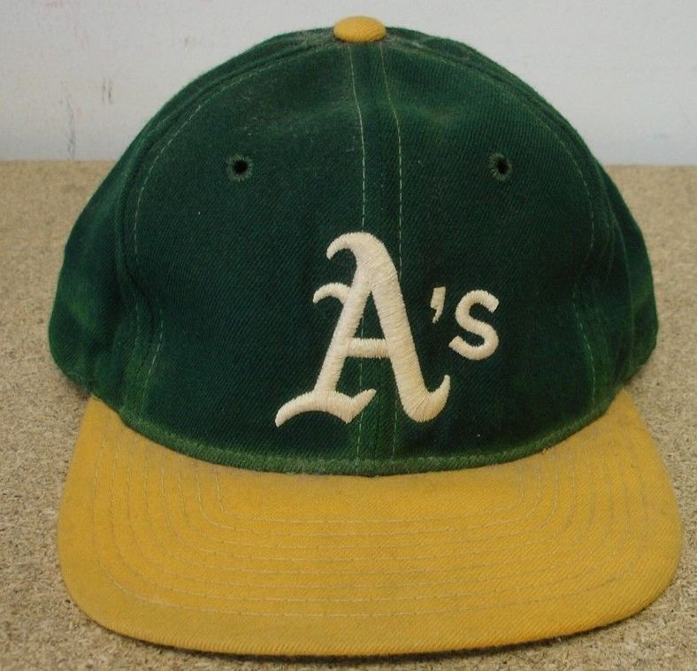
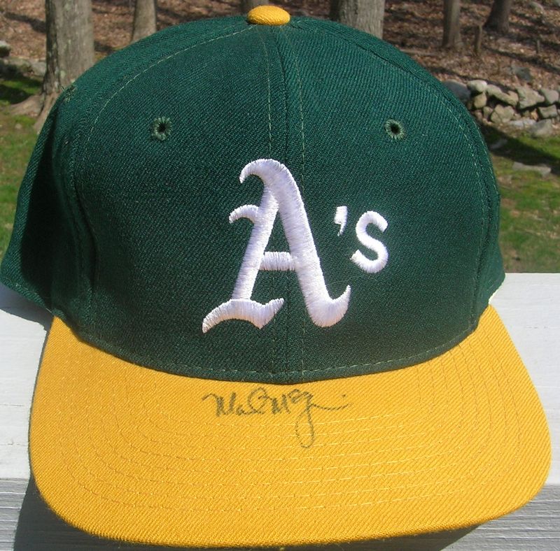
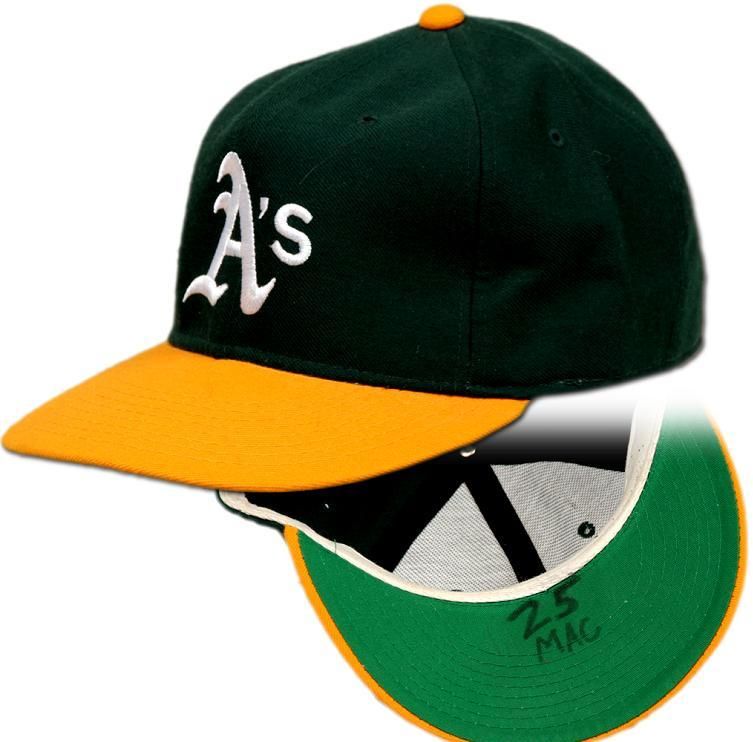
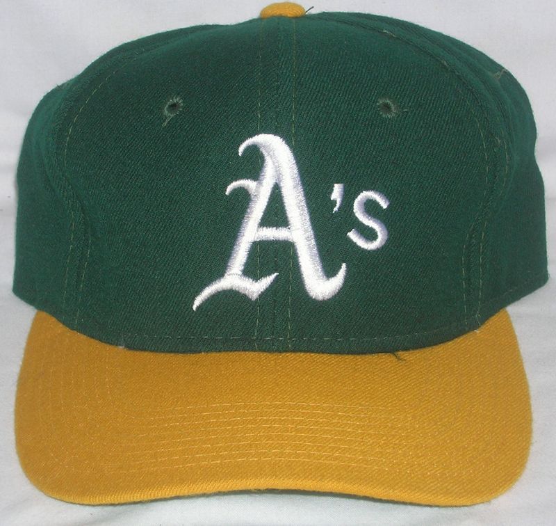
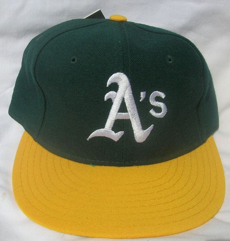
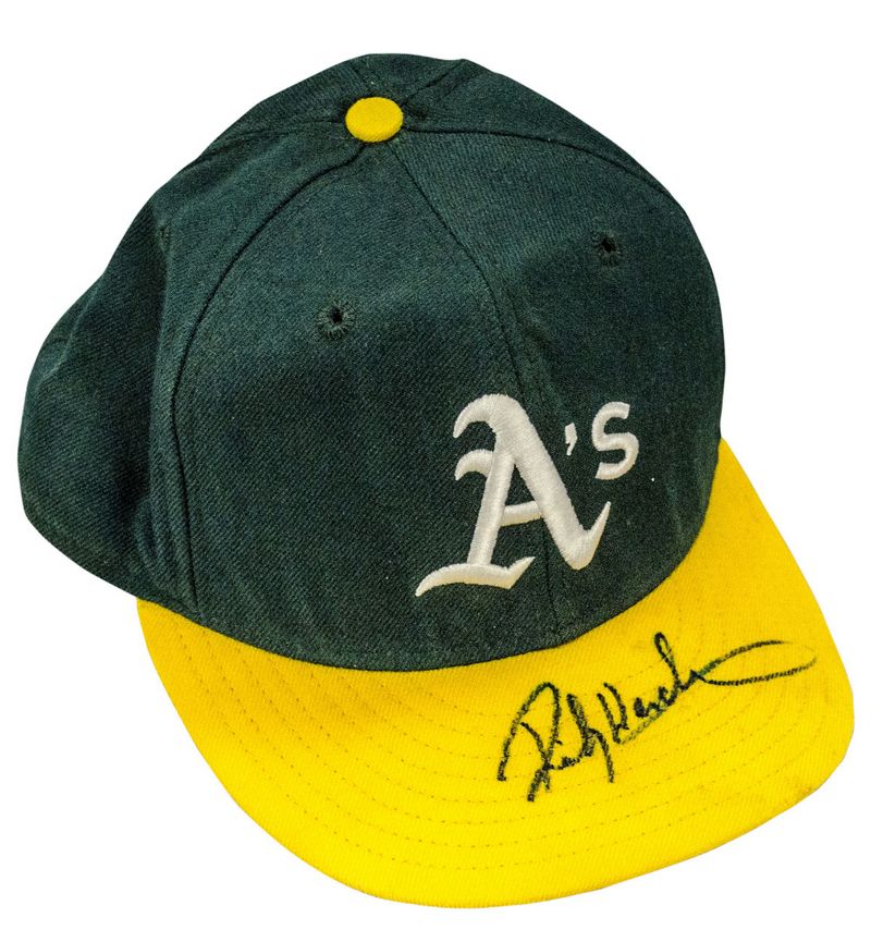
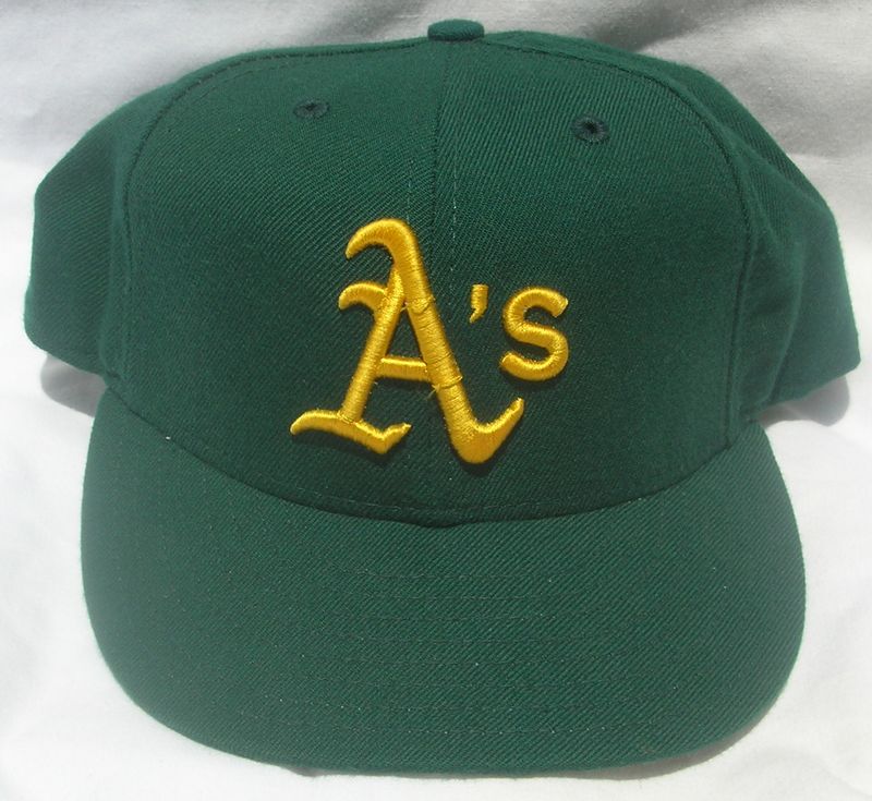
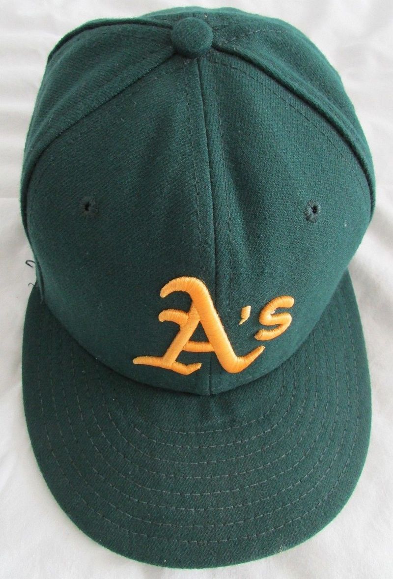
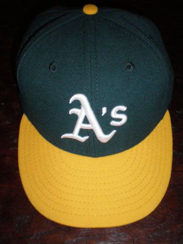
1982
Colors change to darker forest green and yellow. And the apostrophe gets larger again.
New Era
1983
New Era
Now the apostrophe is really thick.
1984-85
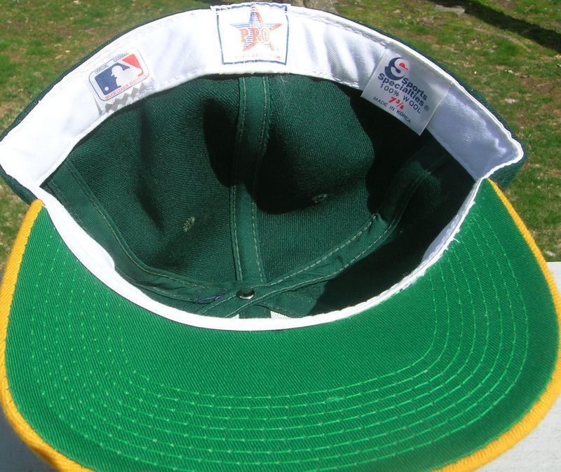
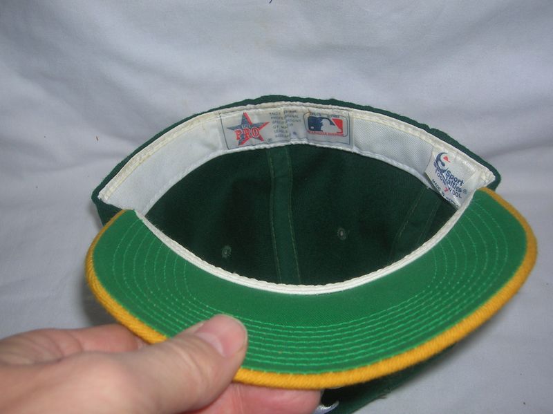
The logo gets sleeker as the A's use both Sports Specialties and New Era caps, though each capmaker has a slightly different look.
New Era
Sports Specialties
Around 1985, Oakland is one of the first teams to make Sports Specialties their main cap.

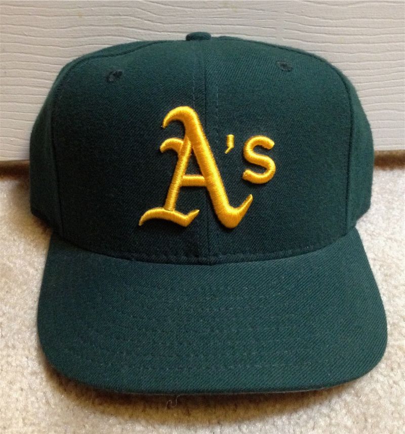
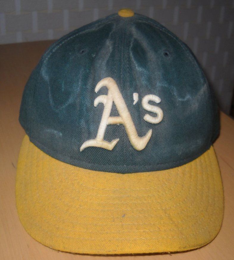
1986-88
The logo gets just a tad thinner at the base of the A (left side). Most players use Sports Specialties but some still wear New Era.
New Era


Sports Specialties

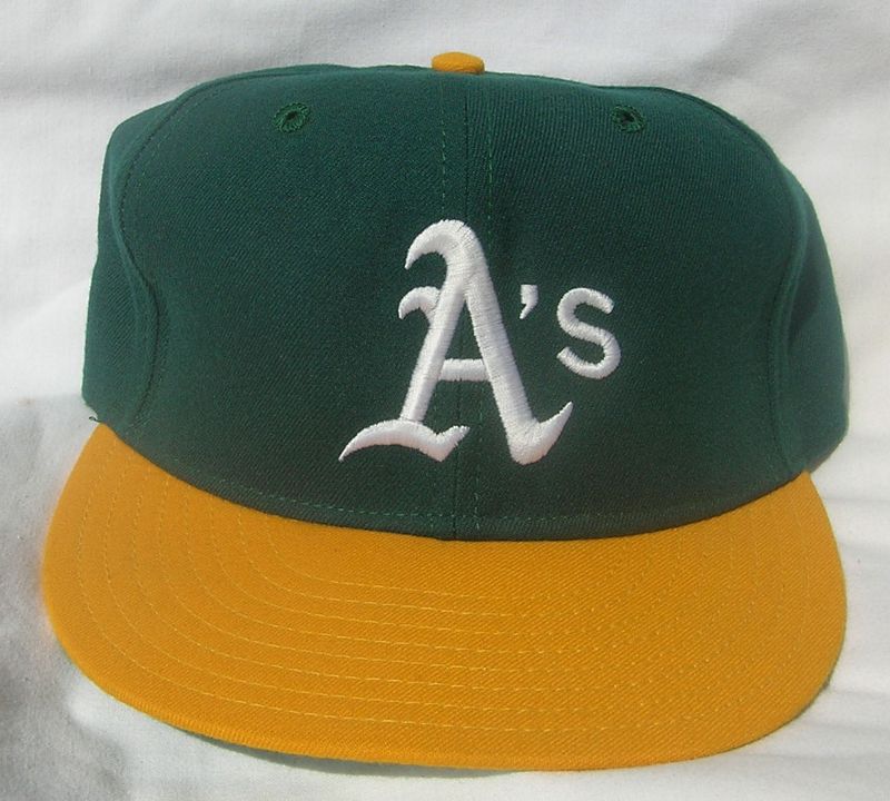
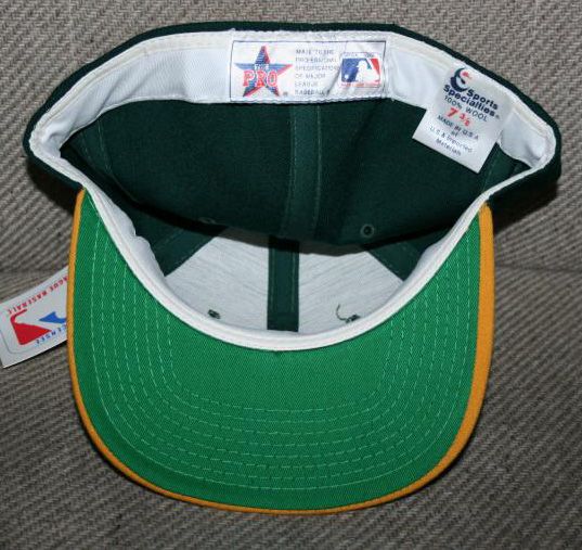
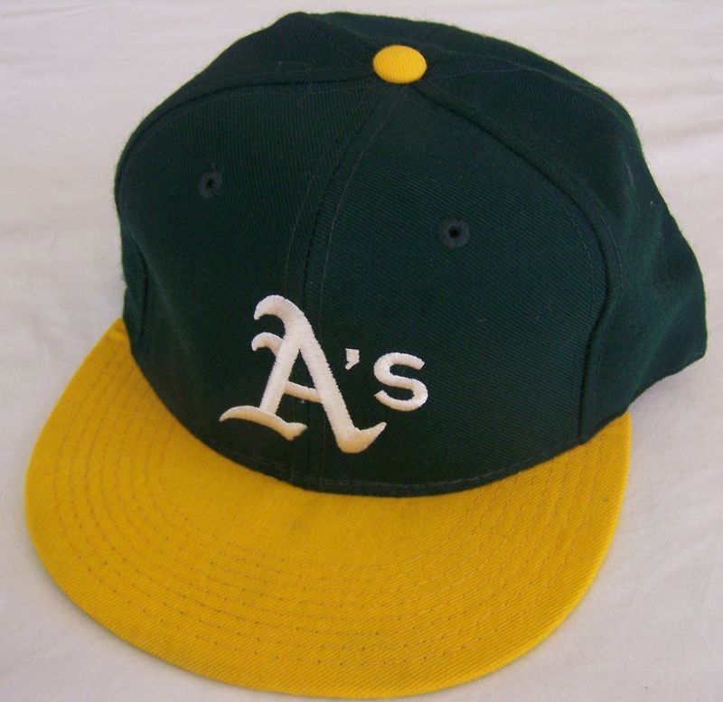
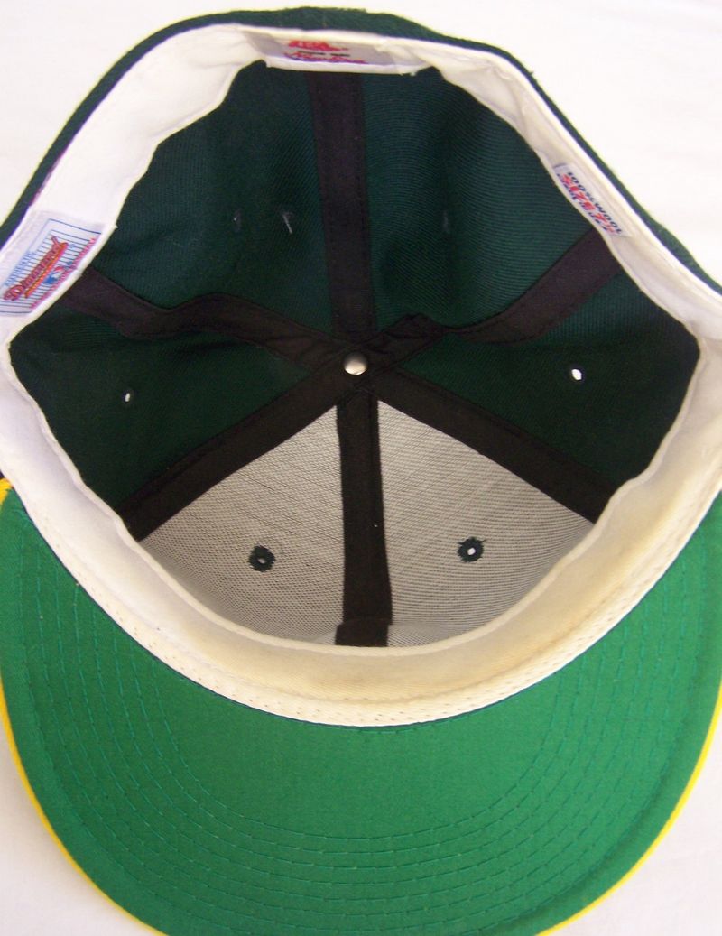
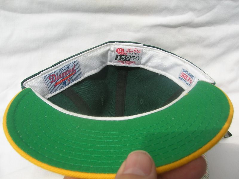
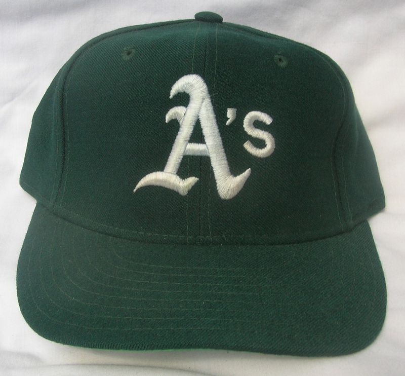
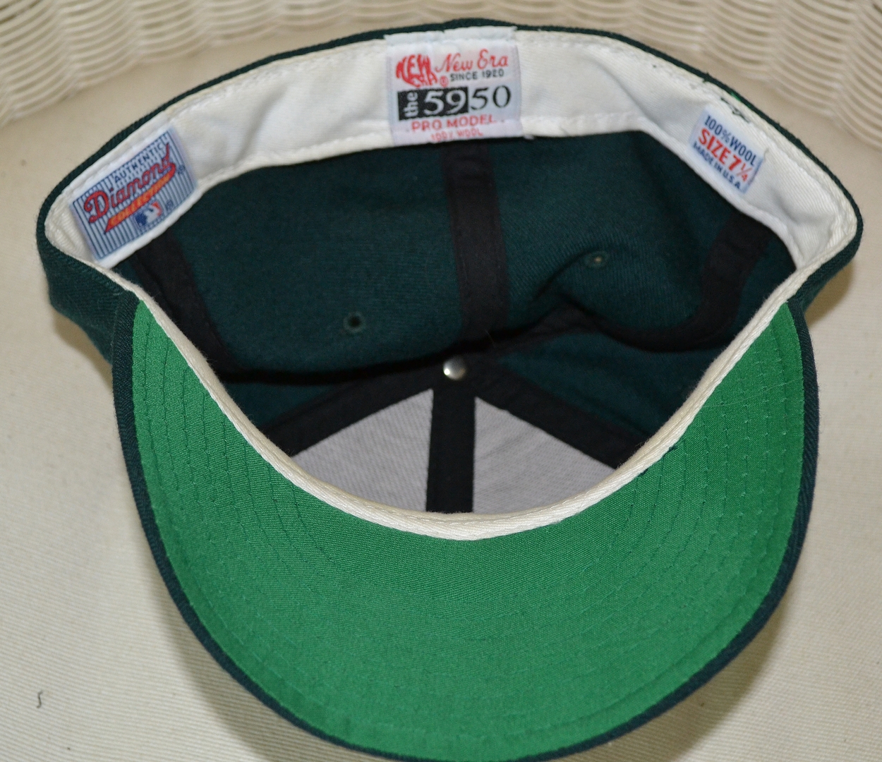
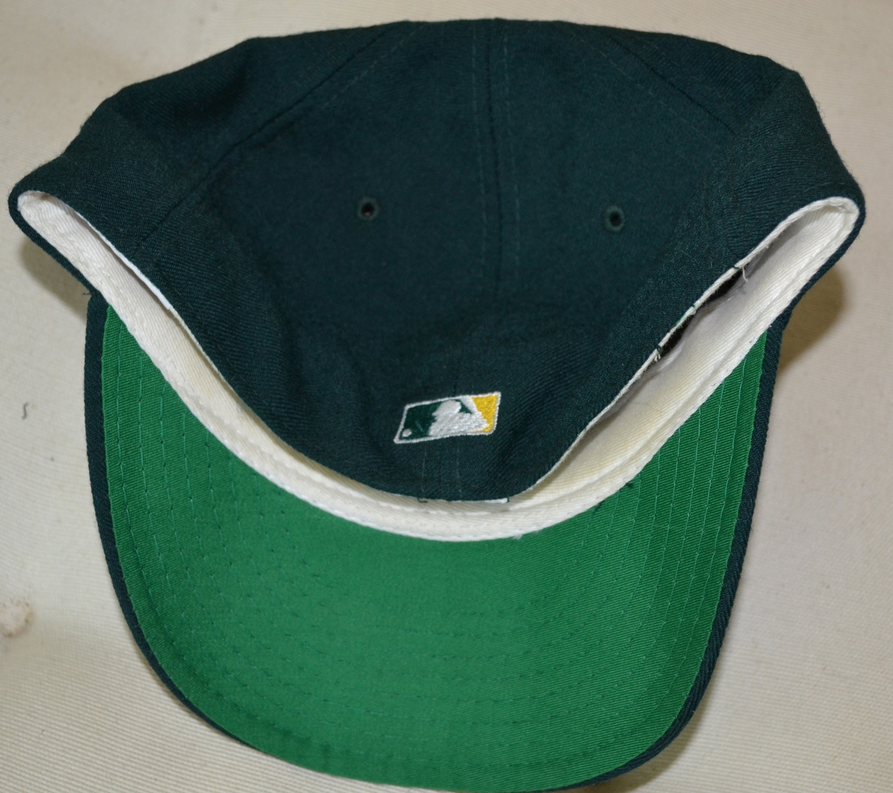
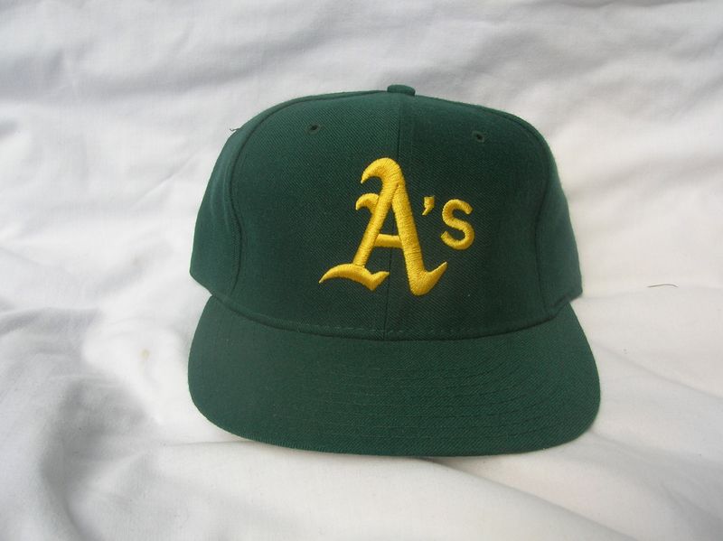
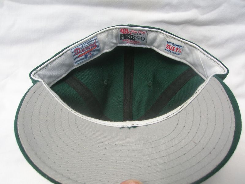
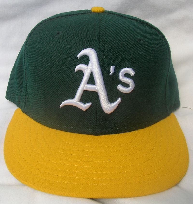
1988-91
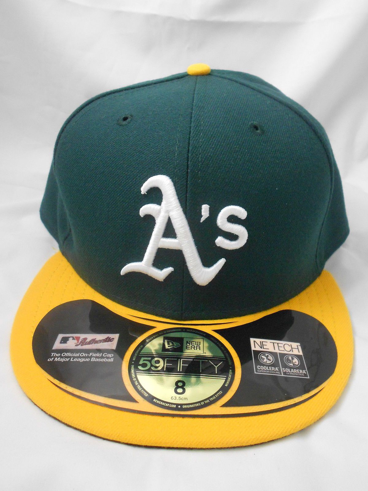
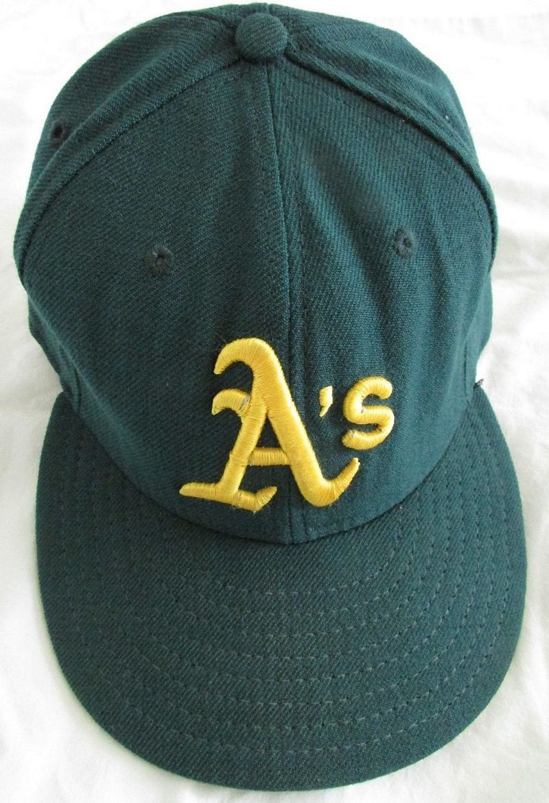
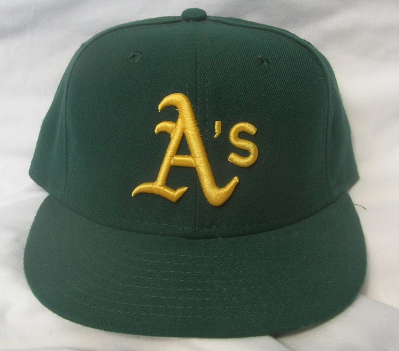
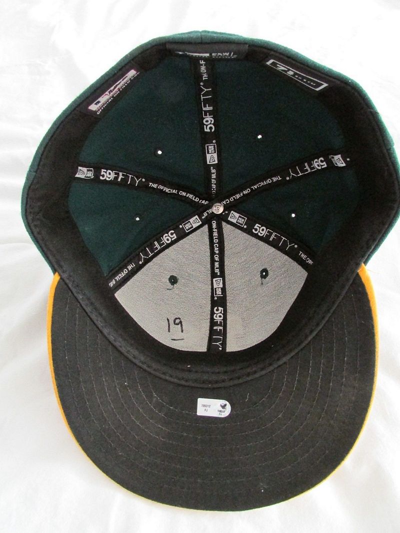
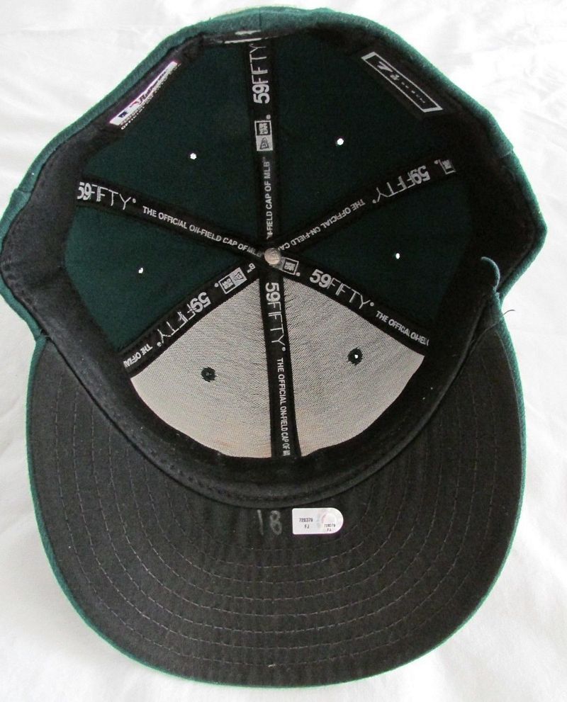
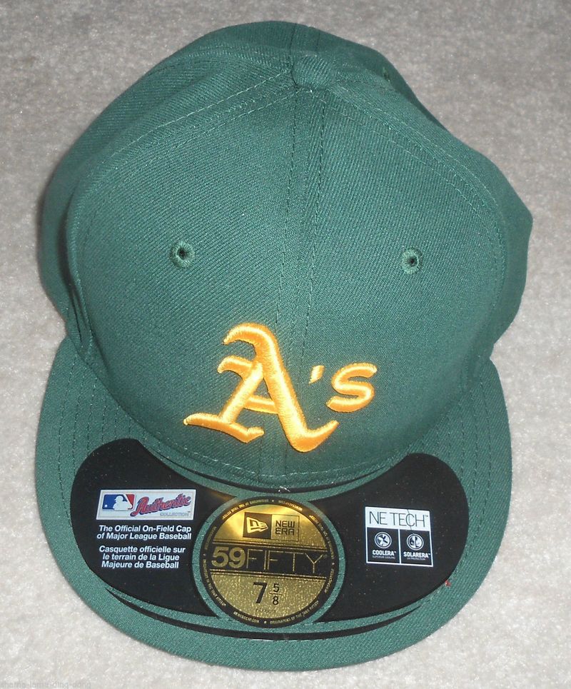
The logo gets thinner again. The A's wear mainly Sports Specialties caps through 1991, but this New Era logo becomes the one still used today (...and it's also incorrectly put on Cooperstown "1972" kelly green caps...)
New Era
Sports Specialties
New Era

Sports Specialties

1992
New Era
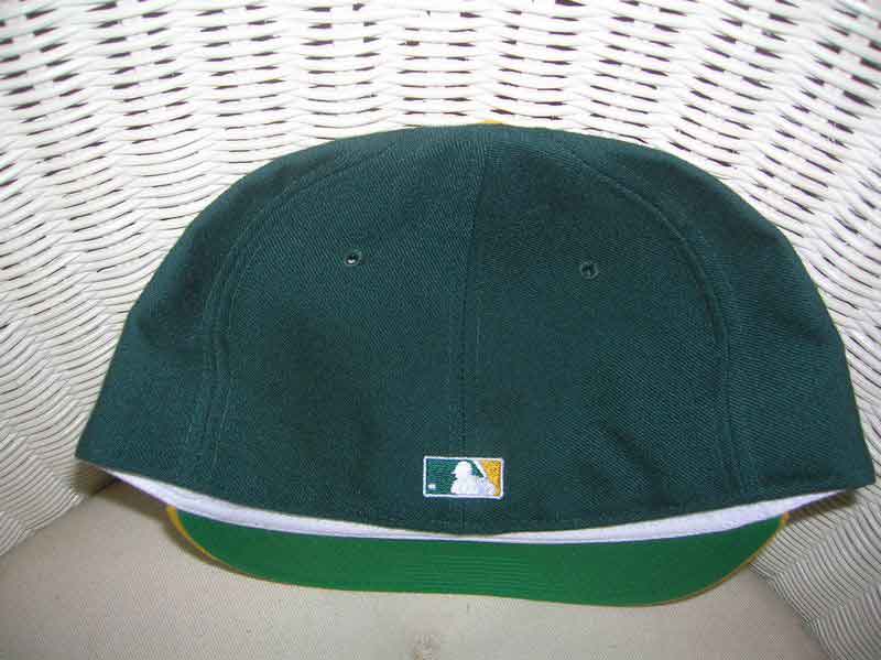
The A's now wear New Era caps almost exclusively.
MLB Batterman logo initially appears as a glued on patch in 1992....
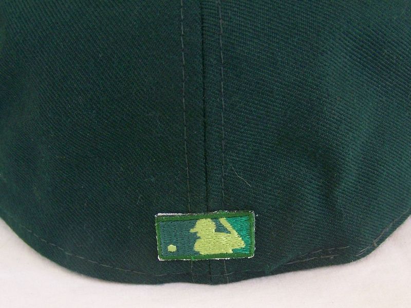
...then is embroidered on later in the year in team colors.

1993
New Era
All-green road cap debuts in 1993.

1994
Grey underbrims are used by some players. Road cap logo changes to gold.
New Era
-1.jpg)
-2.jpg)
-3.jpg)
1995-99
New Era
Undervisors are all grey by 1995.
Raised embroidery debuts in 1996.

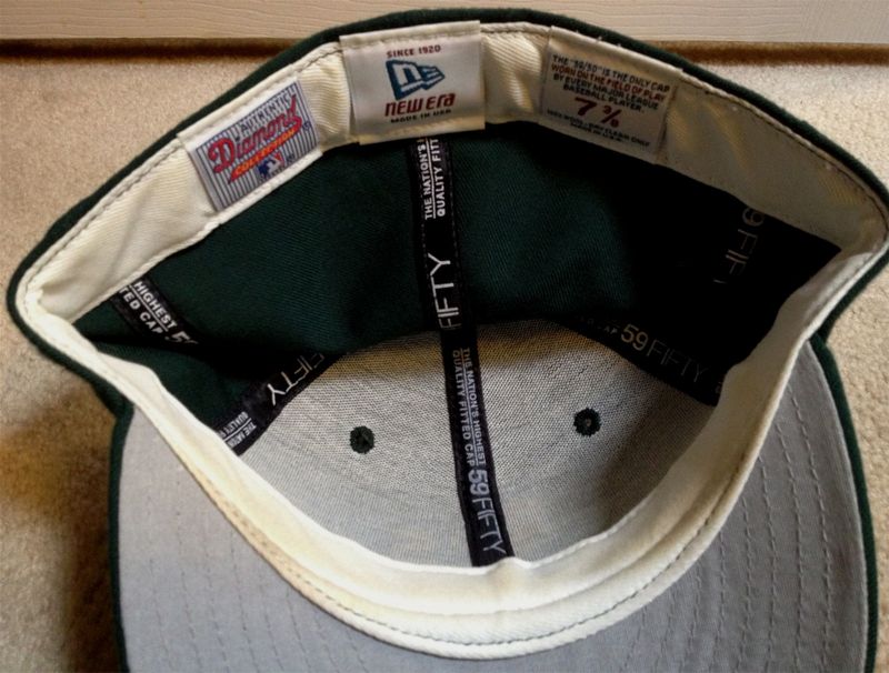
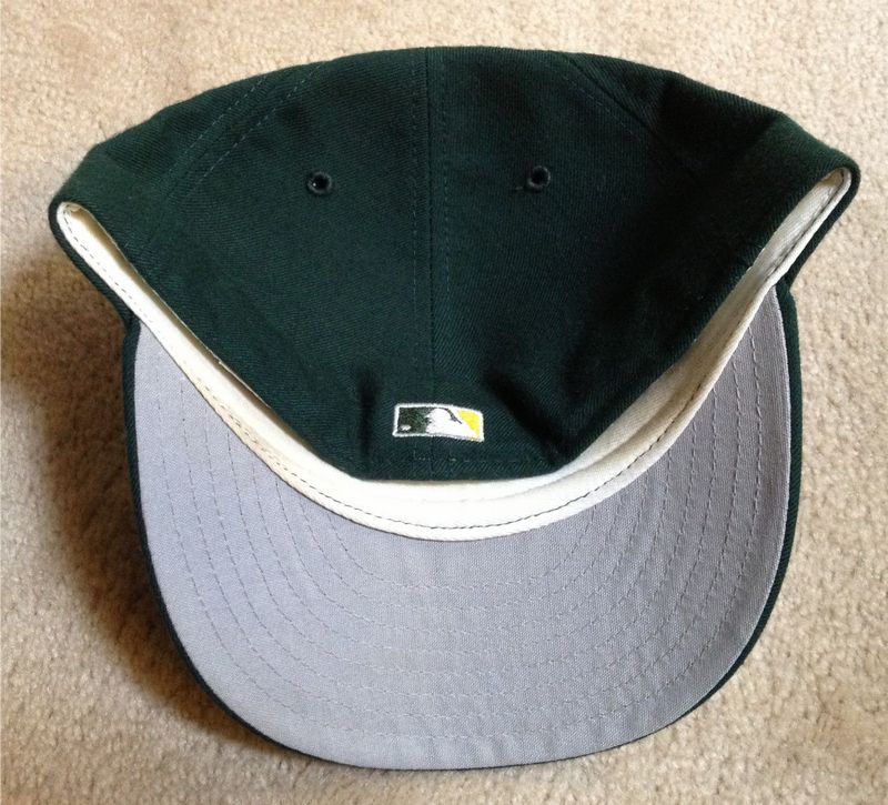
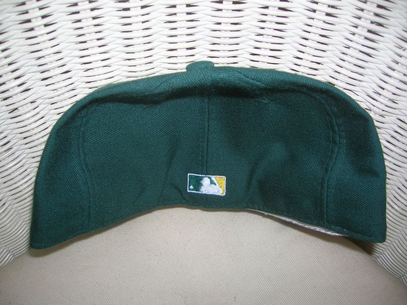
2000
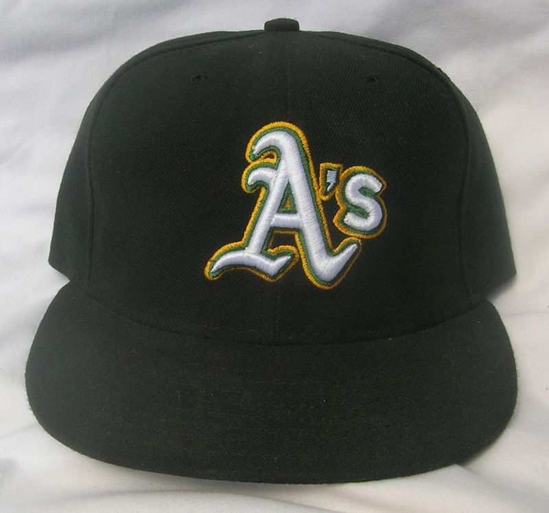
In recognition of the 100th anniversary of the Athletics, a black jersey and cap is used as an alternate. I'm still looking for 2000 home and road caps with the same "Authentic" tag.
New Era

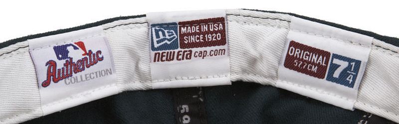
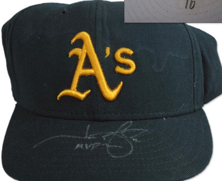

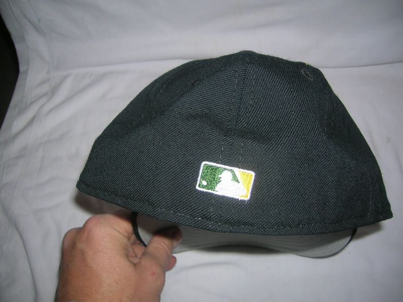
After 2000 the black cap is retired from on-field use but remains an official alternate.
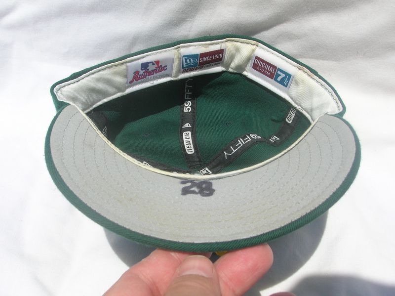
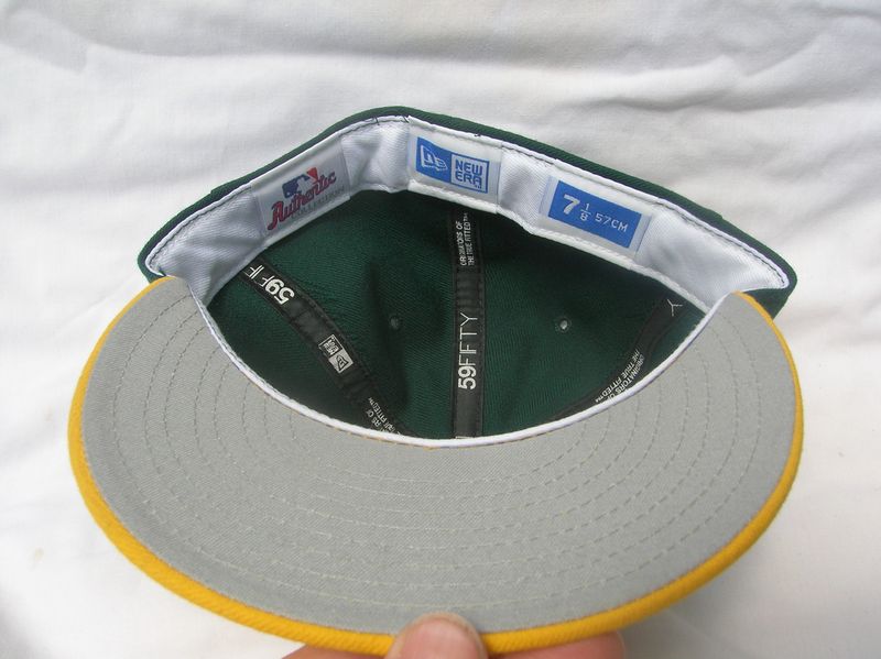
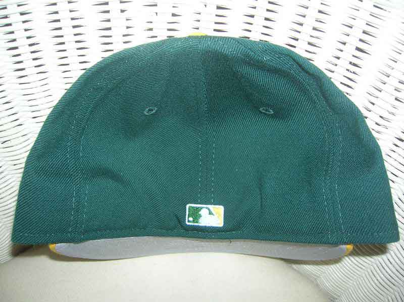
2001-06
New Era

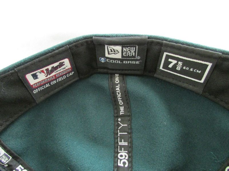
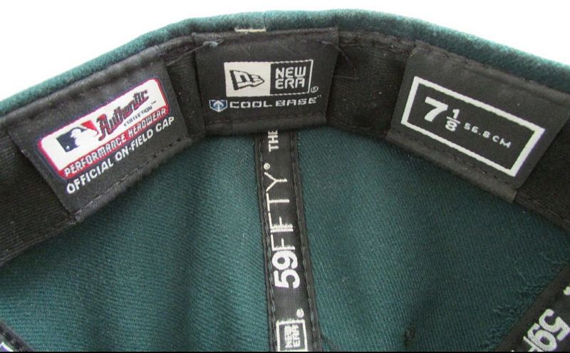
2007
Caps become polyester with black underbrims.
New Era


2008-10
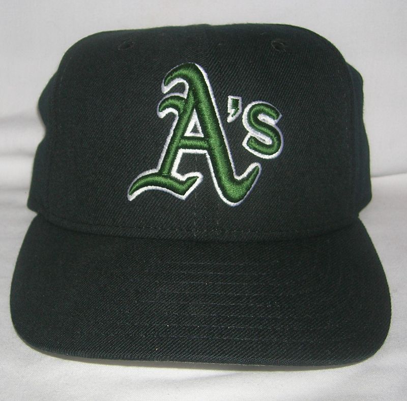
A black alternate debuts.
New Era
2011-12
Black alternate cap retired.
New Era

2013
BP cap worn a few times.
New Era
2014-present
New road cap debuts. BP cap not used.
New Era