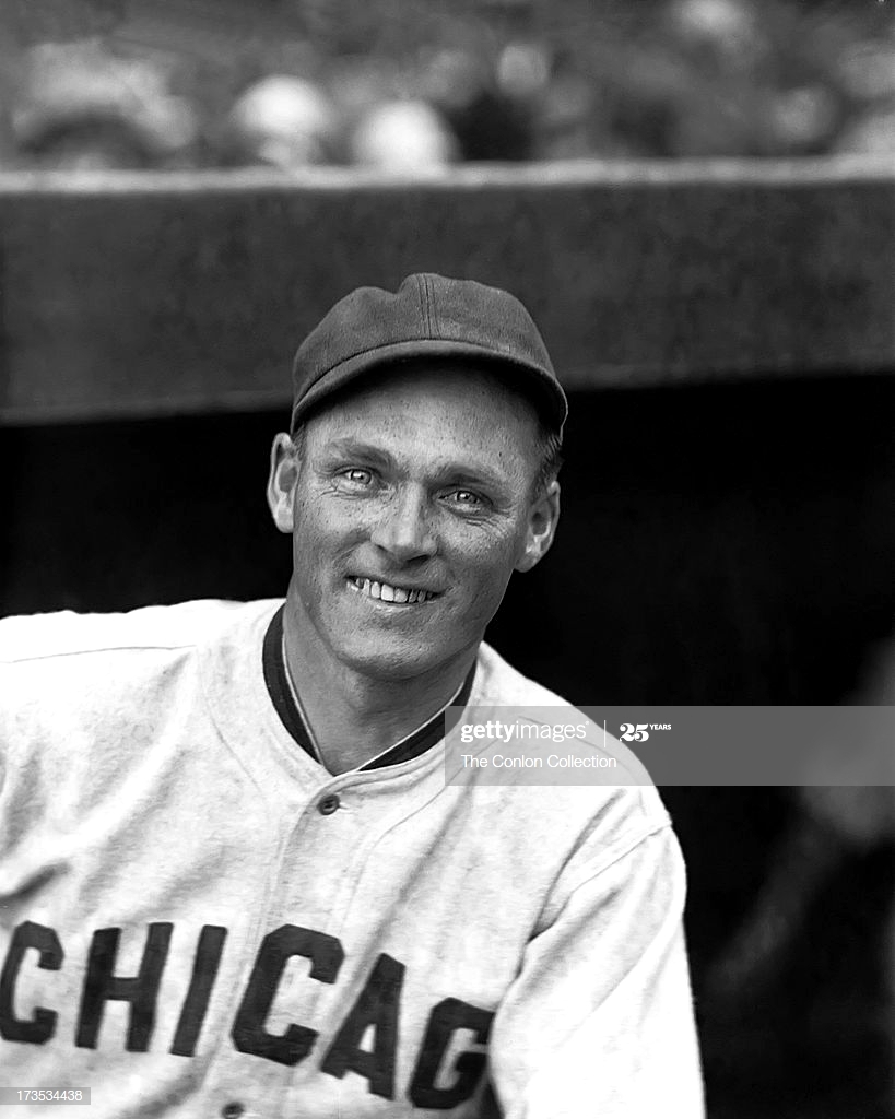
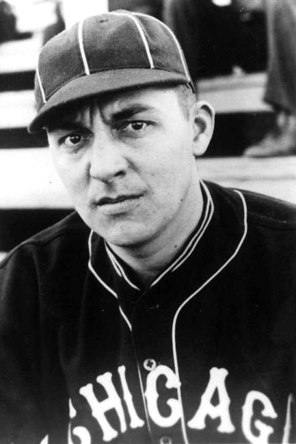
Chicago White Sox Caps History
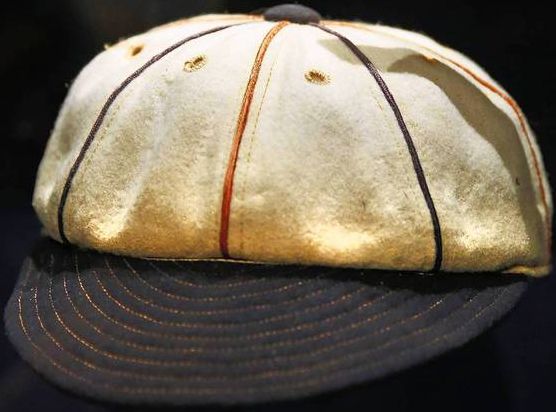
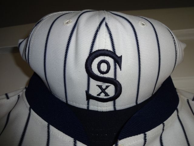
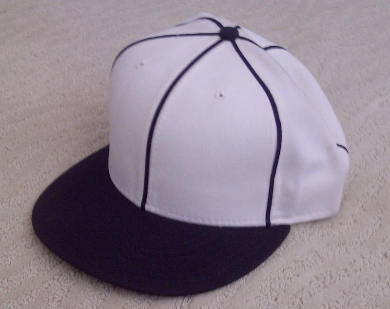
1917 World Series
Used only at home in the 1917 Series.
1929
Home cap is navy with pinstripes and no logo, road is plain navy with no logo.
1930-31
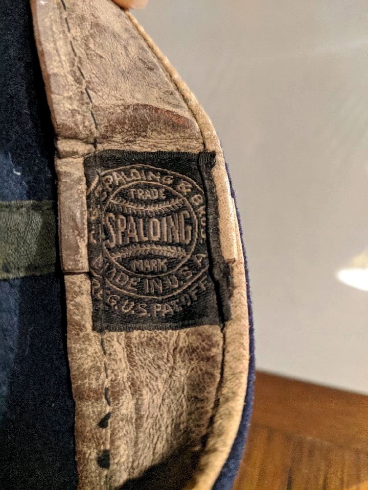
Spalding
This is the home cap for 1930-31. Road caps were navy with pinstripes.
1932
Home cap is plain navy. Former home cap is now the road cap.
Spalding
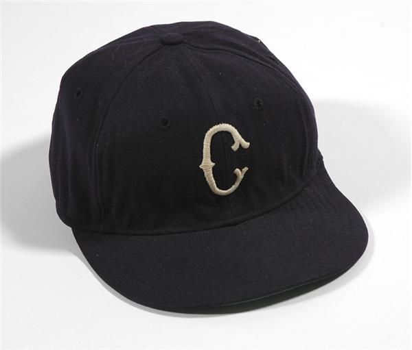
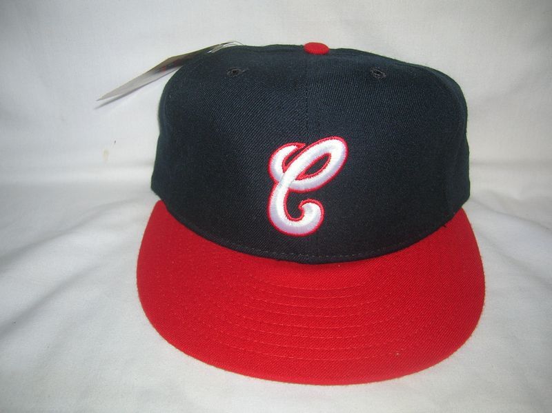
1933-35
Home is plain navy, road is navy with white tuscan "C"
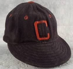
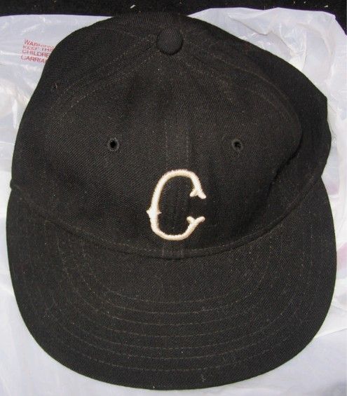
1936-38
Navy cap with white tuscan "C"
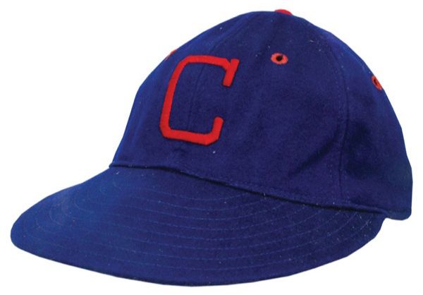
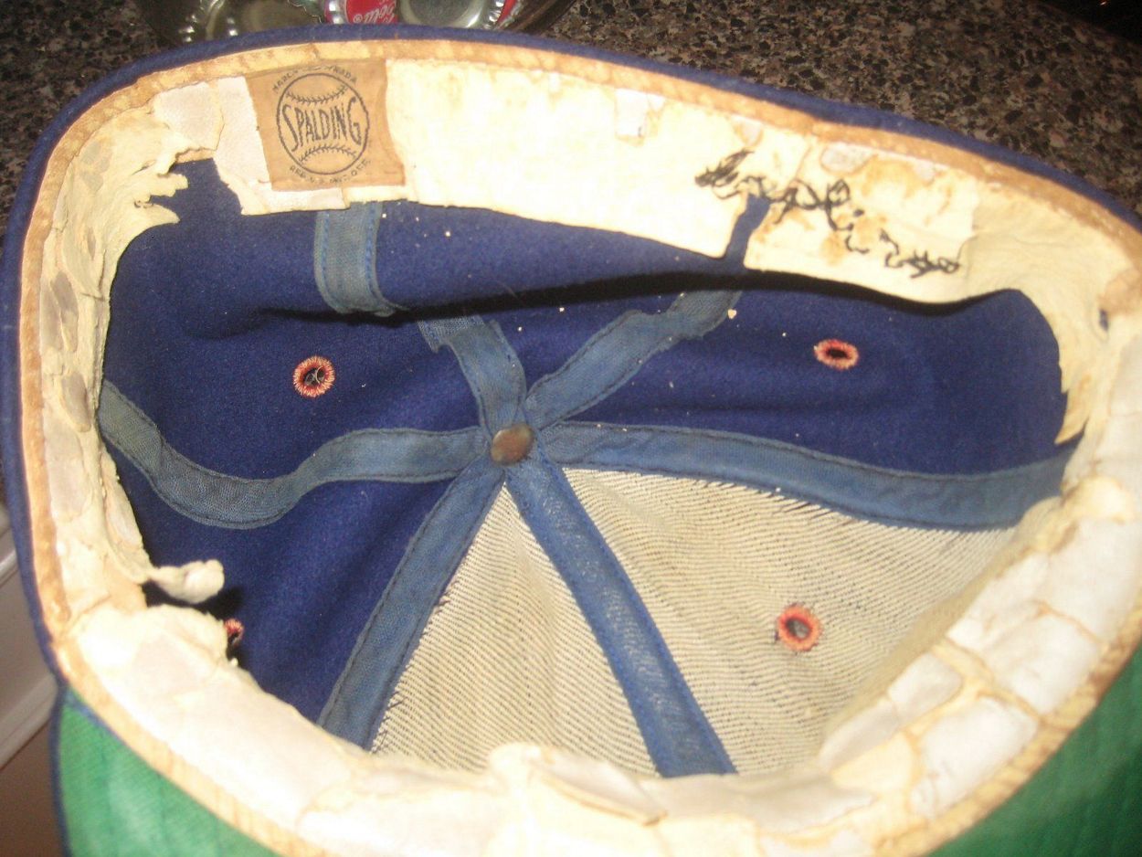
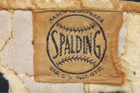
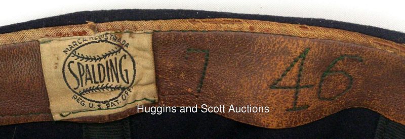
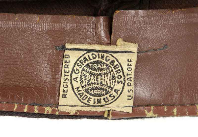
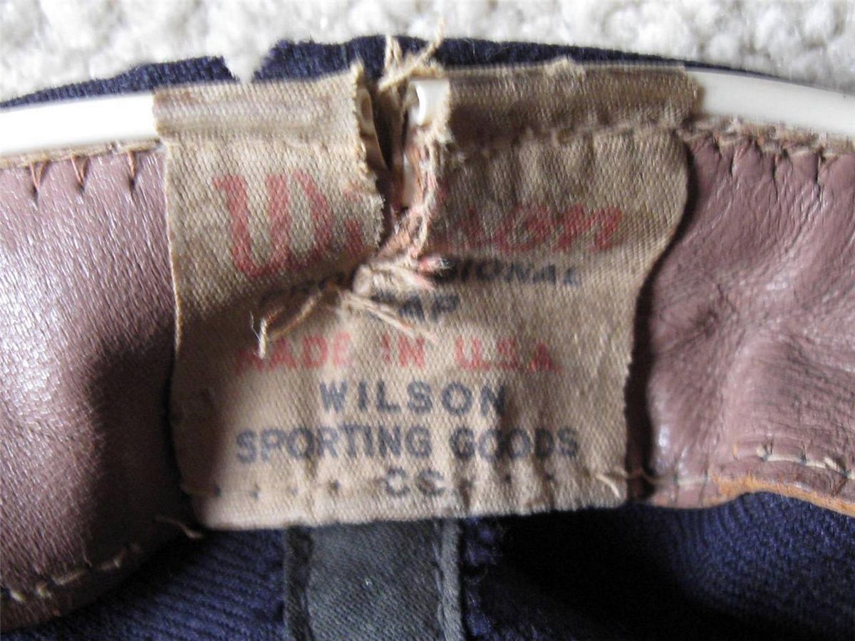
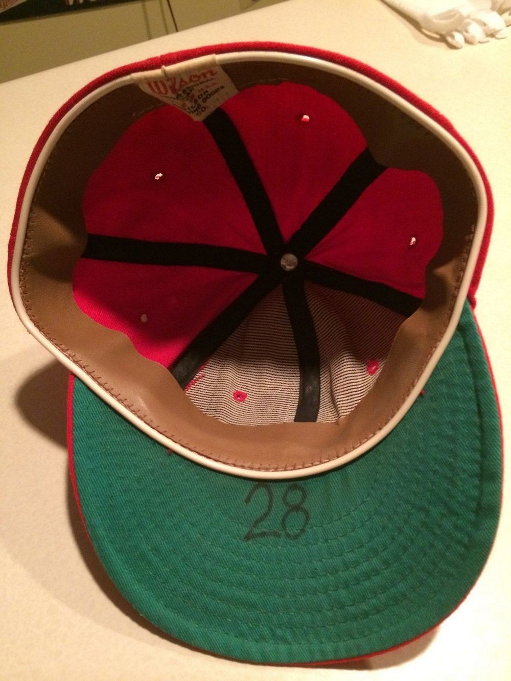
1939-48
Spalding
Cap logo changes to a block "C". The HOF database shows white at home, red on the road, but all the photos I've seen show a red block "C" used home and road.


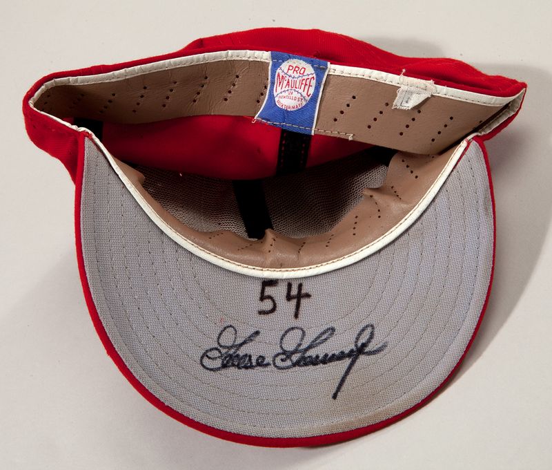
1949-50
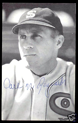
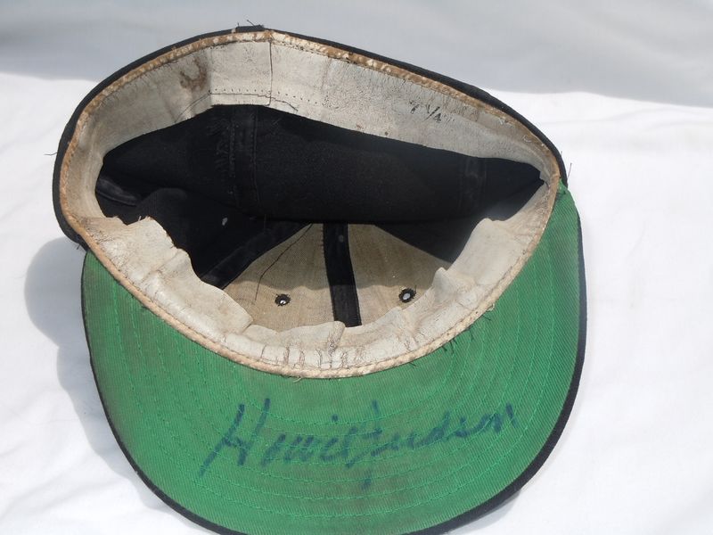
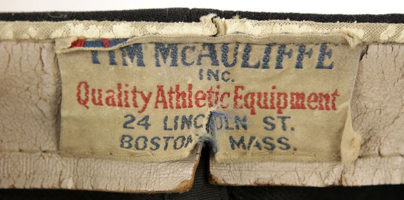
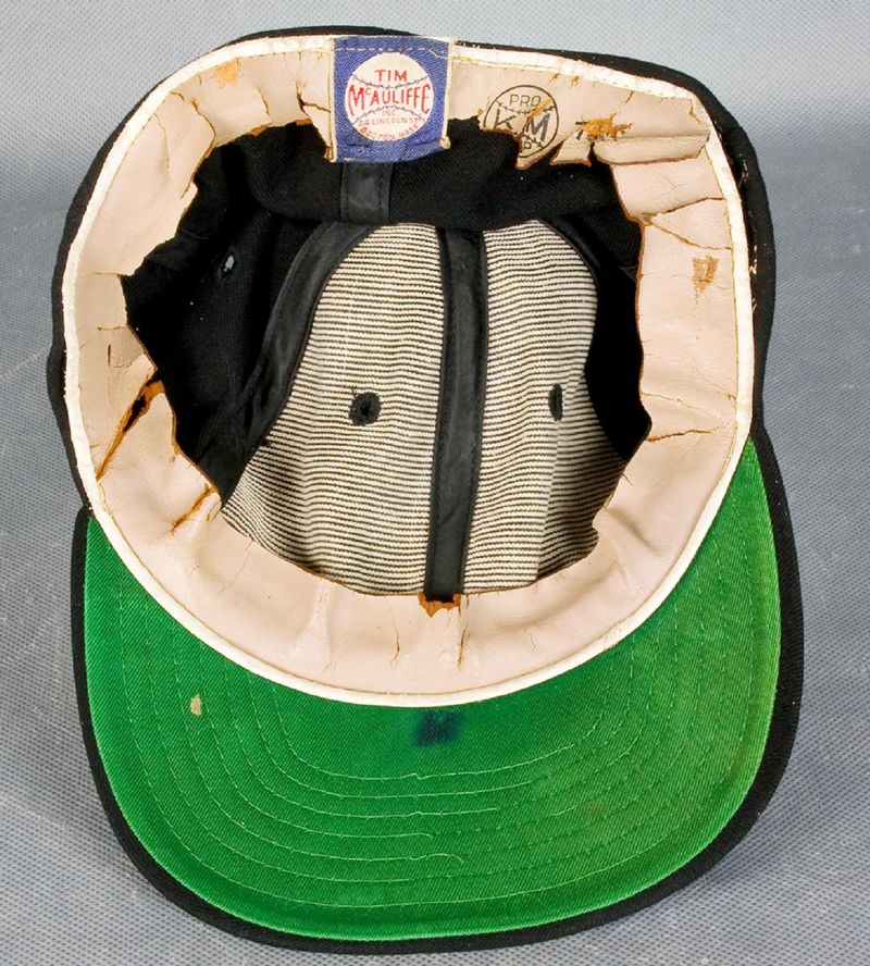
Tim McAuliffe by Leslie
White tuscan "C".

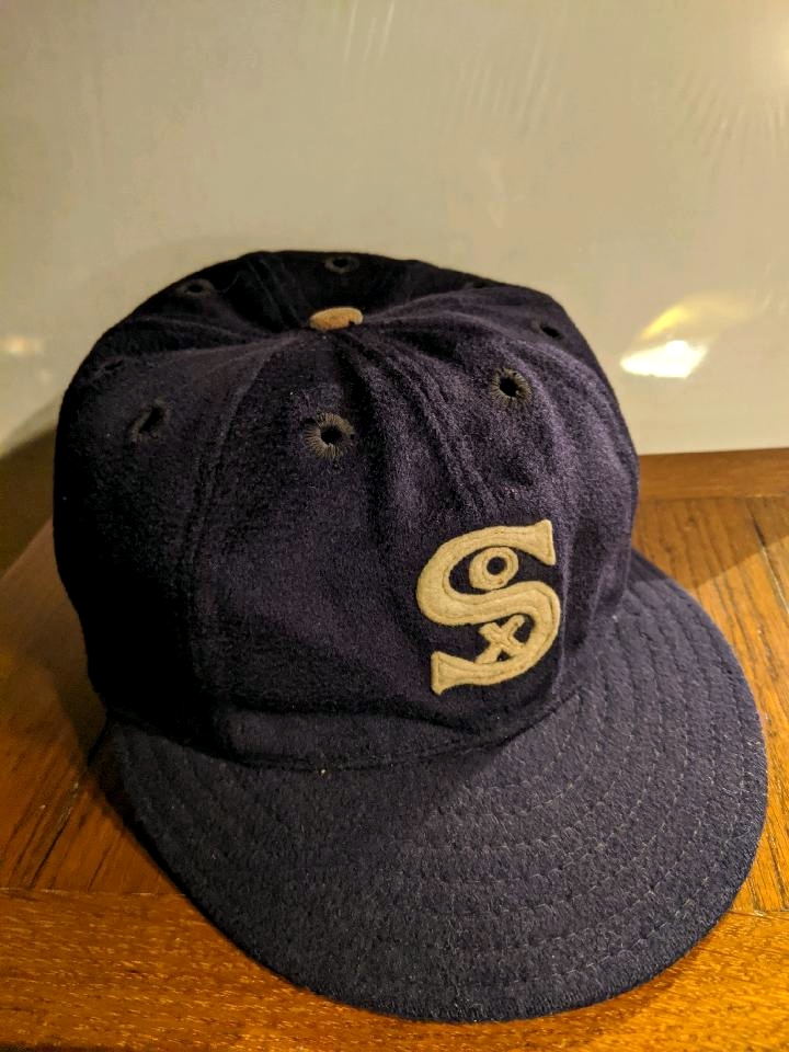
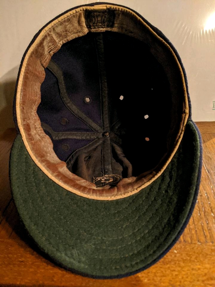
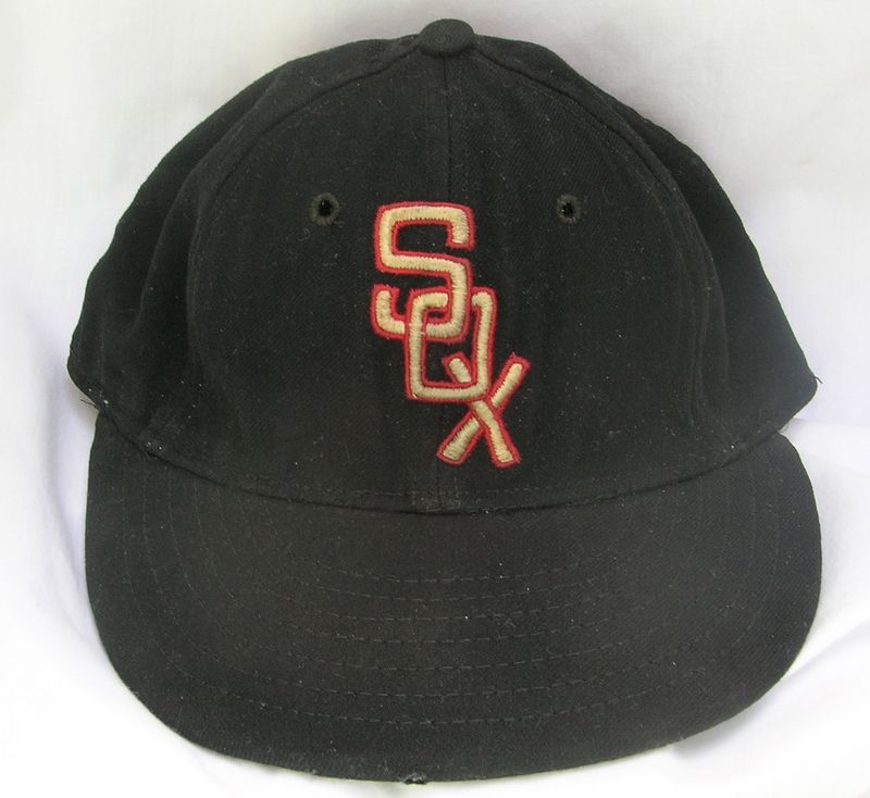
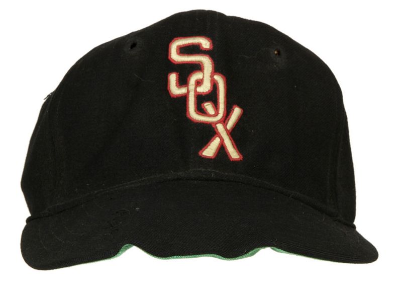
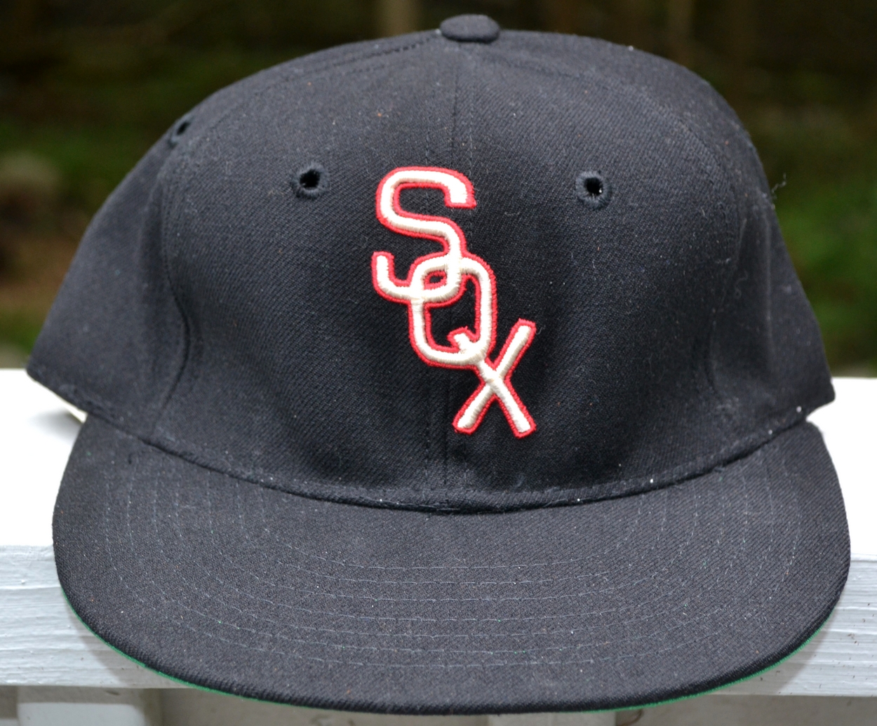
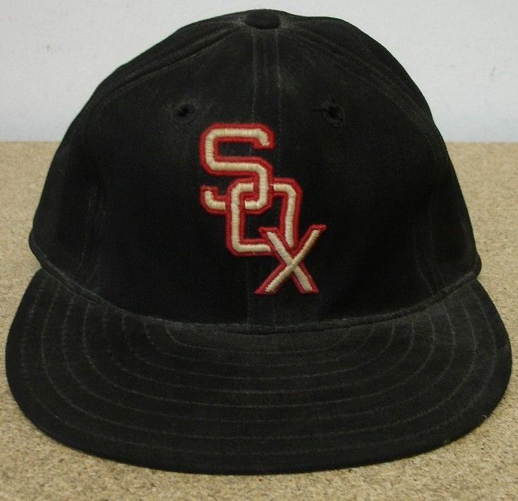
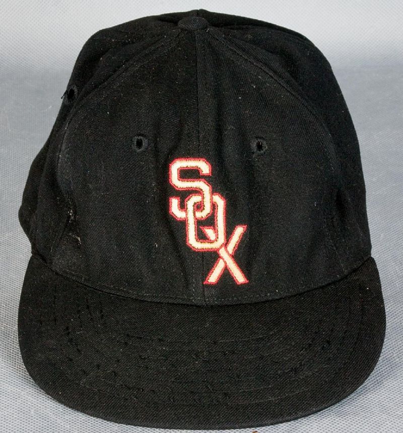
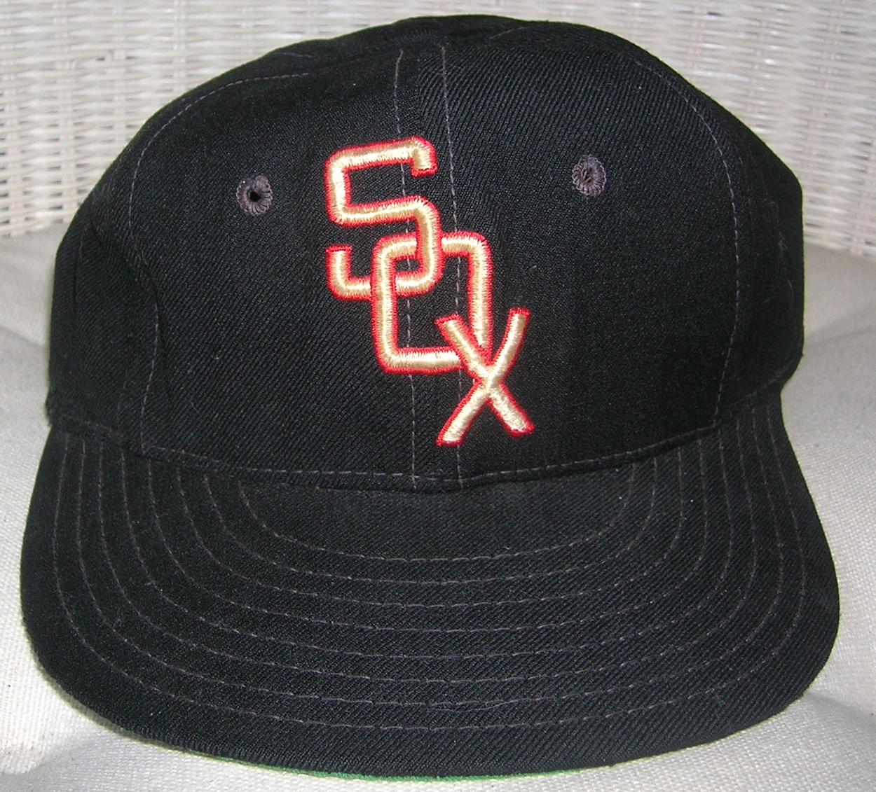
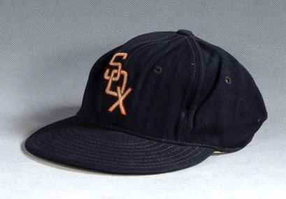
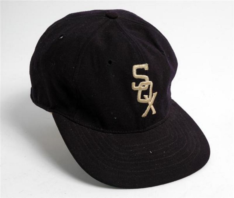
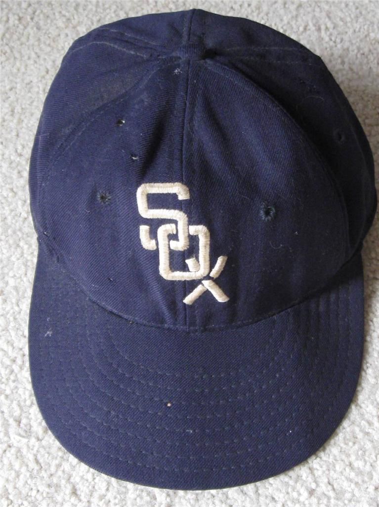
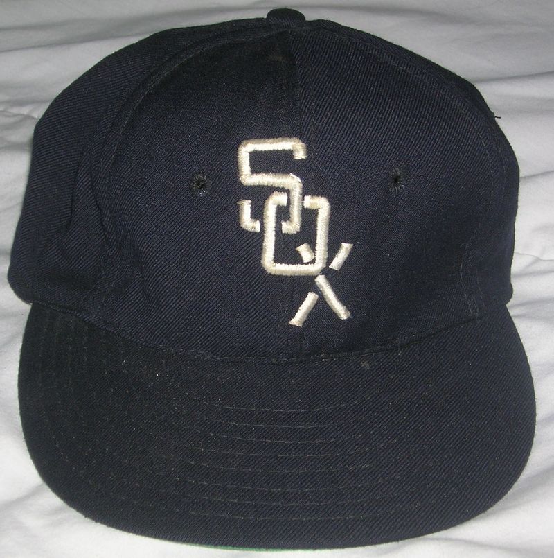
1951
"SOX" replaces "C" as the logo. Watch how the logo changes continually over the years. I believe I have all the variations correct. In the 1951, S and O interlock, O overlies X, and one cross in the X overlies the other.
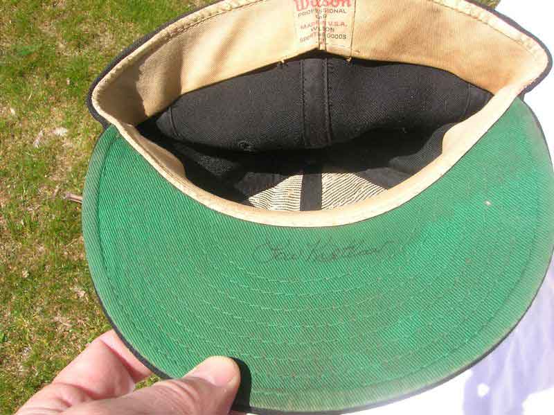
Tim McAuliffe by Leslie
1952
With a switch to Wilson caps, the logo is squished and S is larger than the O and X. Also, now S overlies O, O overlies X.
Wilson

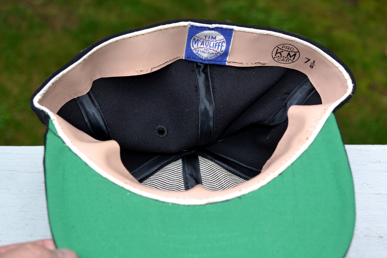
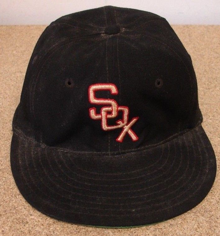
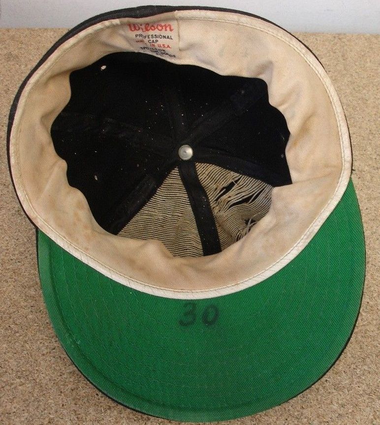
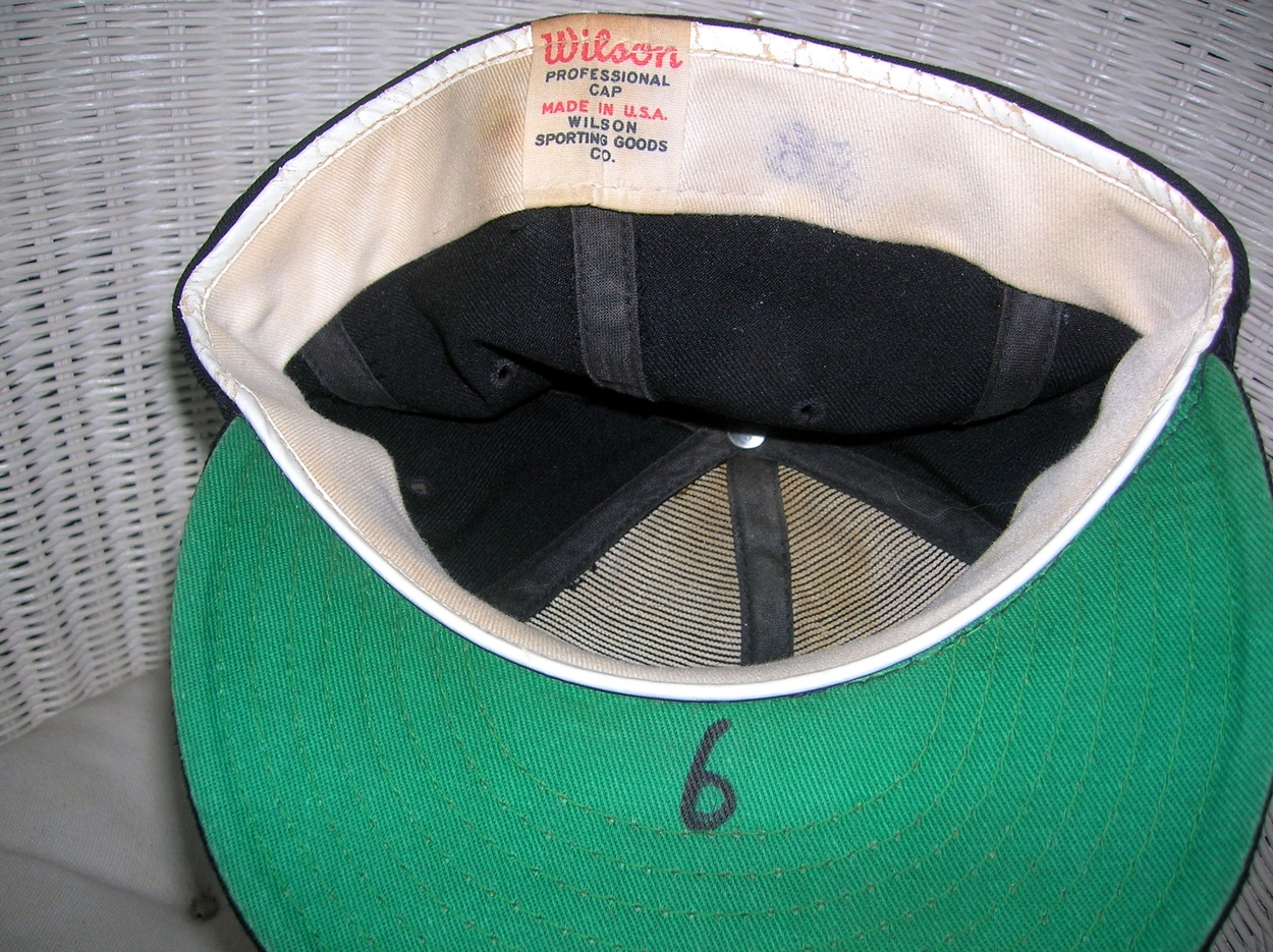
1953-55
In 1953 the Sox return to McAuliffe caps. The logo interlocks the same as the 1951 cap, however, letters are not as wide as the 1951 logo, and the red outline trim is thinner.
Tim McAuliffe/KM Pro
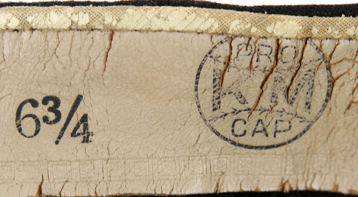
1956
The Sox start wearing Spalding caps. The logo is wider, red outline trim is wider, there is no space where the S and O interlock, X overlies O. McAuliffe caps are also worn, might be from 1955.
Spalding

1957
A new McAuliffe logo, with thin rounded letters, the gap between the base of the S and the top of the X is larger and unlike all other logo variations, the red trim does not cross any letters. Spalding caps are also used in 1957, could be caps from 1956.
Tim McAuliffe/KM Pro
Spalding
Later in 1957 the McAuliffe logo returns to the same exact design as 1953-55.
Tim McAuliffe/KM Pro
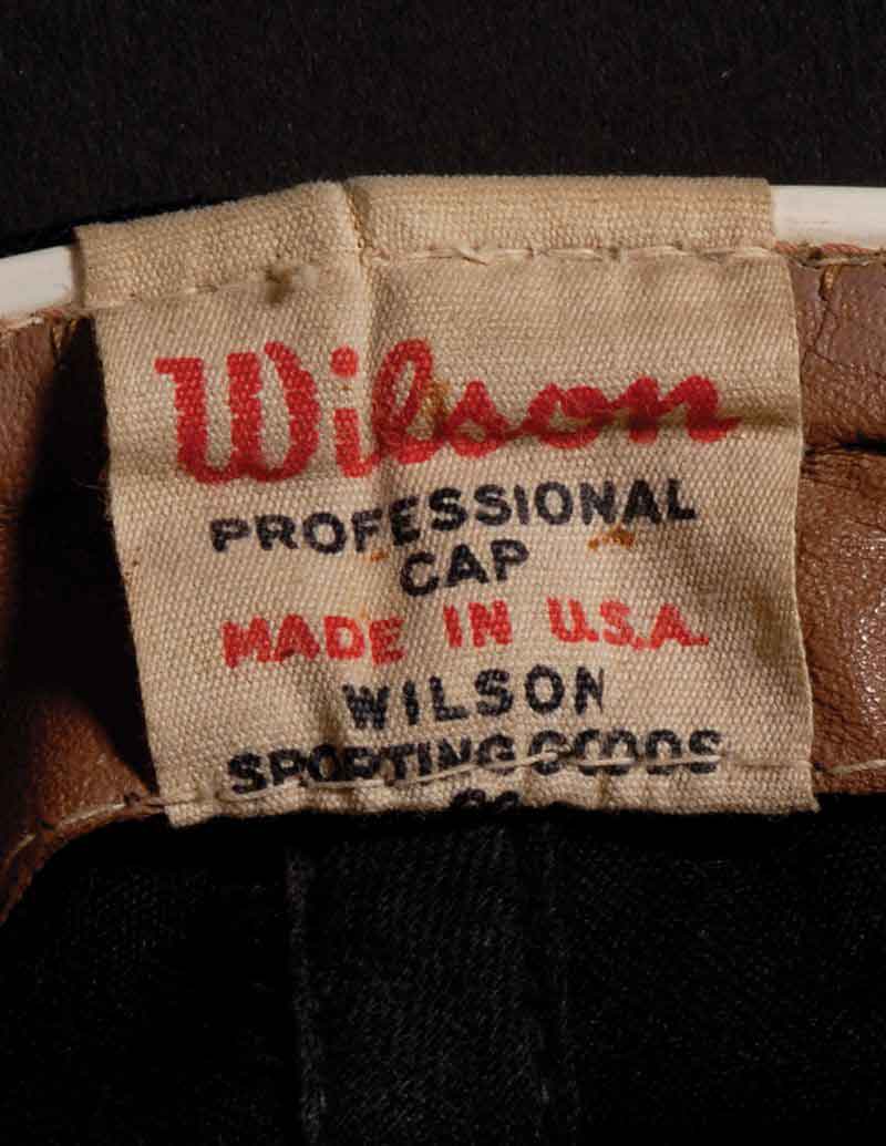
1958
The Sox start using Wilson caps. The logo is different again, it's wider with thinner red trim and O overlaps X. McAuliffe also worn.
Wilson
Tim McAuliffe/KM Pro
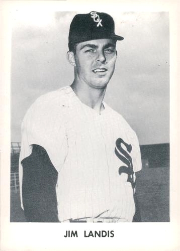
1959-62
Yet more logo tweaks. On Wilson caps, X overlies O again. Some players still use McAuliffe and even older Spalding caps, but maybe only in spring training.
Wilson

1963
Wilson
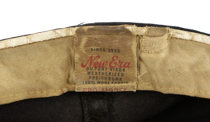
New road cap has no red trim around the logo.
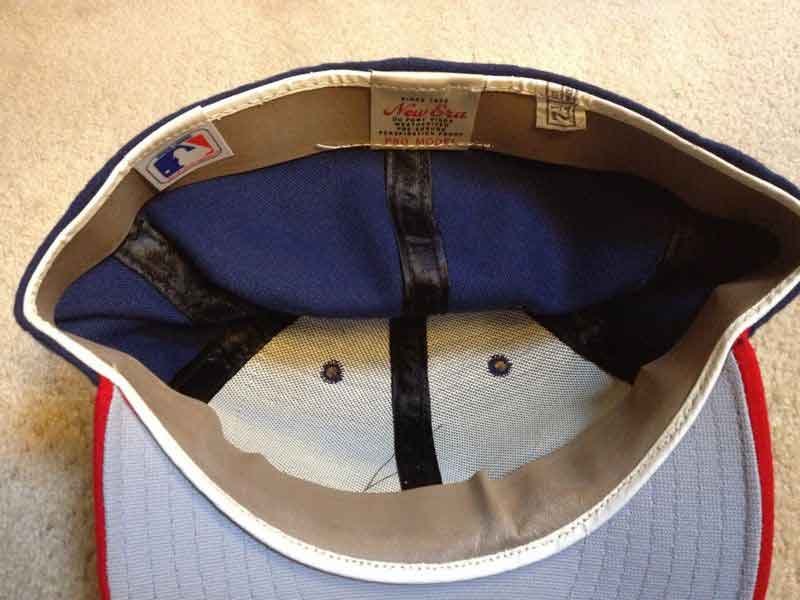
New Era
1964-66
Wilson
New owners and new uniforms. Caps are navy and the white logo has gaps between letters rather than overlap.
1967-68
Wilson
Logo gaps are wider.
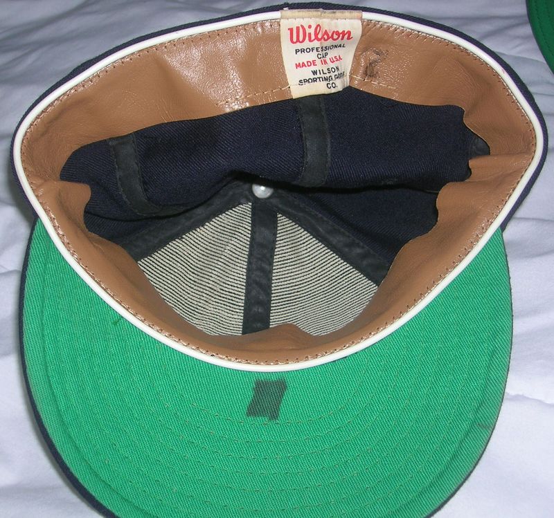
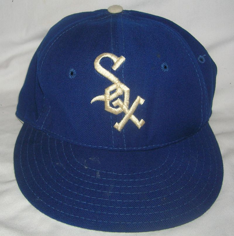
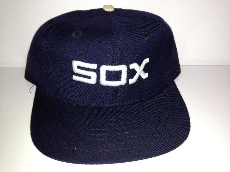
1969-70
Wilson
The script changes.
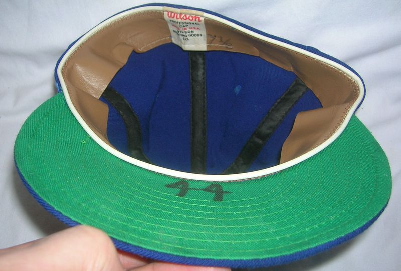
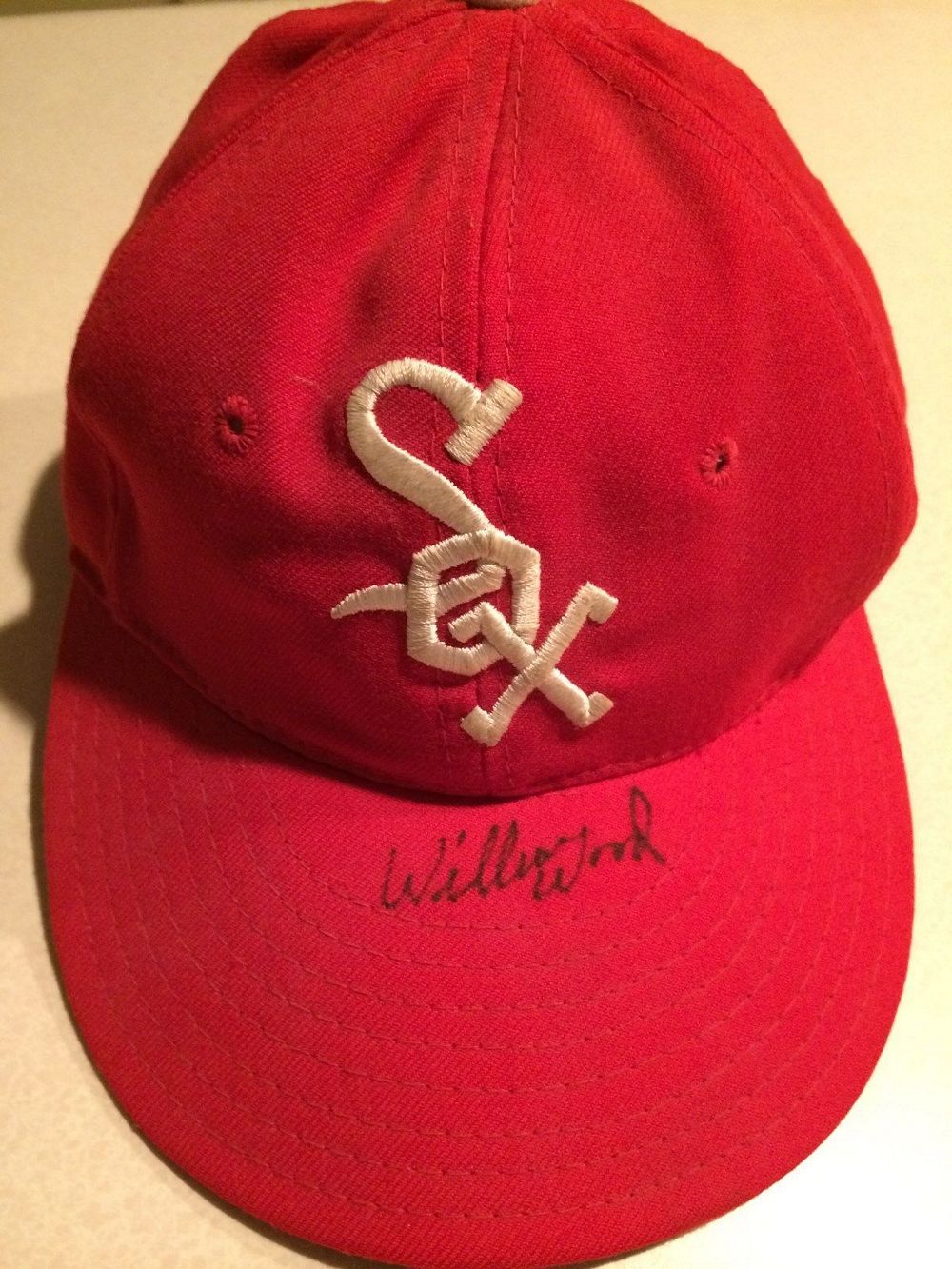
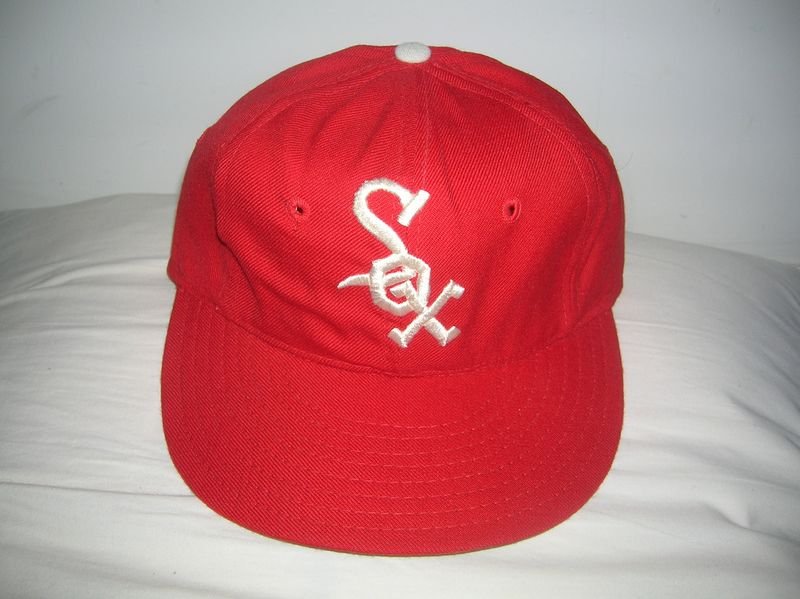
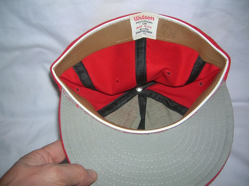
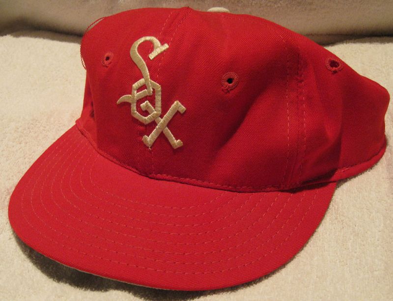
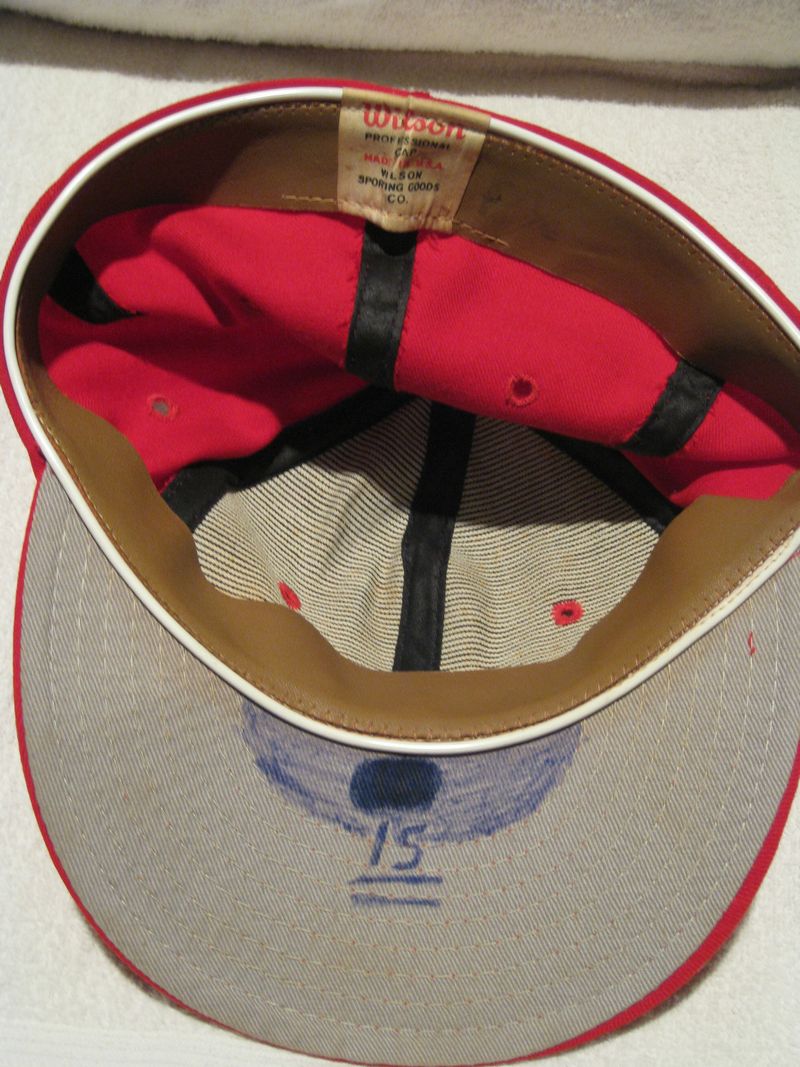
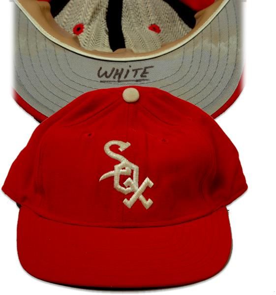
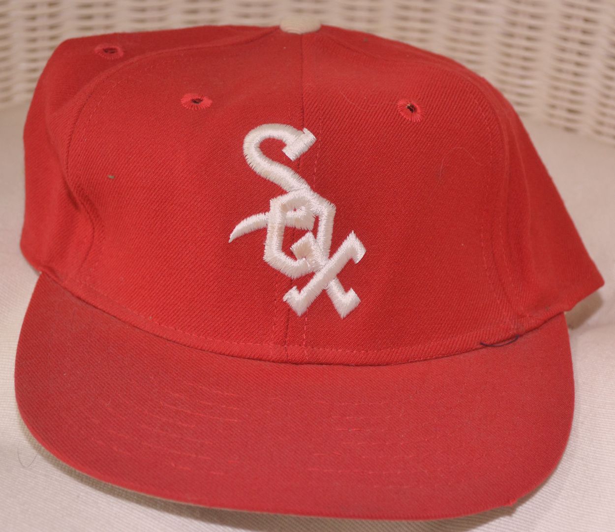
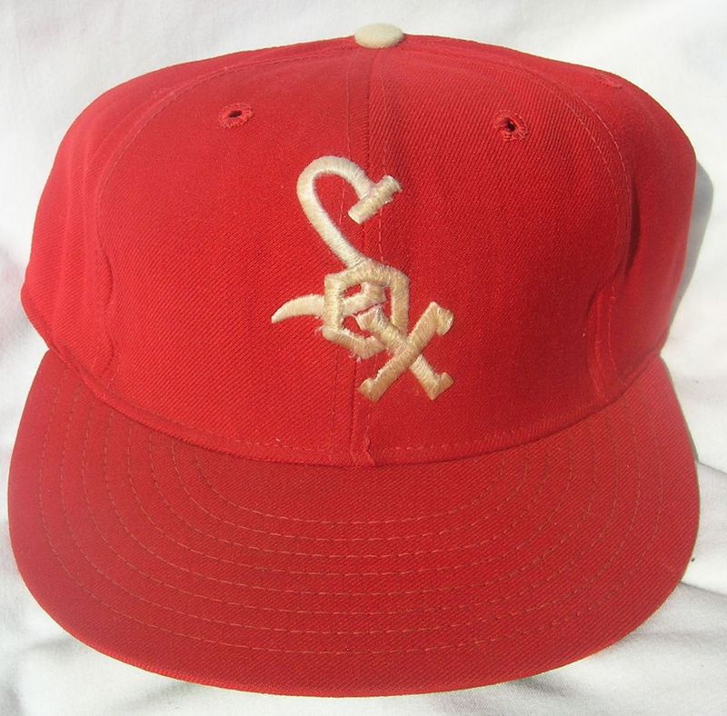
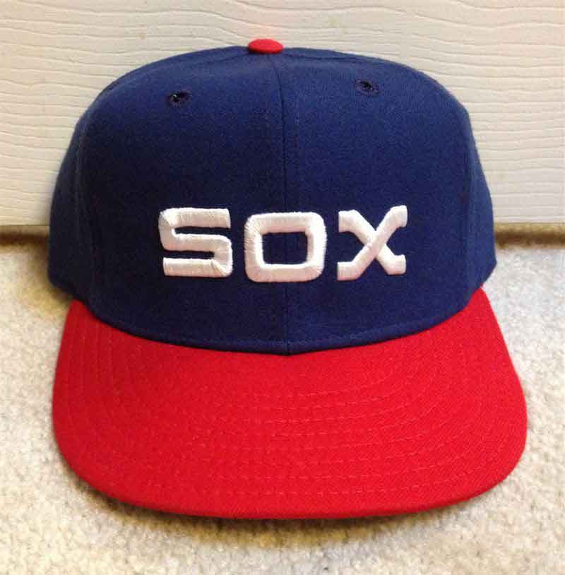
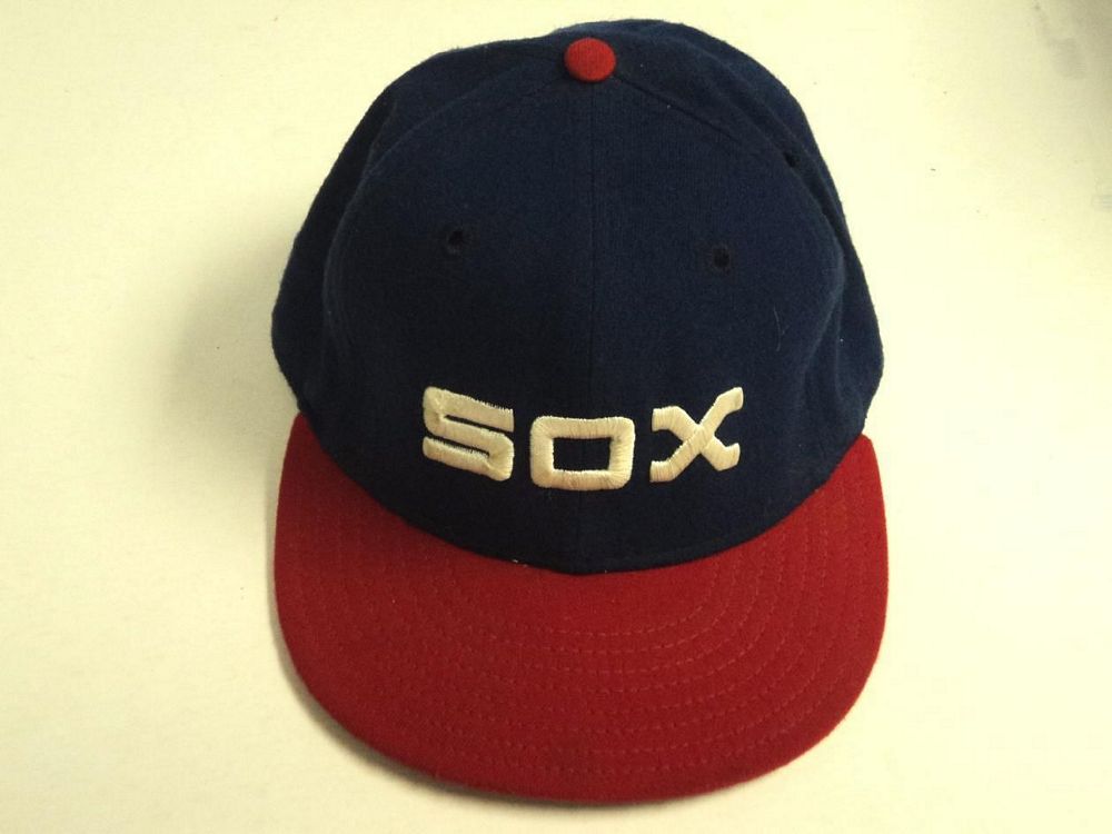
1971
The White Sox are now red Sox.
Wilson
1972-73
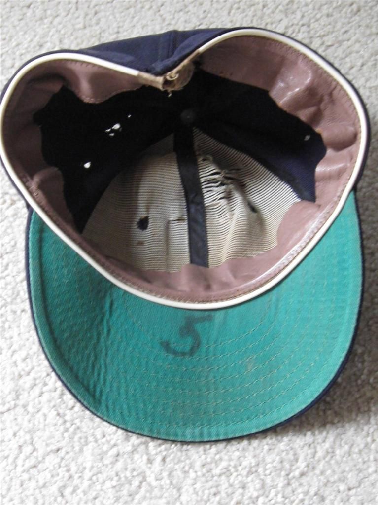
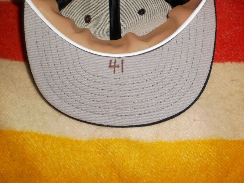
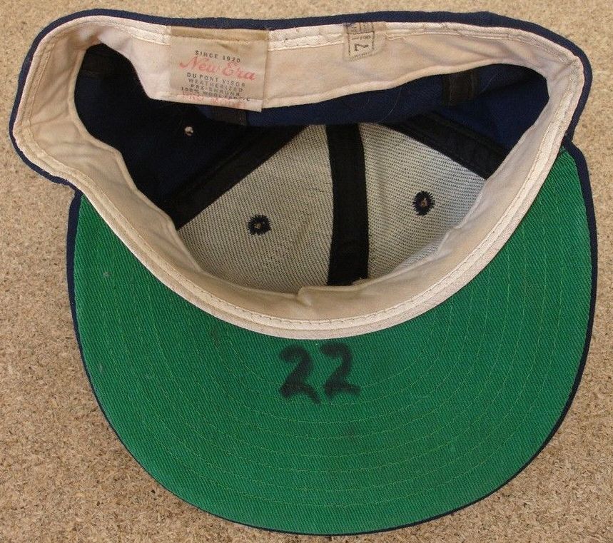
The Sox start using grey underbrims around 1972.
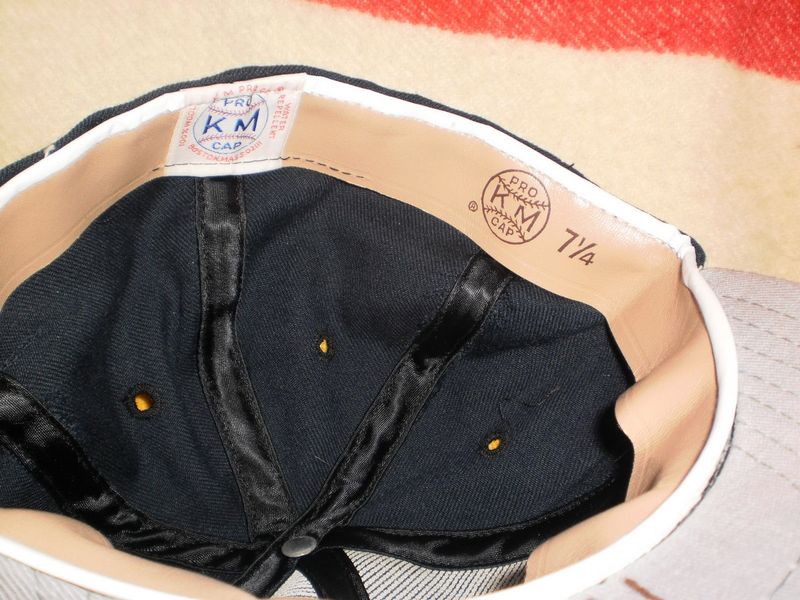
Pro McAuliffe
Here's a rare Pro McAuliffe, made for McAuliffe Uniform, owned by Stall & Dean's Richard Stall. It's clearly a New Era-made cap under private label. LOA from the Goose worn in 1972.

Wilson
1974
In 1974 New Era stopped private label capmaking for Wilson. This cap could have been made by New Era but it was finished off by someone else. The 1974 Wilson White Sox cap is unique in that: letters are thinner, "S" interlocks with "o", and "o" overlies "x". This is exactly how American Needle embroiders throwbacks today, probably they did the embroidering and/or made this cap for Wilson.
Wilson
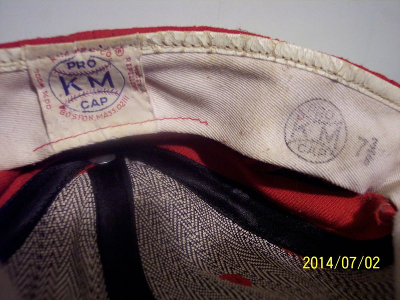
The Sox also use KM Pro.
KM Pro

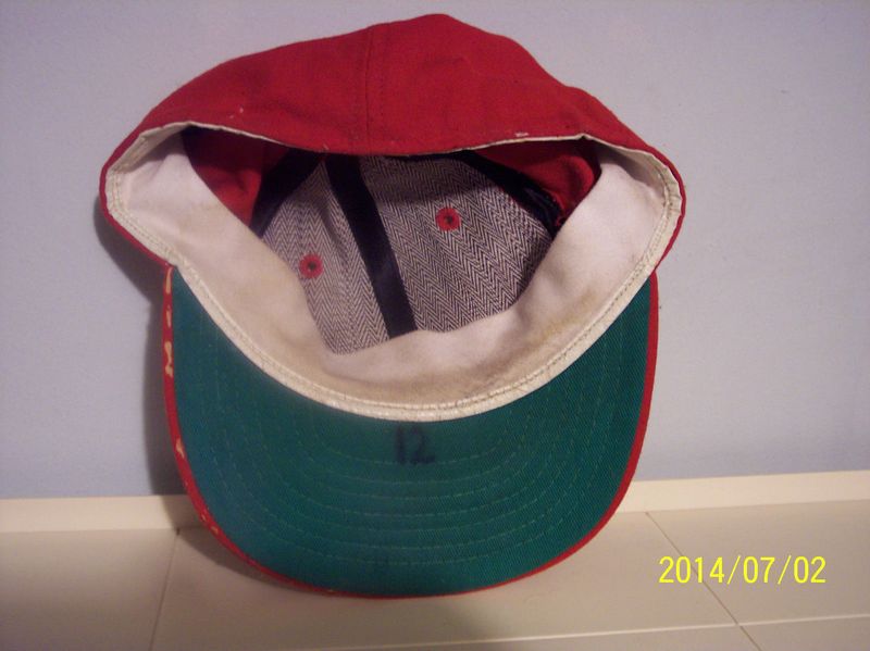
1975
In 1975 the Sox use both New Era and KM Pro, now with green underbrims (confirmed by pictures).
New Era
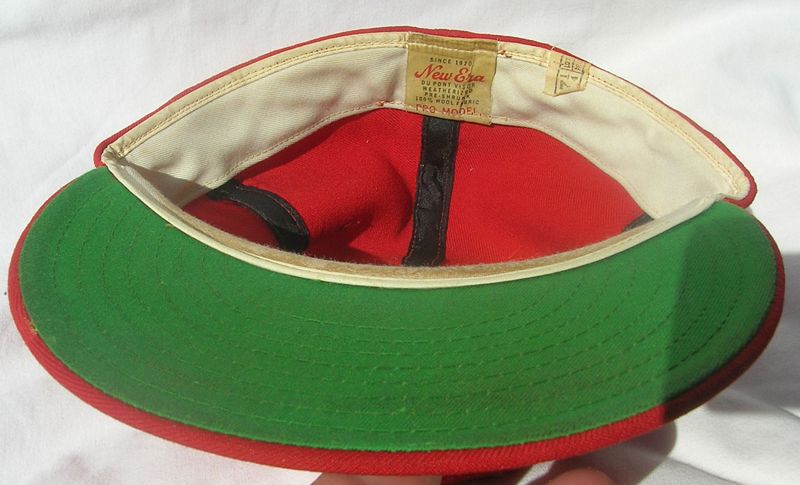
KM Pro

1976
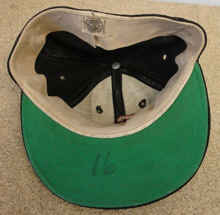
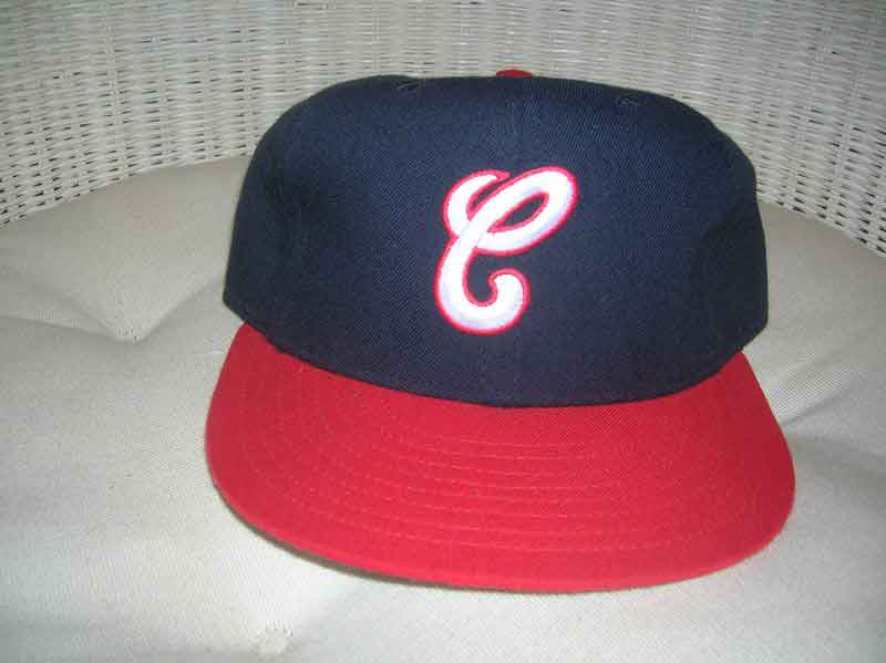
The Sox turn retro and bring back navy.
KM Pro

A white cap with blue visor was used on an April 13-21, 1976 road trip to Minnesota, Boston & New York, after which it was banned by the A.L. for being too distracting to the hitters.
1977-81
After KM Pro goes under, the Sox turn to Roman Pro. The cap below came from KM Pro inventory and has a Roman label.
Roman Pro
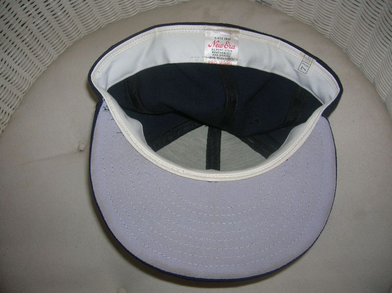
New Era
New Era caps had green under the brim at first. Player choice perhaps?
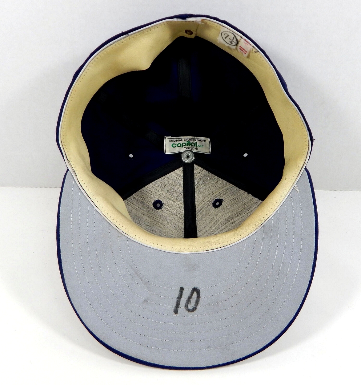
Capital Ace
Tokyo-based Capitol Ace made caps as well as jerseys, worn by some players & staff.

New Era

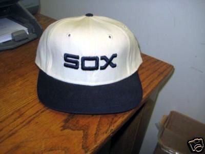
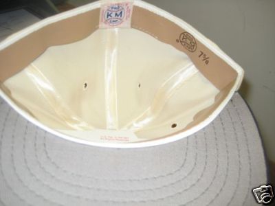
1982-86
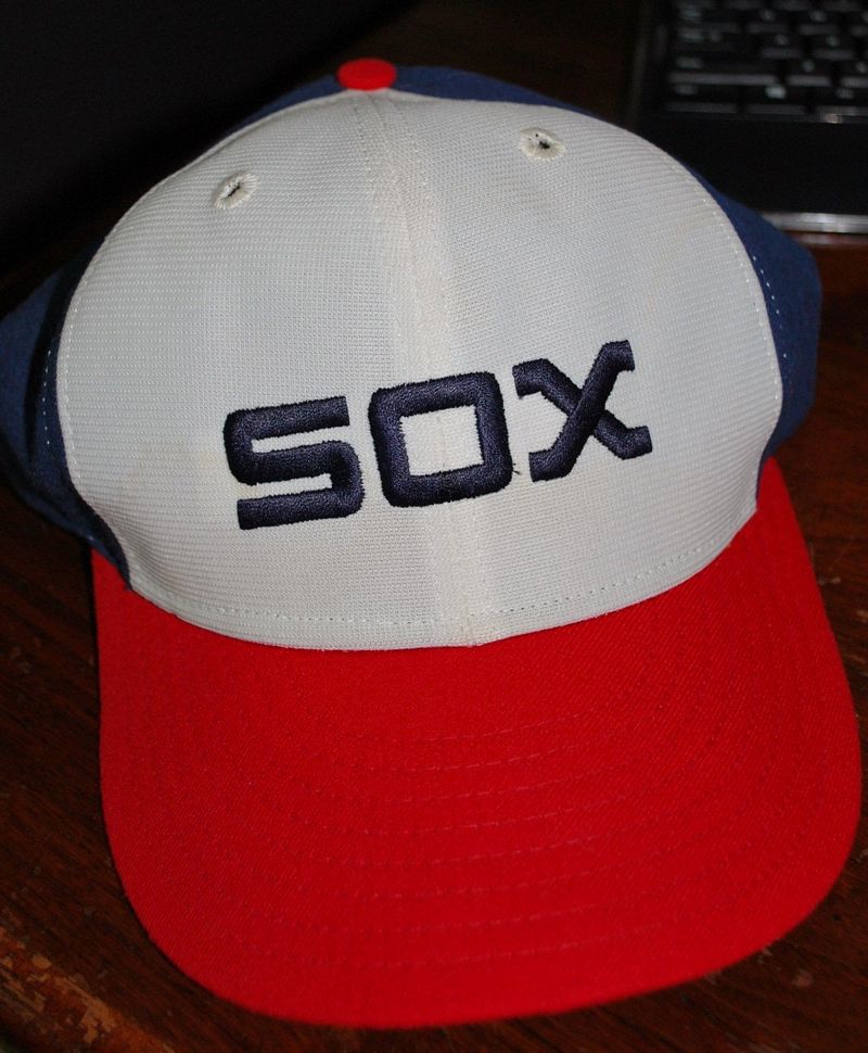
Time for a change. Home caps have nylon white front panels.
New Era


1987-89
Right on schedule the Sox switch to a look based on their 1942 set.
New Era
1990
New Era
1990 sees the first Turn Back the Clock game.
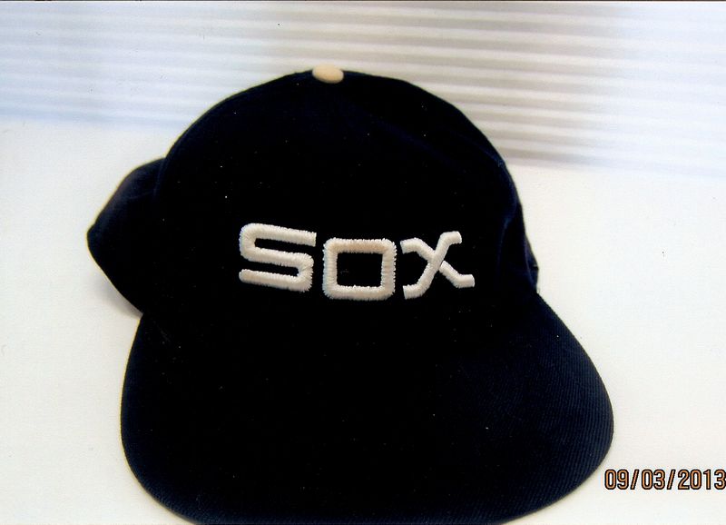
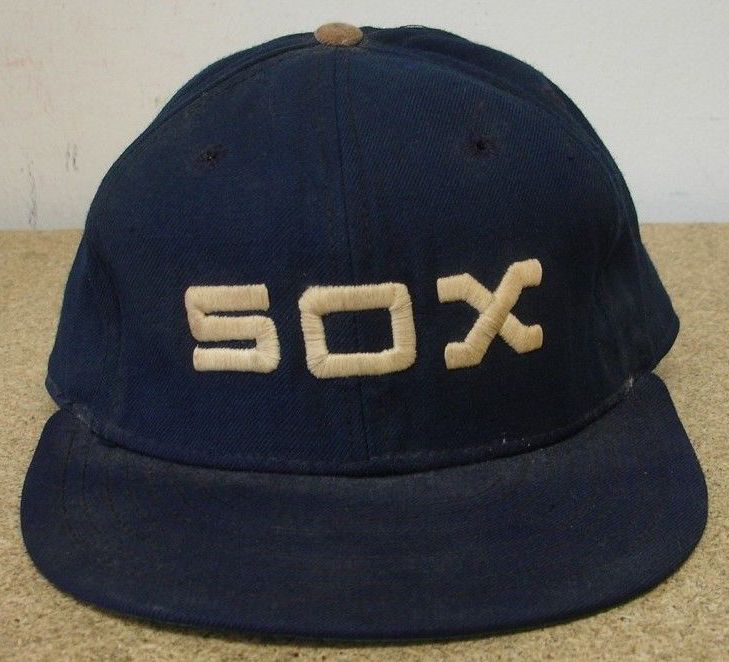
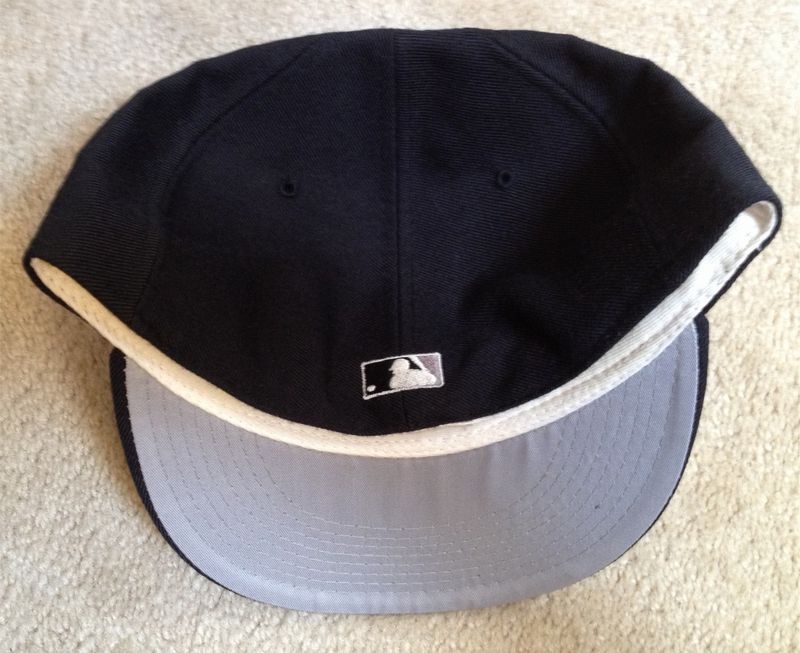
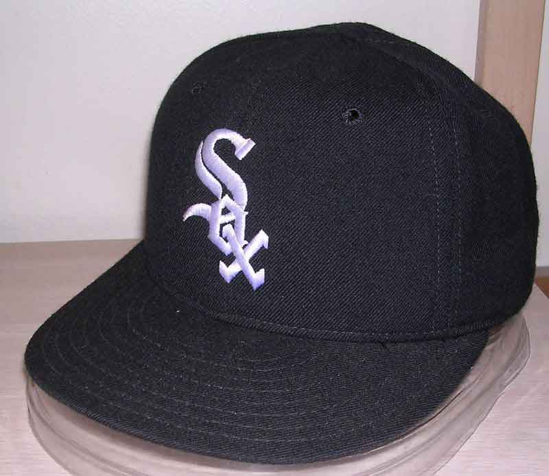
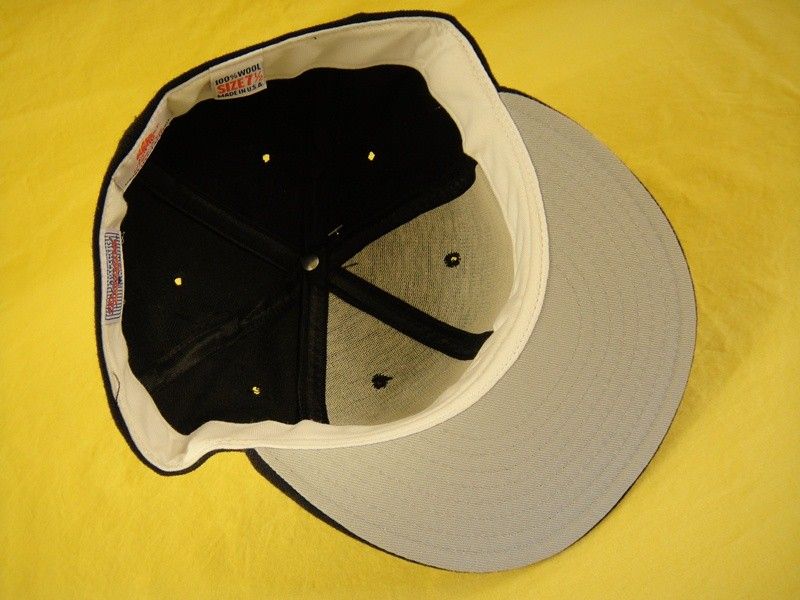
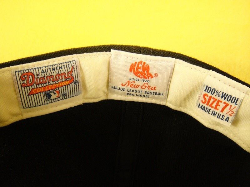
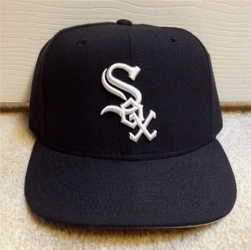
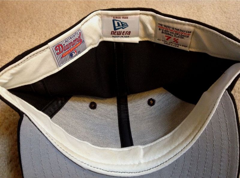
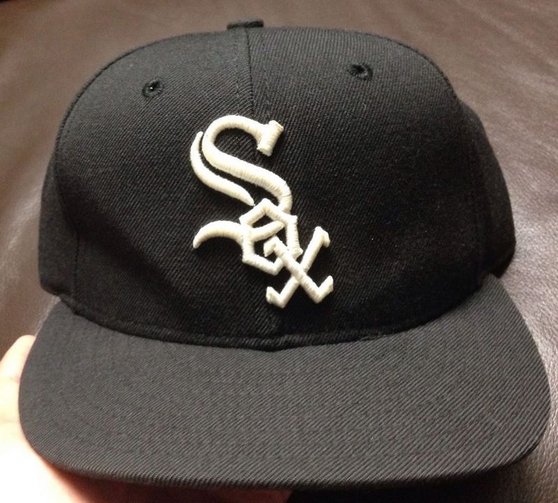
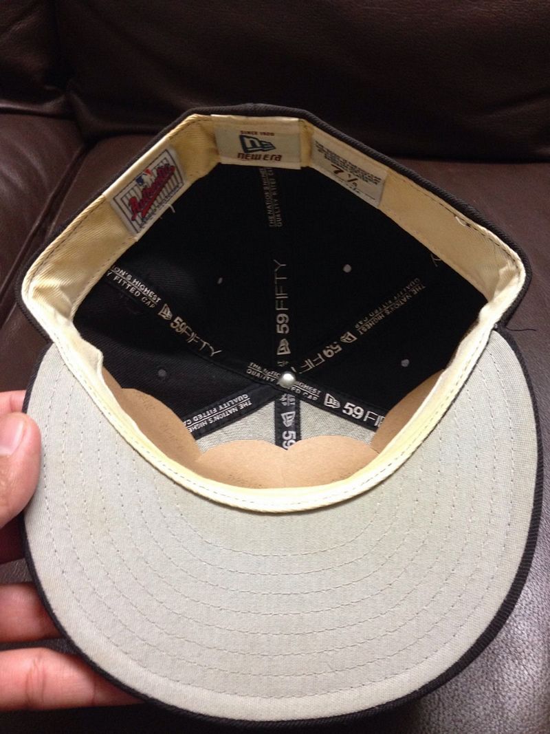
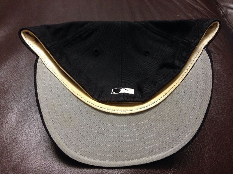
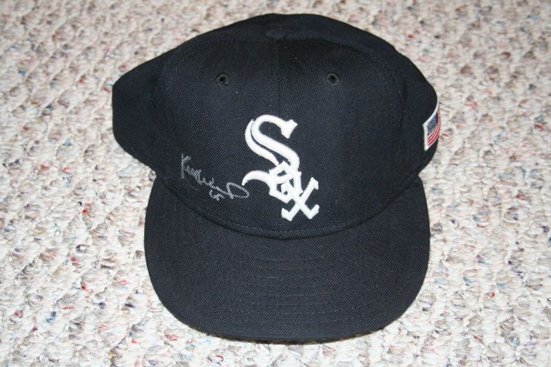
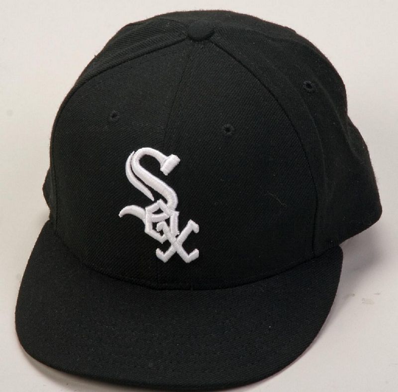
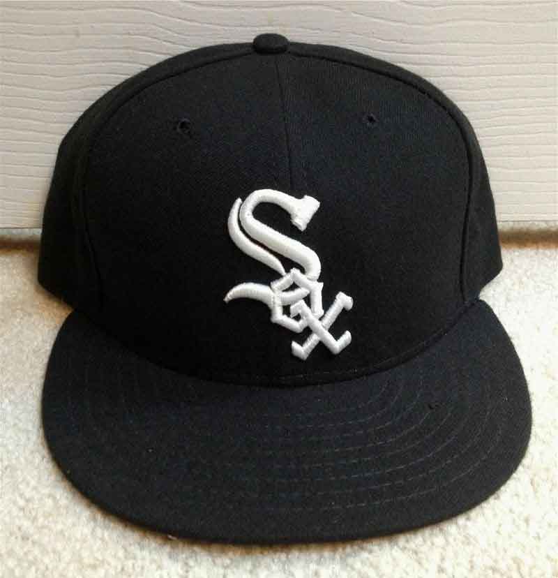
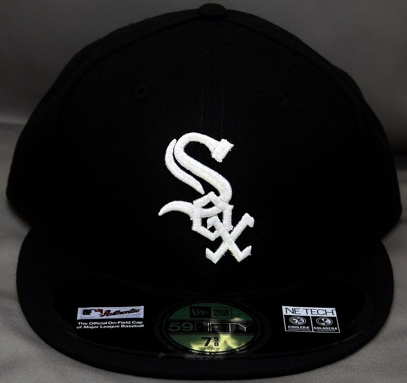
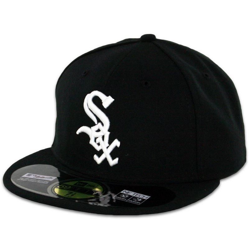
1990-2000
In order to keep baseball designers employed, a new look is ordered and introduced at the final homestand at old Comiskey Park in 1990. It's a return to a black look similar to 1949-63 but adding silver trim in place of red.
New Era
MLB Batterman logo initially appears as a glued on patch in 1992 then is embroidered on later in the year.
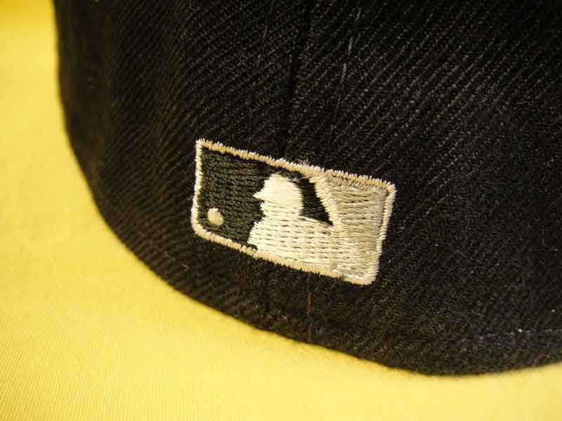

Raised embroidery appears in 1996.
The logo is widened slightly in 1997.

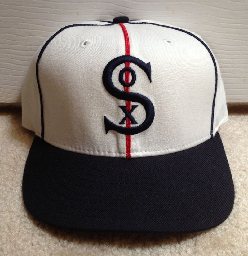
2001
New Era
In honor of the American League's centennial in 2001, and as a charter member of the league, the White Sox wore throwback uniforms on Sundays based on their victorious 1917 World Series look.

2002-05
New Era

2006
New Era

A 2006 Sunday alternate jersey is based on the Sox' 1906 look.
 <
<
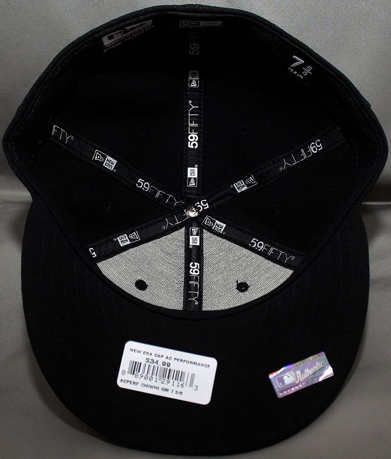
2007-11
Welcome to polyester and black undervisors.
New Era
2012
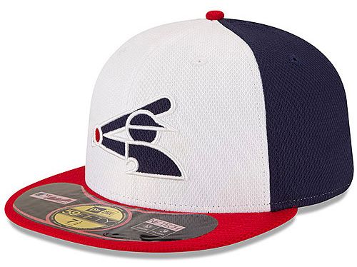
The Sox return to Sunday throwback jerseys. The 2012 alternate is the 1971-75 look.
New Era

2013
The 2013 Sunday alternate is the 1982-86 style. The red cap returns for one game.
New Era

2014
The Sox announce the throwback jersey will be used regularly and with the BP cap. However the BP cap is only worn once.
New Era

BP cap used just once.

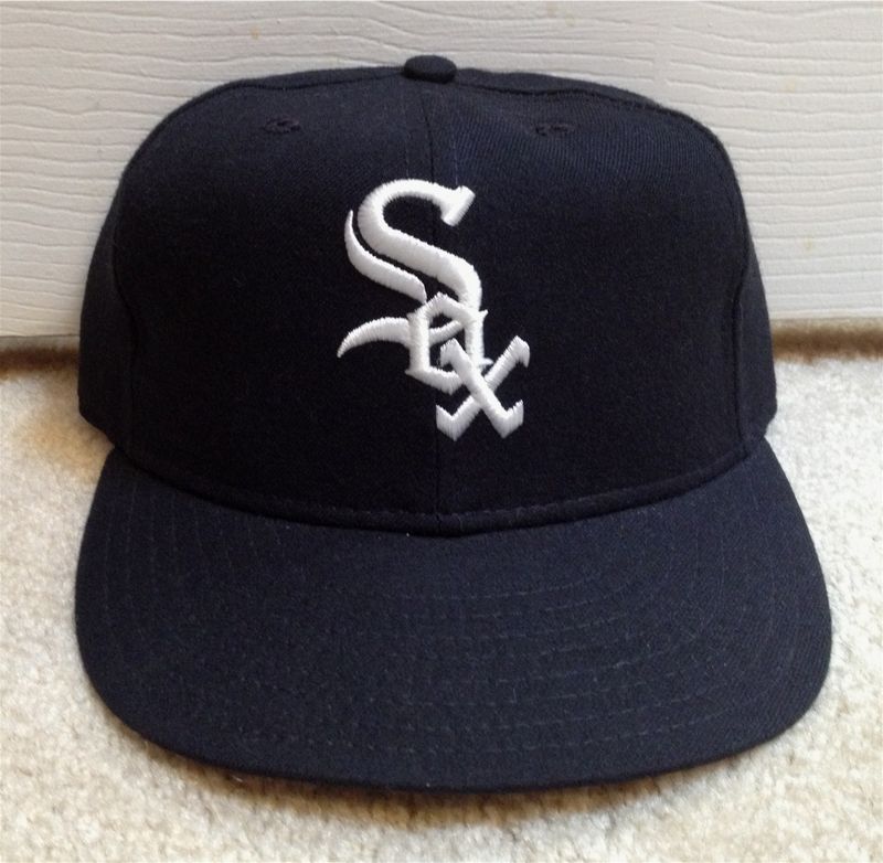
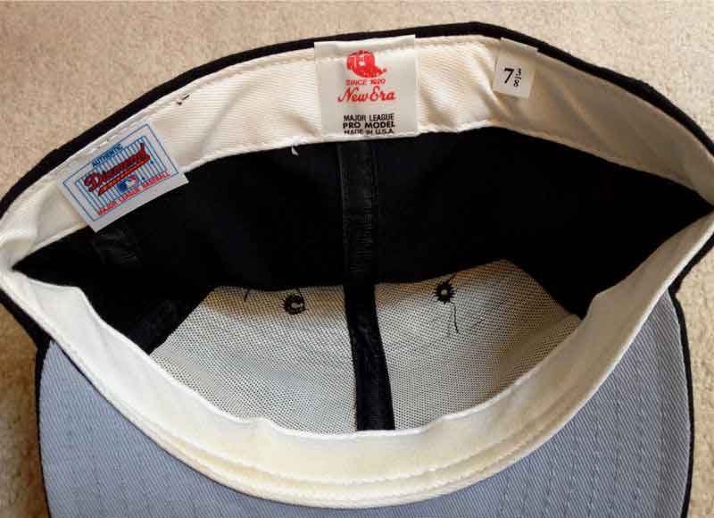
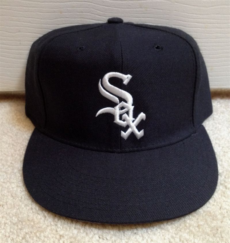
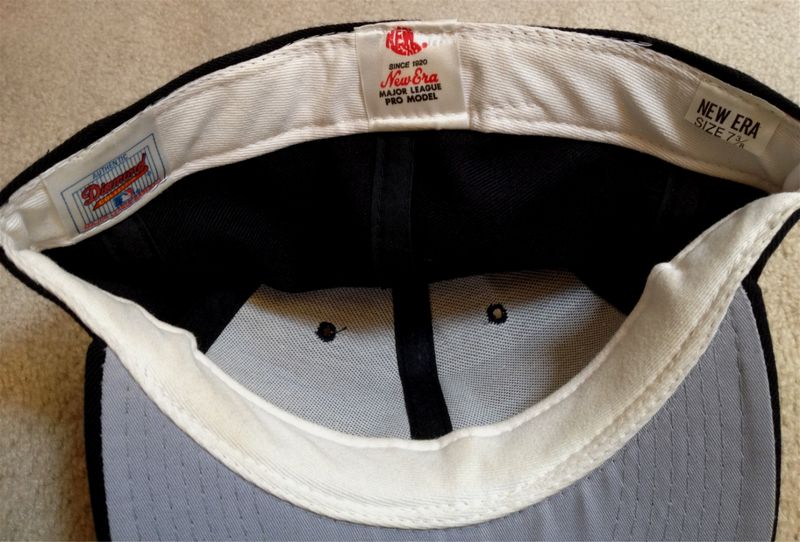
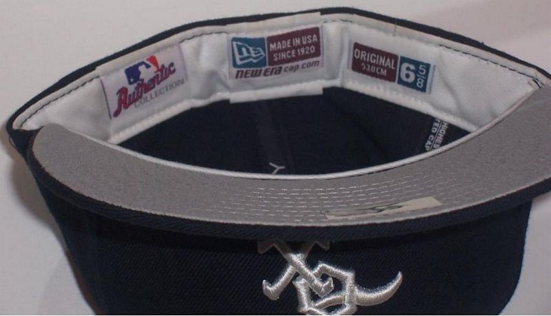
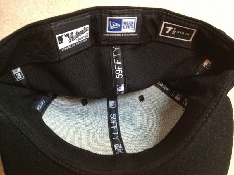
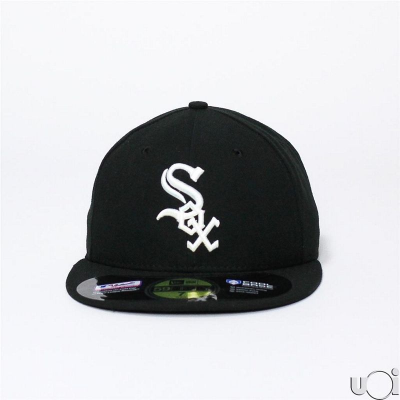
2015-present
BP cap dropped.
New Era